Article
Smartsheet dashboard design: Strategic color use

Welcome! In this new dashboard design-focused series we’ll teach you how to make your dashboard look stunning and professional at the same time. We’ll cover the most important aspects of dashboard design — color palettes, font sets, layouts, and more — and accompany those teachings with recommendations you’ll be able to use to take your dashboards to the next level.
To kick things off we’re going to start with one of the most impactful aspects of a dashboard: the color palette. Color is a very powerful tool in dashboard design. It can evoke emotions, highlight important information, and aid in data comprehension. Choosing the right color palette is crucial for creating visually appealing and effective dashboards.
So let’s get started.
Coloring Outside the Lines: Exploring the Fundamentals of Colors
Color is Deceptive
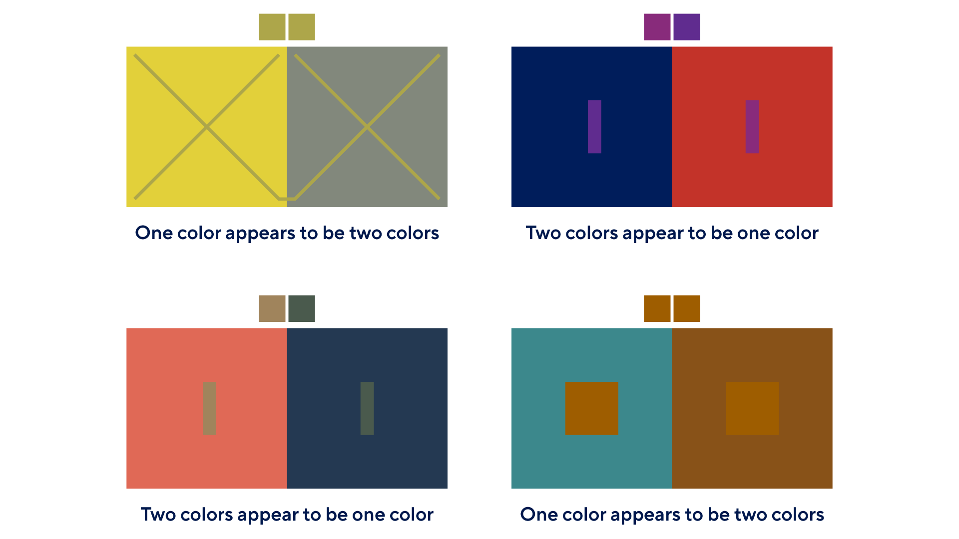
How color behaves in relation to other colors and shapes is a complex area of color theory. For example, the 4 graphics above show just how complex and multi-dimensional color perception is. Our eyes and brain adjust for these differences automatically.
Color perception can be deceptive and is influenced not just by an object’s physical properties but by a variety of other factors, including the light, audience, and surroundings in which a color is viewed.
When designing your dashboard's color palette, it is important to consider the context in which the colors will be viewed, and the overall goal of the visualization. Consider leveraging color relationships to highlight the most important information, and ensure color helps your dashboard viewers interpret the information on your dashboard.
Understanding The Color Wheel
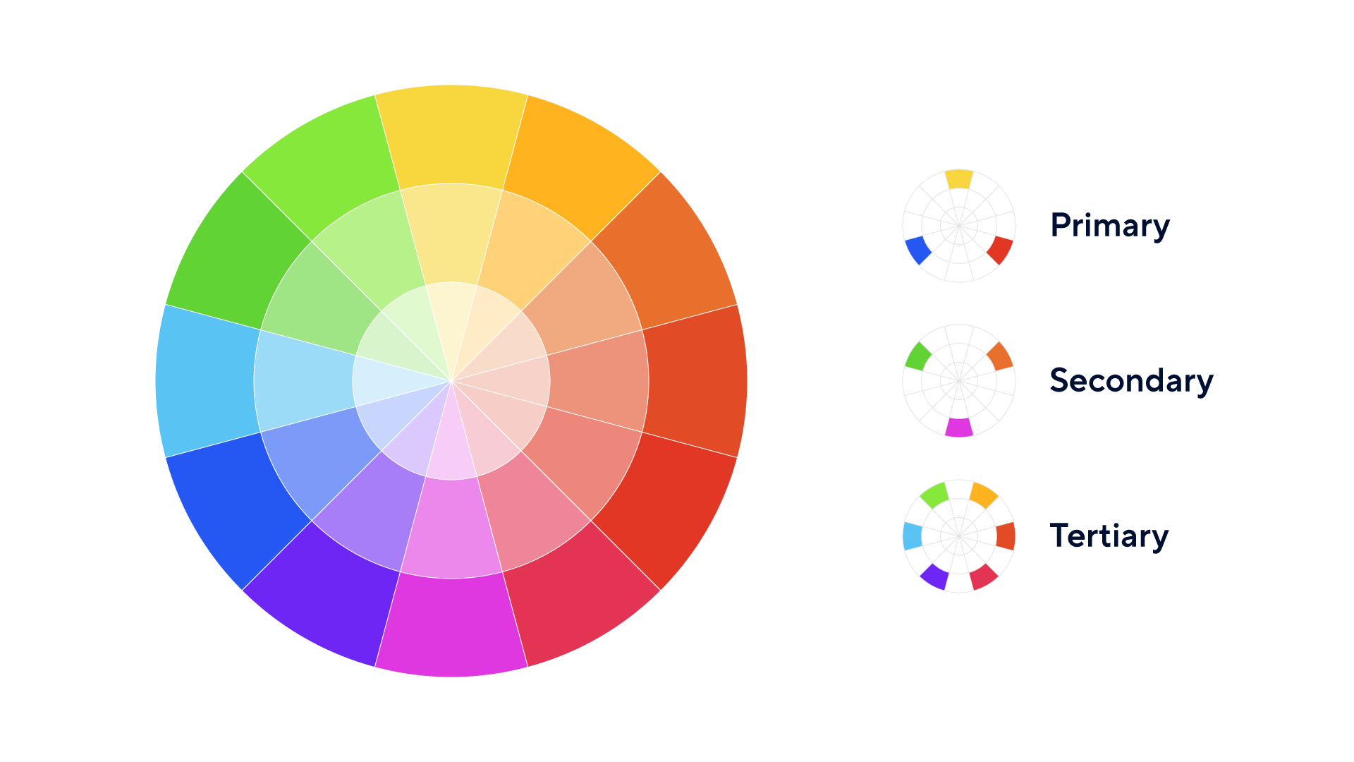
The color wheel serves as a valuable tool for organizing and understanding the relationships between colors. It is commonly depicted as a circular diagram, with colors arranged in a specific order. It also helps you make effective, harmonious color choices to create captivating visual compositions.
At its core, the color wheel provides fundamental information about primary colors (red, blue, and yellow) and secondary colors (green, orange, and violet). It also showcases tertiary colors, which result from combining a primary color with a secondary color.
- Primary colors: Primary colors are the building blocks of all other colors. They cannot be created by mixing other colors. The primary colors are typically red, blue, and yellow.
- Secondary colors: Secondary colors are created by mixing two primary colors together. The secondary colors are green (blue + yellow), orange (red + yellow), and purple (blue + red).
- Tertiary colors: Tertiary colors are formed by mixing a primary color with a neighboring secondary color. Examples include yellow-orange, blue-green, and red-purple. Tertiary colors provide more variety and subtlety in color palettes.
Respecting Color Relationships and Leveraging Schemes
The color wheel, with its organized arrangement of hues, offers a guiding framework for creating harmonious color schemes. By understanding the relationships between colors on the wheel, we can strategically select and combine colors to generate visually pleasing compositions. Whether aiming for vibrant contrast or soothing unity, following a well-executed color scheme empowers you to navigate the realm of color with confidence, so that you can design dashboards that resonate with viewers.
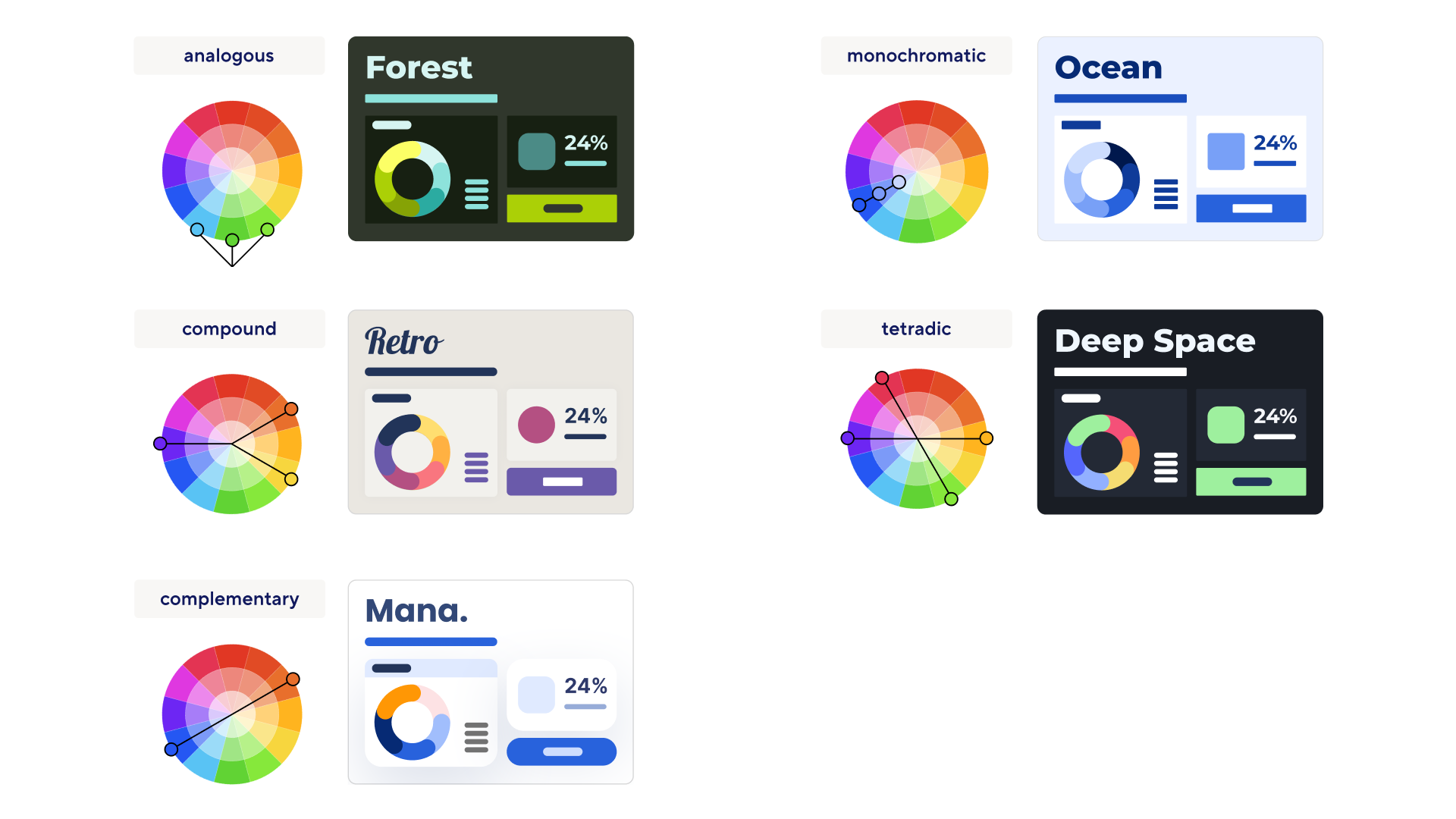
Monochromatic scheme:
The monochromatic color scheme is based on variations of a single hue. It uses different shades, tints, and tones of the same color to create a cohesive and subtle palette. This scheme is often used to achieve a sophisticated look that’s easy on the eye.
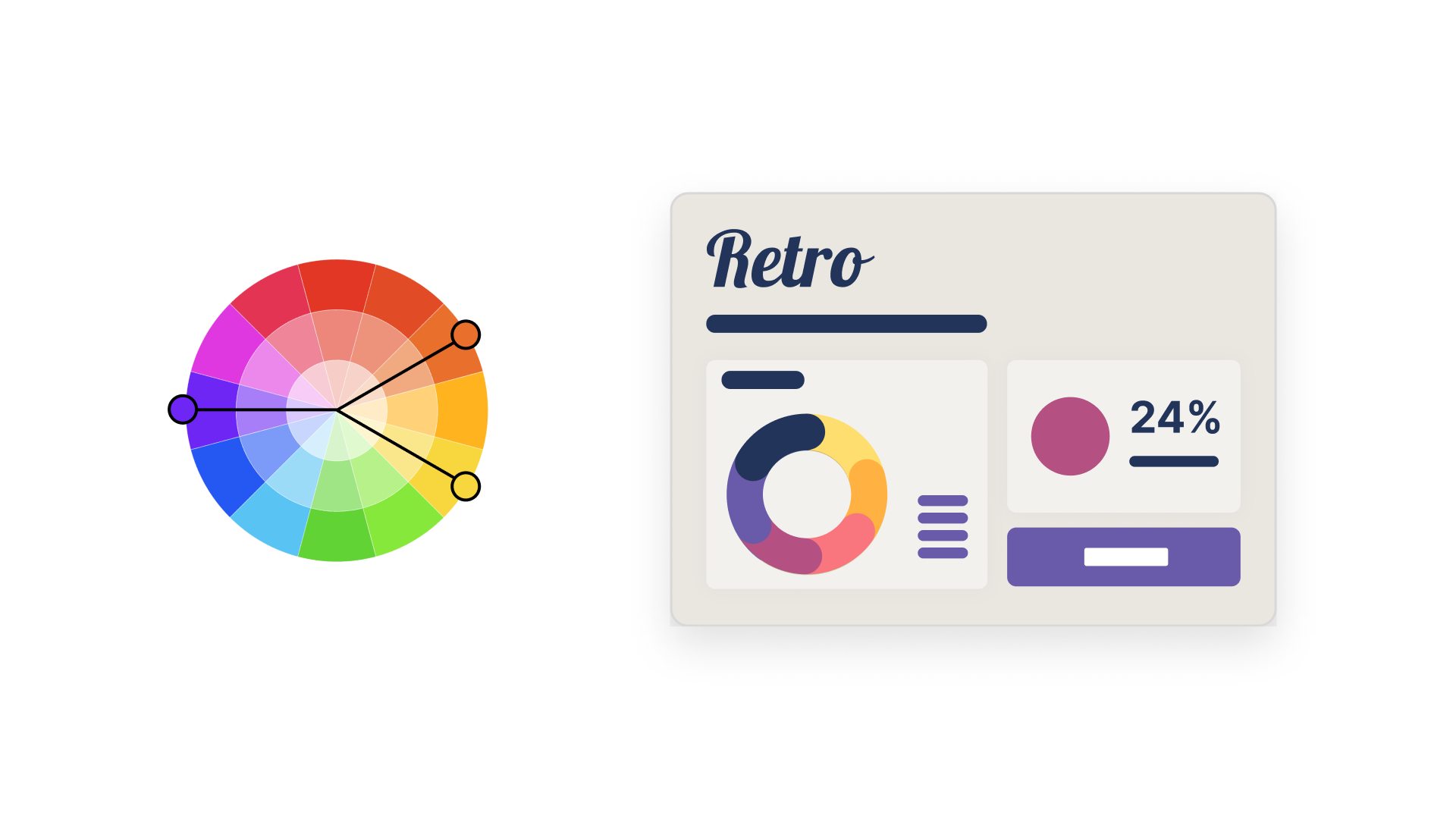
Analogous scheme:
An analogous color scheme incorporates colors that are adjacent to each other on the color wheel. These colors share similar undertones and create a sense of unity. Analogous schemes are commonly used to achieve a harmonious and calming effect.
Complementary scheme:
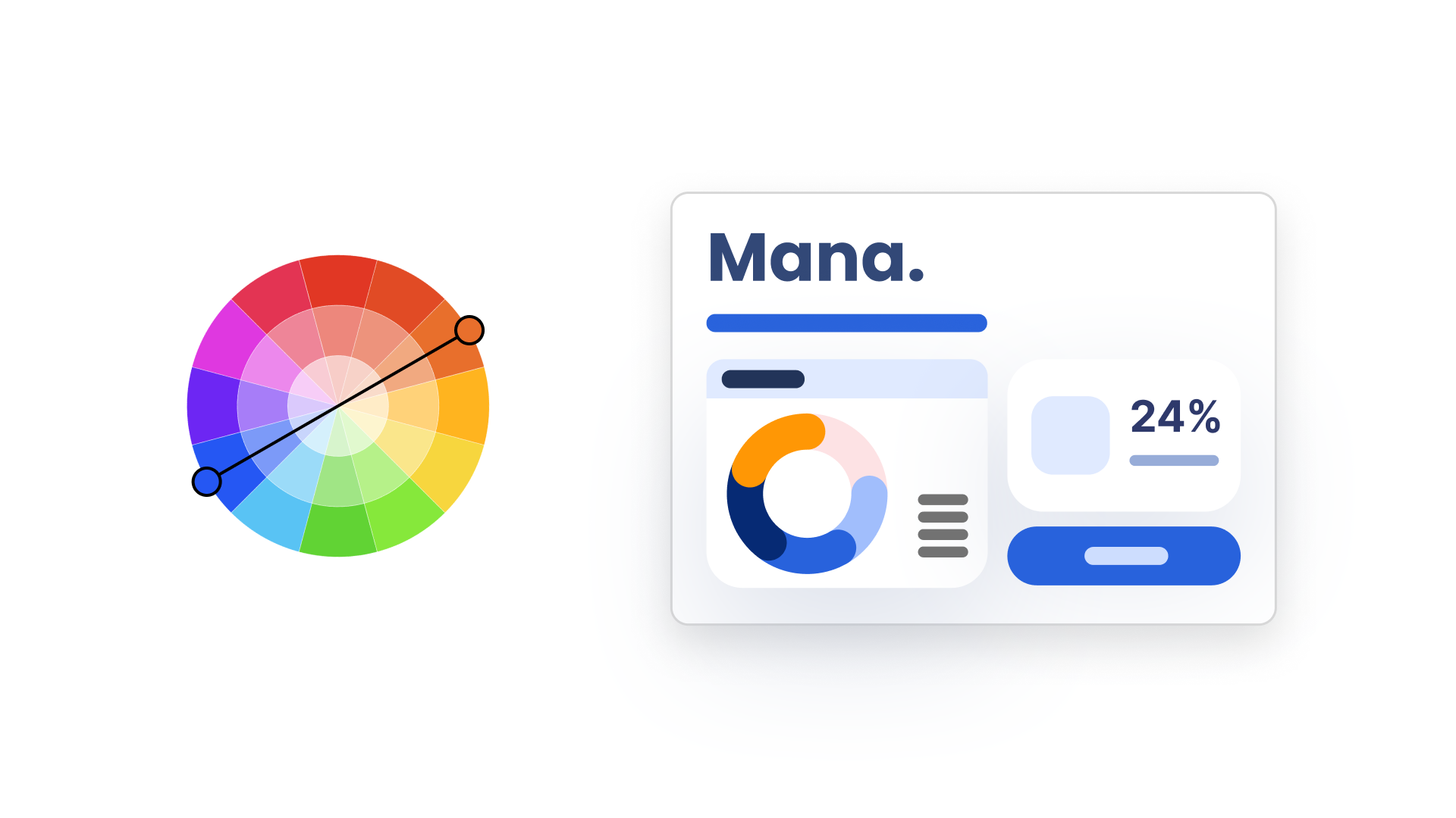
Complementary colors are opposite each other on the color wheel. This scheme creates a high-contrast combination that grabs attention. The colors intensify each other when used together, making them suitable for creating vibrant and energetic designs.
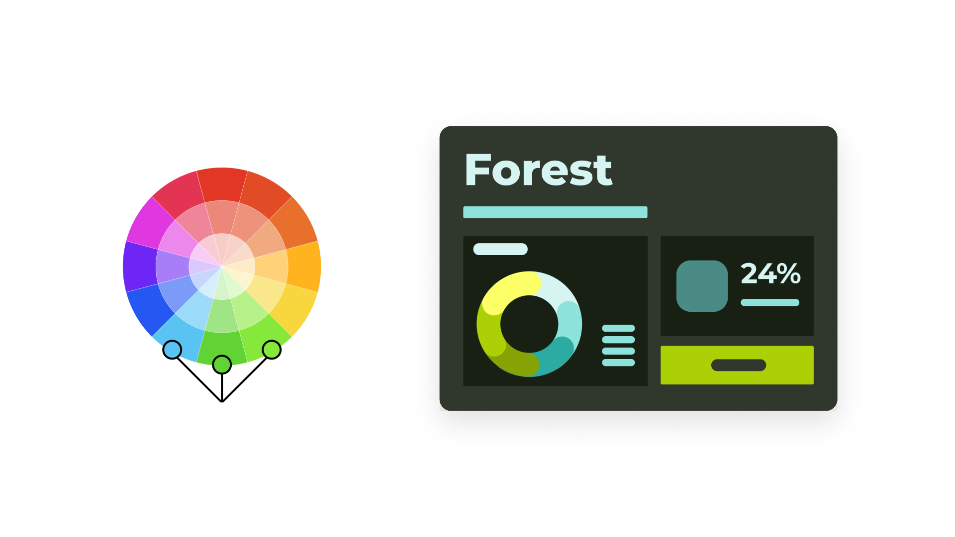
Compound color scheme:
A compound color scheme involves combining two or more colors that are not next to each other on the color wheel. This creates a balanced contrast and offers a wide variety of colors to work with. By selecting colors that form a rectangle or square on the color wheel, designers can achieve visually interesting and proportionate compositions.
Tetradic scheme:
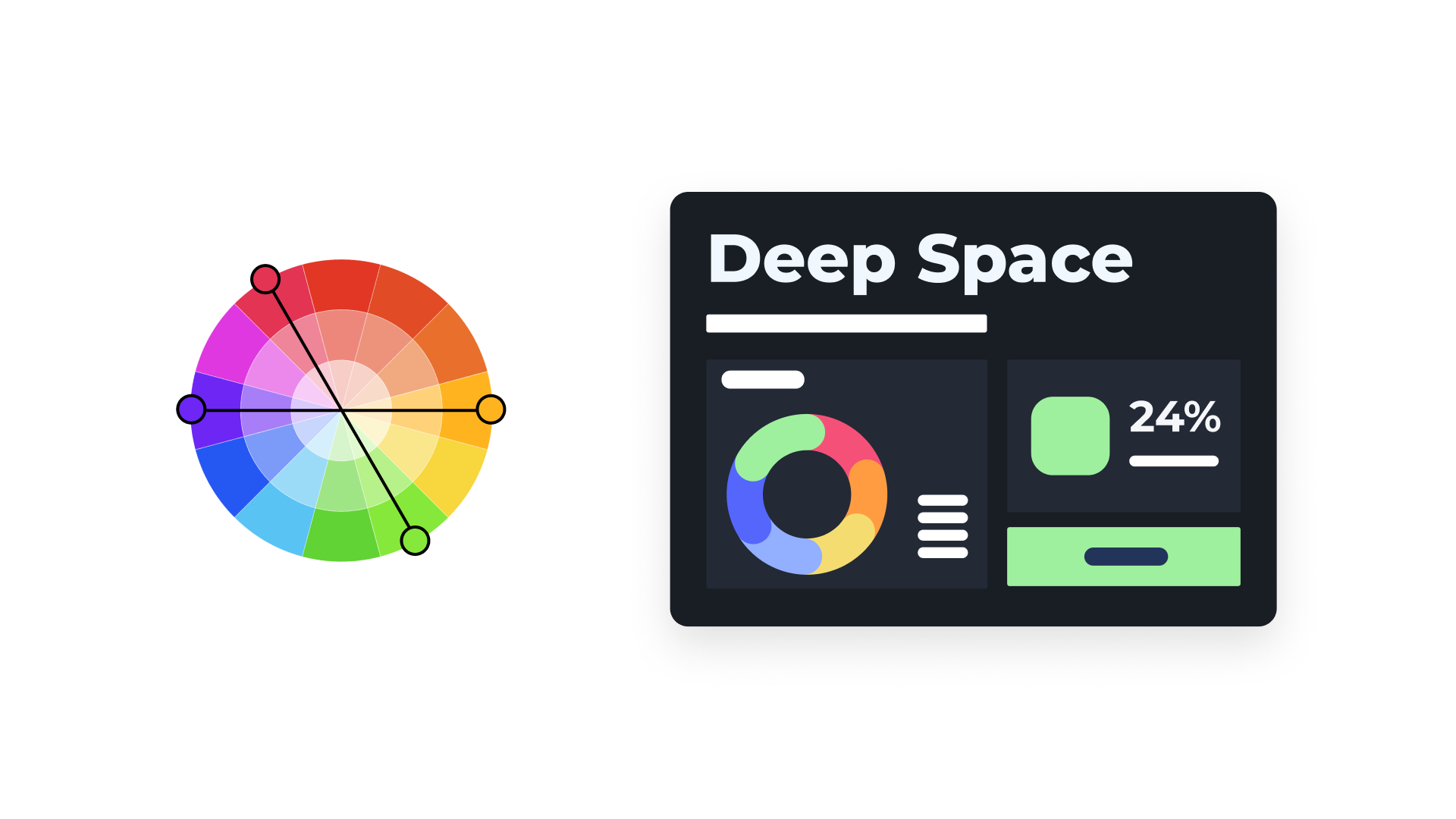
The tetradic color scheme consists of colors that are equidistant from each other on the color wheel. These color combinations are known for their lively and exuberant nature, making designs visually striking.
Design Principles for Stunning, Informative Dashboards
In this section, we will explore a range of design principles specifically focused on color palettes. From achieving color harmony and contrast to establishing color hierarchy and maintaining consistency, these principles will help you effectively select and use colors in your dashboard designs. Whether you are aiming for a harmonious color scheme, emphasizing key data points, or enhancing the overall user experience, understanding these design principles will help you create striking, informative, and engaging dashboards.
Let's take a look at our key principles for building color palettes that enable successful dashboard designs.
Color harmony
When designing a dashboard, it's crucial to think about the visual appeal of the color scheme. The colors you choose should be both visually pleasing and harmonious with one another, creating a balanced and cohesive overall look and feel. This makes for an effective dashboard design.
Functionality
Use colors in the dashboard to improve its functionality. Strategically employ colors to emphasize important information through color hierarchy, visual cues, and feedback. Ensure that the colors in the palette are distinct and easily distinguishable, facilitating effortless navigation and interpretation of the dashboard by your audience.
Readability
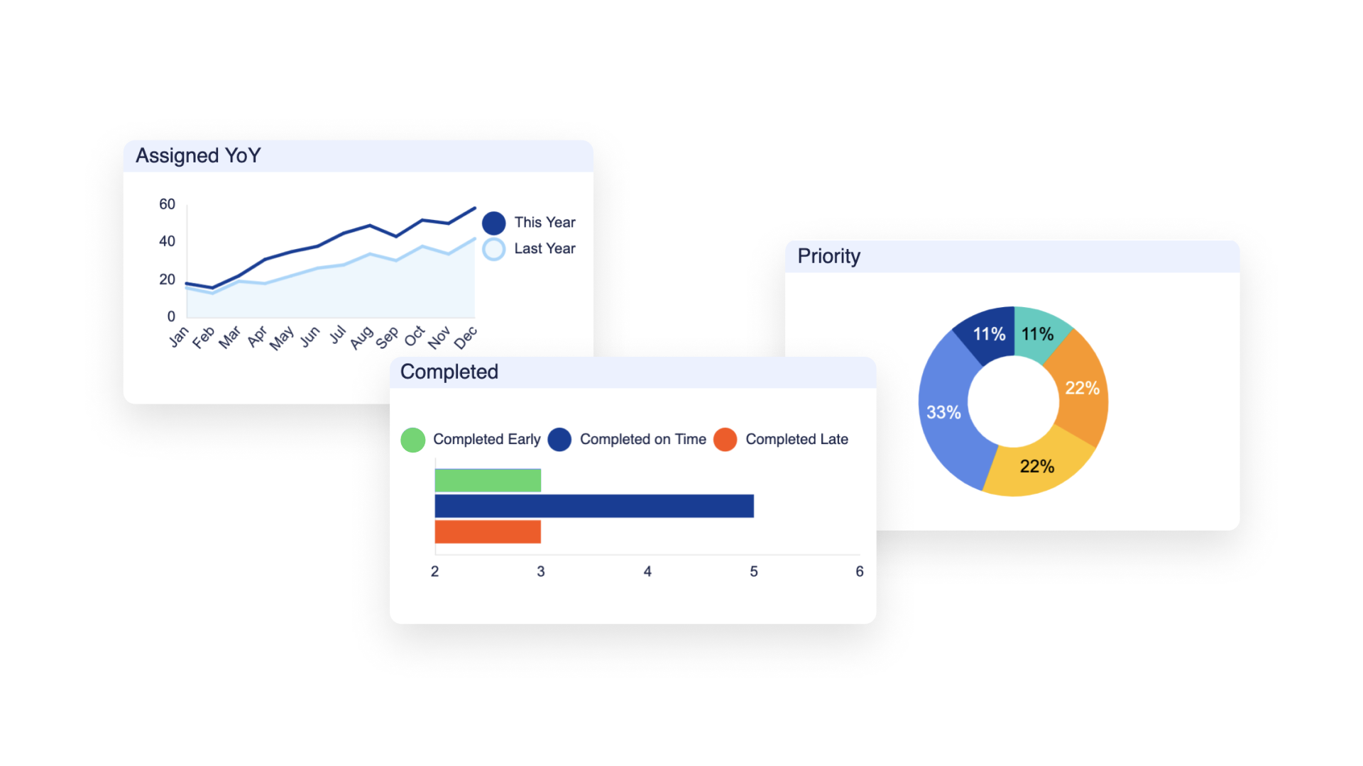
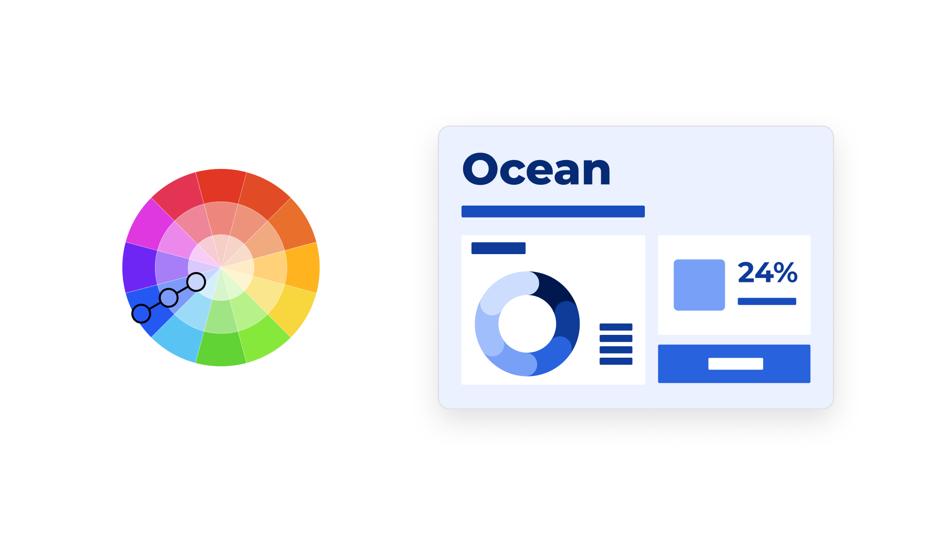
Color themes should help the user efficiently process information. Colors should be leveraged to create visual cues, emphasize data, and guide users' attention to key areas of the dashboard, without overwhelming or distracting from the main content. Colors can also help people identify important information and easily interpret it, especially when it comes to reading charts.
For example, let's say you’re building a chart with financial data. Green is often associated with growth, profit, and positive outcomes in many cultures, especially in the context of finance. On the other hand, red is commonly associated with loss, debt, or negative outcomes. These are what we call “semantic colors” and they quickly enable anyone looking at a chart to easily understand what data is positive and what data is negative.
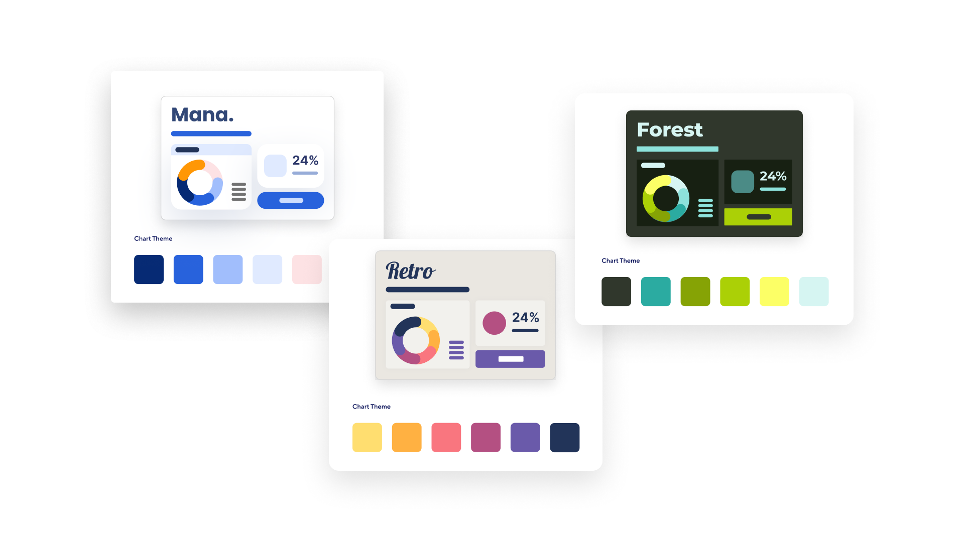
Simplicity through consistency
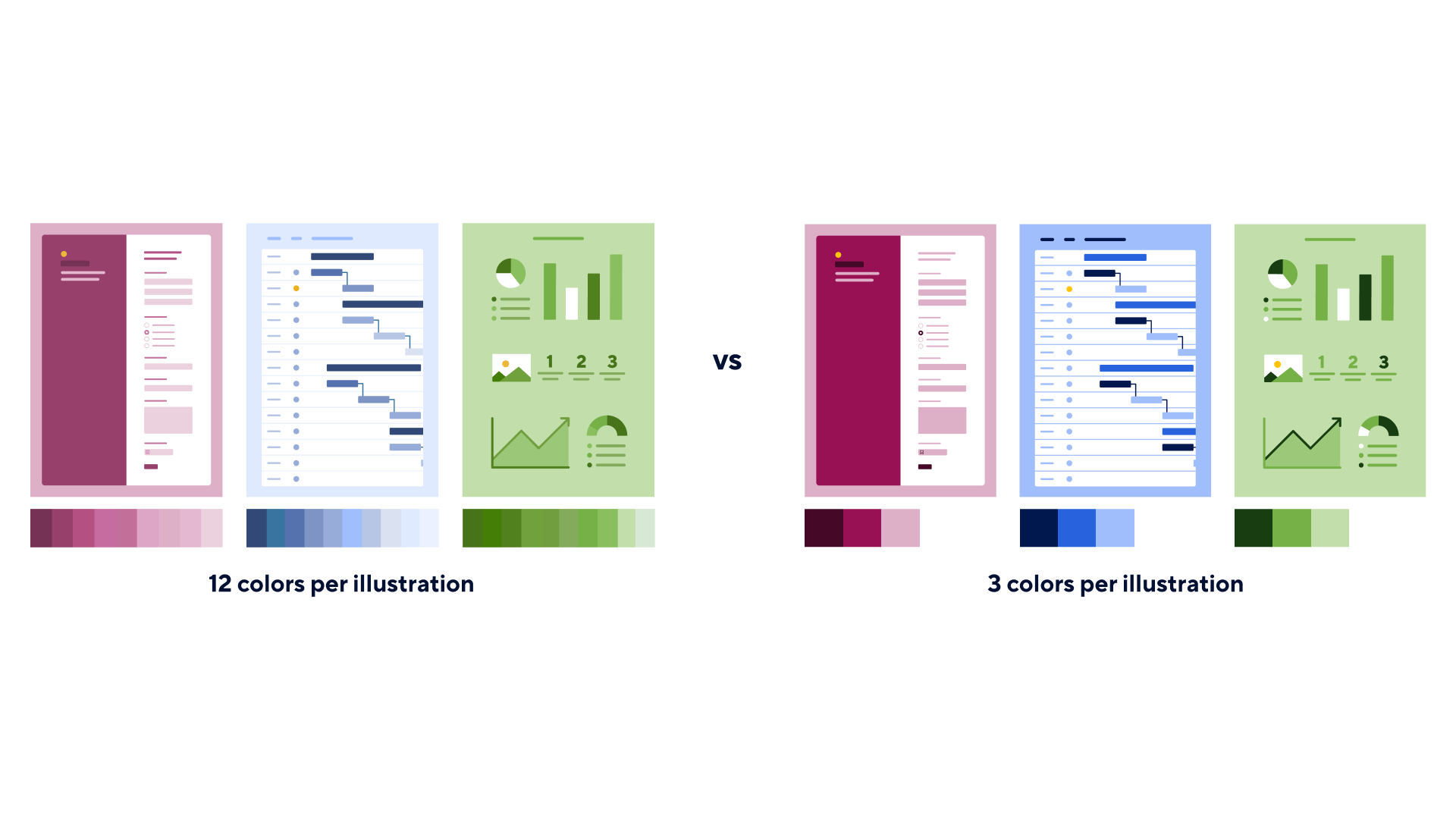
To achieve a clear and visually pleasing dashboard design, it's important to maintain a consistent color scheme. By limiting the number of colors, you can create a sense of unity, and ensure that your dashboard looks clean and well-organized. This simplicity will help the audience navigate through your dashboard easily. Keep in mind that a good dashboard design should be both easy on the eyes and user-friendly.
Accessibility
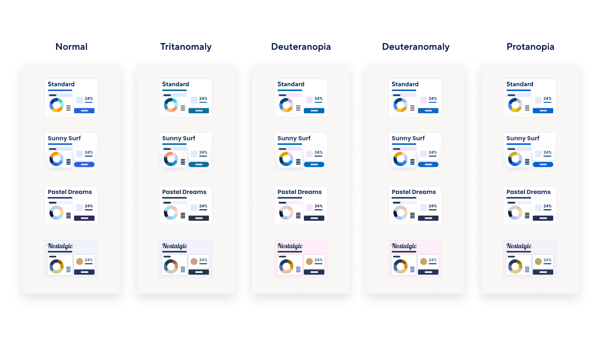
Accessibility should be at the forefront of the dashboard design process. This includes being mindful of color contrast ratios, avoiding over-reliance on color for conveying information, and ensuring the dashboard is usable for everyone, including those with visual impairments or color blindness. By considering these audience aspects, we can create dashboards that are accessible to a diverse range of viewers, fostering inclusivity, empowering everyone to engage with the data effectively, and enabling meaningful experiences for all individuals.
To ensure that the color palette you’ve built is accessible to individuals with color vision deficiencies, you can use tools like Coblis to validate its distinctness and clarity for all users.
And with that, we absolutely encourage you to leverage these principles the next time you want to up-level the look and feel of a dashboard. Stay tuned for our next blog post, where we’ll show you some examples of these principles in action as we’ll be sharing new dashboard color themes designed with these fundamentals in mind.

