Introduction
When you work on a work management platform, like Smartsheet, that is mission critical to so many people on a daily basis, you learn that anything that introduces friction, barriers, or leads to a frustrating customer experience is your enemy. The impacts of the problem may start with an individual user not being able to complete a task, but the work affected by each impacted user can quickly spiral out of control. This can ultimately lead to large-scale loss of productivity and revenue.
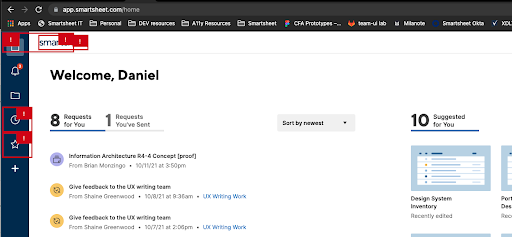
At Smartsheet we have customers across all industries, at organizations large and small our goal for each of our customers is the same. We are working to ensure each and every one of our customers have the same world-class experience with Smartsheet.
The COVID-19 factor
When I joined the UX team at Smartsheet in May of 2020, the lockdown from COVID-19 was just beginning. As companies scrambled to figure out how to maintain employee productivity and morale with a suddenly 100% remote workforce, we were lucky to have Smartsheet adopted and fully functional across the organization. We pressed on with our roadmap, taking care to prioritize projects that would help companies shift towards a more dynamic way of working. Creating a more accessible product was one of our high priority projects. We had to figure out as a team what “a more accessible” product meant for our users and what our plan would be to bring that to life.
Defining our accessibility roadmap
We first needed to update our VPAT, which was out of date. We identified four key issues using tools like WAVE and Accessibility Insights, which can examine a web page and flag accessibility violations automatically. We identified and decided to resolve the following high priority issues before anything else:
- Color contrast: Ensuring that our UI elements have enough contrast to be clearly visible to WCAG 2.0 AA standards
- Alt-text: Ensuring any essential images and visuals have proper descriptions, and non-essential visuals are properly hidden
- ARIA labels: Ensuring all of our UI elements have well-crafted ARIA labels and any needed descriptions to provide proper context
- ARIA tags: Ensuring the appropriate use of additional ARIA tags such as roles were present across the product so that we can better control the user experience
Accessibility Insights Chrome extension flags a wide variety of violations, and includes suggestions on how to fix them.
We selected these four issues as things that we wanted to identify and fix before beginning the formal testing process with an external accessibility testing vendor. We wanted to optimize the impact of testing by removing violations that we knew would come up. We also wanted to address keyboard navigation issues with new design work, including any redesigns of existing features.
Putting accessibility first
While fixing accessibility issues on existing code was an important step, it was reactionary. Treating these issues as code defects pushed engineering teams to prioritize fixing these issues at the expense of planned work. For long-term success, we needed to design for accessibility earlier in the product cycle. In 2020 we were tasked with creating a new design system; a massive redesign to our fundamental UI:This was a perfect time for us to design for an accessible experience from the start. Thanks to our work with a new design system, we were already halfway there.
Accessible components
The new design system was made up of a collection of commonly used components, font styles, colors, and spacing guides. Individual components were designed to:
- Meet color contrast requirements
- Include keyboard focus states amongst other tools
- Give designers the building blocks for creating user experience with consistent visual hierarchy, spacing, alignment, and more.
What we were missing were the tools and guidance to help designers make accessible-first experiences.
Adding to our a11y toolkit
Even before identifying the four key accessibility (a11y) issues we needed to ensure our internal teams were educated on how to avoid a11y issues in the future.
- I created a component library specifically for accessibility annotations. This would enable designers to provide detailed specs to their engineering partners for keyboard navigation, alt-text for visual elements, ARIA labels and other tags.
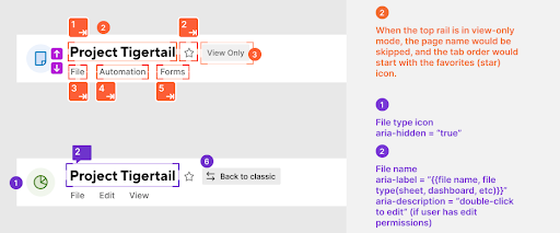
An example portion of a11y specs for our new global top rail component (Design not final).
- We added a section to our presentation for UX designers new to Smartsheet around the a11y spec components and how to use them.
- I gave a presentation walking through the process using a new feature as a case study on thinking through accessibility considerations like aria-roles, tab order, aria-labels and aria-descriptions to provide valuable context for the outcomes of interacting with focus-changing elements.
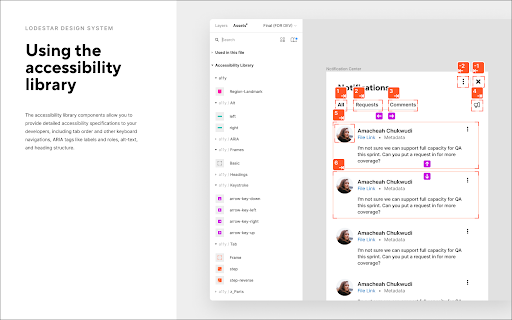
Slide from our presentation on using the Figma Design System.
Digging even deeper
Next, we audited all of our existing components, both those that were designed but not yet implemented as code, and those that were in the progress of implementation, to ensure that no new code releases ship without an accessibility review. We ensured any missing accessibility specifications were included prior to the feature being released. We have also started a similar audit of our existing components which have already shipped.
We’re just getting started
While Smartsheet is in the early stages of our accessibility journey, the efforts we have made to push accessibility consideration to a much earlier part in our product design and development cycle are substantial. We continue to raise awareness of the impact of accessible design across the organization and are committed to making Smartsheet a more accessible and delightful experience for all of our customers.
