What Is a Stacked Bar Chart?
A stacked bar chart is a variant of the bar chart. In this version, data may be displayed as adjacent (horizontal bars) or stacked (vertical bars). Each bar displays a total amount, broken down into sub-amounts.
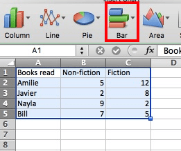
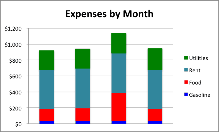
Equivalent subsections are the same color in each bar. This formatting makes it easy to compare both the whole picture and the components of each bar, as seen in the (fabricated) data below.
Stacked bar charts allow users to see changes in a series of data and where they occurred. For example, the increases or decreases of the value of investments in a stock portfolio over time is often represented as a stacked bar chart.
A variation of the stacked bar chart is the 100% stacked bar chart. In this form, each bar is the same height or length, and the sections are shown as percentages of the bar rather than as absolute values.
How to Read a Stacked Bar Chart
In a stacked bar chart, segments of the same color are comparable. With a horizontal variation of the chart, the x-axis (on the left side) shows the stacked variable, and the y-axis (on the bottom) shows the segments. In the column version of a chart, they are switched.
See how Smartsheet can help you be more effective

Watch the demo to see how you can more effectively manage your team, projects, and processes with real-time work management in Smartsheet.
How Do You Make a Stacked Bar Chart in Excel?
The basic steps for stacked charts are the same as for creating other charts in Excel. Basic steps are below. For in-depth instructions on creating charts in Excel, see How to Make Bar Chart in Excel section of How to Make Bar Chart in Excel article.
How to Create a Stacked Bar Chart in Excel
- Highlight the data.
-
Click Chart, then choose your chart type.
Voila, you have your chart:
You have four basic stacked options:
- Stacked bar
- Stacked column
- 100% stacked bar
- 100% stacked column
Each option has 2D and 3D variations. Try them out and choose the one that presents your data in the clearest style.
Below are examples, respectively, of a stacked bar cylinder, a 100% stacked column cone, and a 100% stacked bar 3D, all with the same data.
How to Create a Stacked Bar Chart in Smartsheet
Smartsheet is a real-time work execution platform that empowers teams to plan, track, capture, automate, and report on work all within a familiar, easy-to-use interface. Teams can create stacked bar and stacked column charts that automatically update as underlying data changes.
See a Smartsheet Stacked Bar Chart in Action
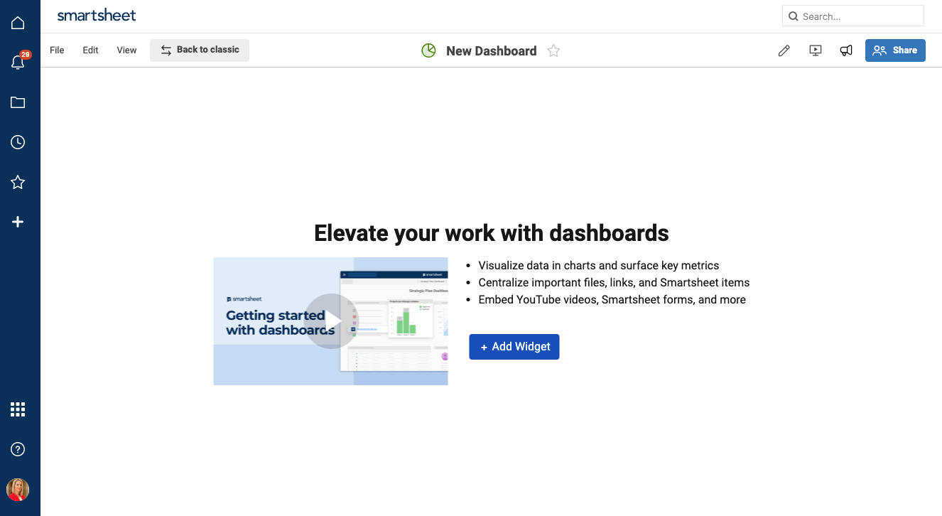
You no longer need to worry about version control or copying your chart into a presentation, Smartsheet charts are live and can be created quickly using Smartsheet data and then stored as widgets on Smartsheet dashboards. (To learn more about Smartsheet dashboards, watch this two-minute video or read this article.) To create a stacked bar chart in Smartsheet:
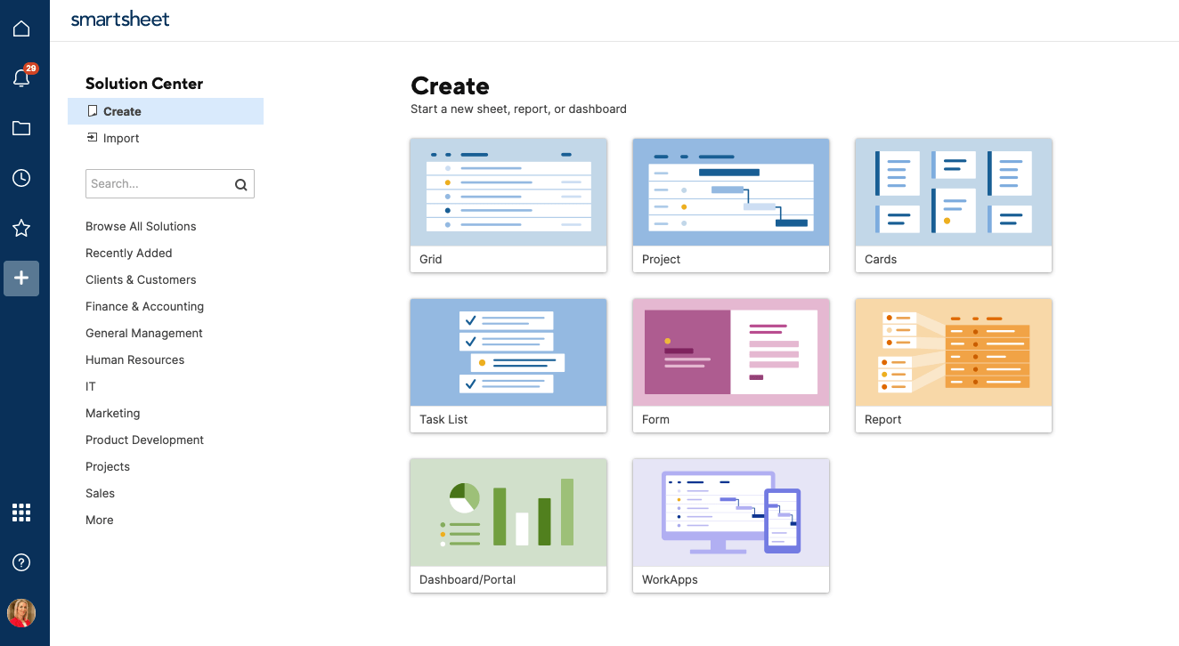
- Open your dashboard or create a new one by clicking the + tab and selecting Dashboard/Portal.
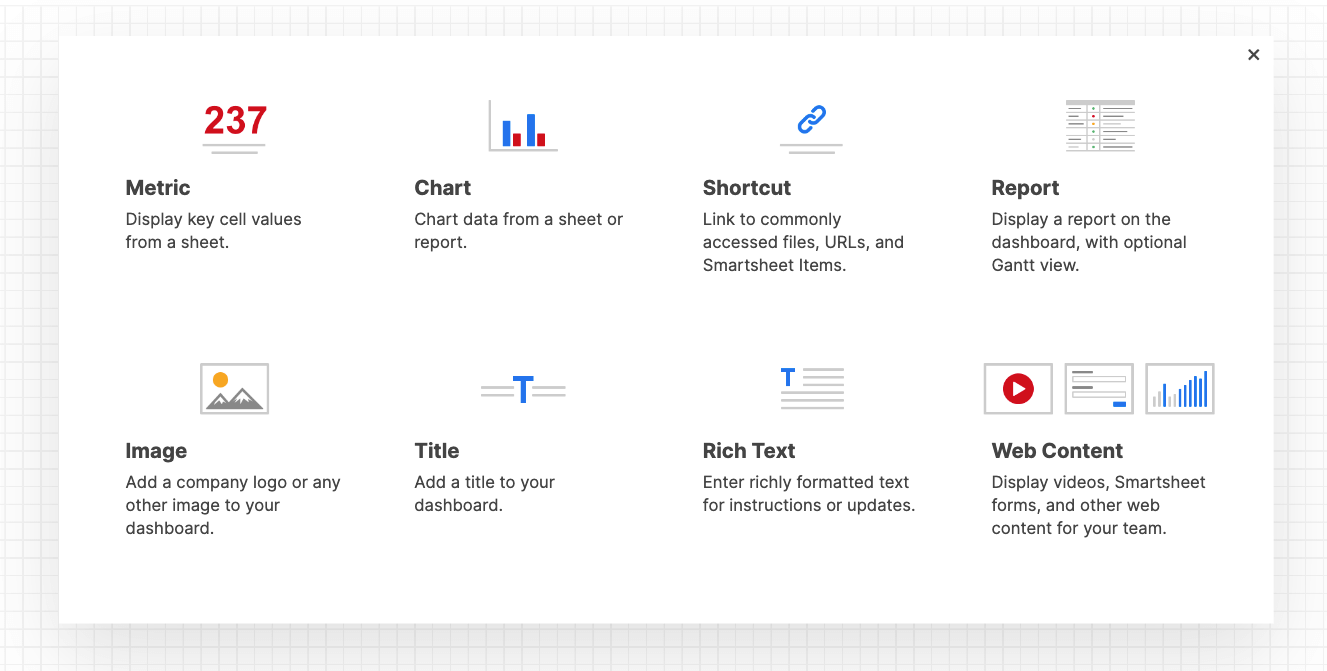
- Next, add your chart widget. Click the Add Widget button at the top of the dashboard. (If you’ve created a new dashboard that contains no widgets, the Add Widget button is immediately available.)
- In the widget selection form, select Chart.
- Before you can select your desired chart, you must first select your data in the Add Chart Data form that appears. Search for the sheet that contains your data.
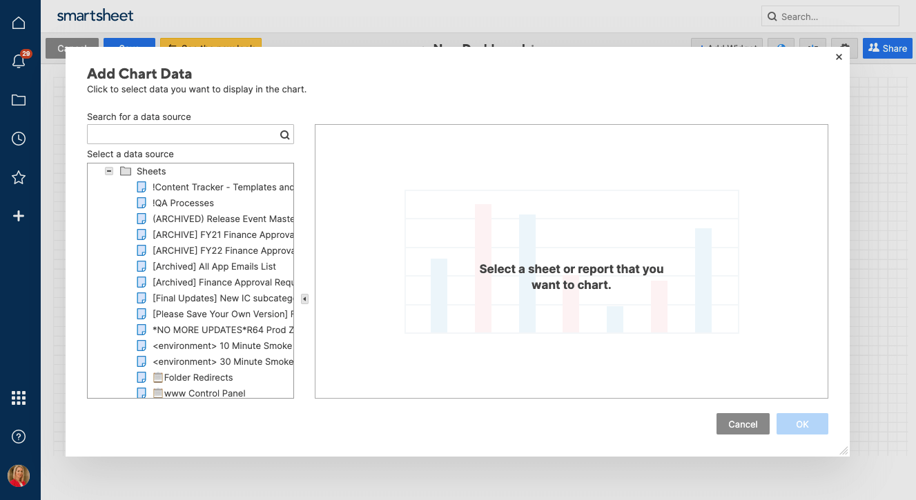
- On the left side of the form, select the sheet that contains the table that you want to chart, then select the range of cells on the right side.
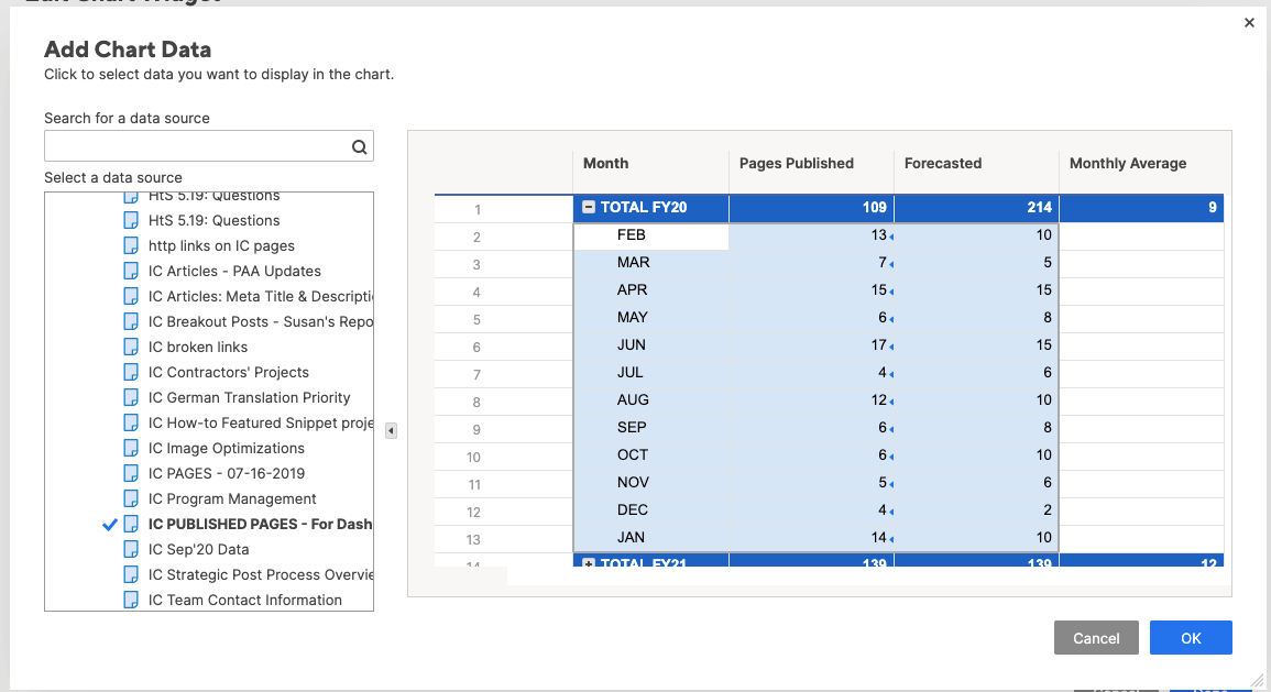
- Once you have your data selected, click OK.
**TIP: If you need to change your data range later, edit the widget and click Edit Data to reselect the data range.
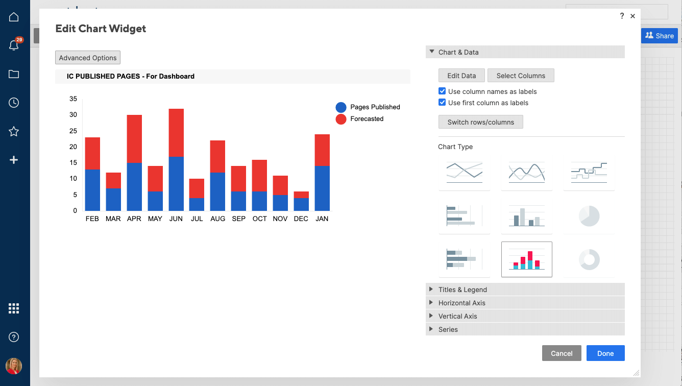
- After selecting your data range, you’ll choose your desired chart type and formatting. Smartsheet will recommend the best chart type for your data; however, you can select a stacked bar or stacked column chart at this time.

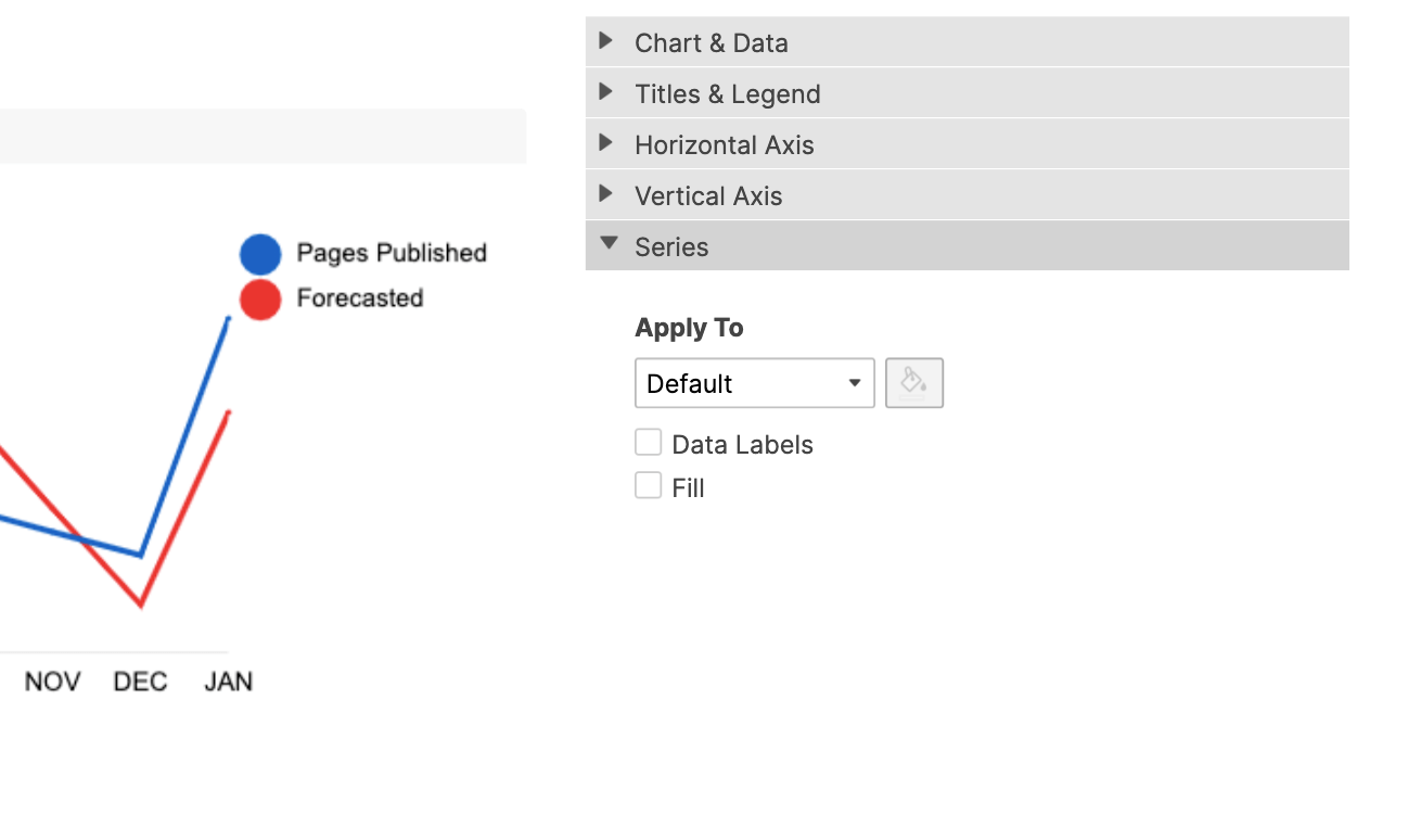
- Customize your chart by adding titles, formatting text, and choosing where or if to display a legend. To change colors or add data labels, click Series, select the data, and choose the color.
- Once you finish formatting your stacked bar chart, simply click the Done button and it will be added to your dashboard.
How to Create a Stacked Column Chart in Smartsheet
To create a stacked column chart, you will follow the steps listed above and simply select the stacked column chart type within the Edit Chart Widget form.
To learn more about how to create and format Smartsheet Charts, check out this one-minute video:

When Should You Use a Stacked Column Chart?
Stacked bar charts (also called stacked column charts) work for many types of data visualization, including nominal comparisons, deviations from the norm, and part-to-whole comparisons. They are ideal for comparing a part of the total to the total.
- Distributions: To show where different items are apportioned.
- Comparisons over Time: To demonstrate how different contributing factors change week to week or month to month.
- Survey Results: To break down responses by demographic groups or other factors.
- Series-Level Changes: To view changes over time in a recurring set of figures, such as in factory production.
- Rankings: To show how a group of results stack up over time, such as the number of deals that salespeople close each month.
When Not to Use Stacked Bar Charts
While stacked bar charts are handy in many situations, they are not perfect for every data visualization. When deployed incorrectly, stacked bar charts can be misleading. Avoid them in the following situations:
- The bars have a lot of segments.
- Readers need to compare each segment to the same segment on other bars.
- The data needs to be compared at a deep level.
Hints for Creating Stacked Bar Charts
After a chart is created, you have many ways to make it easier to read, communicate the presented data, or look better. Here are a few tips to enhance your bar charts:
- Cluster data to create visual links between related information.
- Manipulate the axes to improve readability. You can add or subtract grid lines or change the scale.
- Trend lines can help draw attention to the progression of results.
- Titles can clarify the chart’s message. You can add both a chart title and axis titles.
Instructions for most of these steps can be found here; you can also find steps for clustering data.
When to Avoid Using a Stacked Column Chart
Though the information that can be communicated is similar in the stacked column vs. bar layout, columns make more sense in certain situations:
- If any of the bars have negative values.
- If the number of bars doesn’t go beyond the width of the screen or page.
- If it’s an aesthetic decision by the chart creator.
How Do You Create an Overlapping Bar Chart in Excel?
Overlapping bar charts are a variation of the clustered chart. They are useful for comparing two related values, such as planned versus actual expenses or any target and result. Here’s how to create one in Excel:
- Use the steps above to create a Clustered Bar Chart.
- Click on a bar that you want to appear in front. Right-click and select Format Data Series.
Most versions of Excel: In the Plot Series On area, click Secondary Axis.
Mac Excel 2011: Click on Axis, and click Secondary Axis in the Plot Series On area.
This action will place the bars on top of each other, creating a single overlapping bar instead of two separate stacked bars.
3. Click on the end of a bar that sticks out, and right-click and select Format Data Series.
Most versions of Excel: Change Gap Width to a smaller number (40 percent was used for this example).
Mac Excel 2011: Click on Options and change Gap Width to a smaller number (40 percent was used for this example).
This will make the bar in the back wider, so users can see both.
As you can see in the chart, those cats are blowing through their allotted budget.
How Do You Create a Clustered Stacked Bar Chart in Excel?
A clustered stacked bar chart combines the key features of the stacked bar chart and the clustered bar chart, in order to show related data.
A simple way to do this is to put a blank row between the sets of data. To add space in Excel, select the column of data after where you need the space, right-click, and select Insert.
How to Make a Clustered Stacked Bar Chart in Excel
- Highlight the data you want to cluster.
- Right-click on the highlighted content and click Insert.
A blank column is inserted to the left of the selected column.
If more clustering is desired, starting with the stacked bar chart with the blank row, right-click on a bar and choose Format Data Series.
Most versions of Excel: Click on Series Options and change the Gap Width (this example uses 20 percent).
Mac Excel 2011: Click on Options and change the Gap Width (this example uses 20 percent).
What Is a Stacked Area Chart?
A stacked area chart shows how values change over time for multiple variables. It does so by stacking the lines over a straight baseline at the bottom of the graph, and is meant to display trends rather than tracking values.
Stacked area charts are created like other charts in Excel. First, enter and highlight the data.
Most versions of Excel: Click on Chart. Click Insert, then click Stacked Area.
Mac Excel 2011: Click on Chart, then Stacked Area.
How to Make a Stacked Area Chart in Excel
- Enter the data in a worksheet and highlight the data.
- Click the Insert tab and click Chart. Click Area and click Stacked Area.
Google Music Timeline has an interactive example of an area chart that shows the popularity of different genres of music.
Other Kinds of Charts and When to Use Them
There are many types of charts, each with their own set of strengths and weaknesses. And new chart types are always being developed. Here are a few popular options and when you might want to use them.
Sparkline is a feature in some versions of Excel that allows a small chart to be displayed in a spreadsheet row. It’s valuable for isolating a trend from a large set of data.
Most versions of Excel: Select the data, click the Insert tab, then choose Line, Column, or Win/Loss, and select where you want the sparkline to appear on your spreadsheet. The sparkline will fit into the cell.
Mac Excel 2011: Select the data, click Chart, then under Insert Sparklines, choose the Line, Column, or Win/Loss, and select where you want the sparkline to appear by clicking in a cell.
Line graphs are a standard option in Excel, and they’re easy to create. They’re generally used to compare two data points. Line graphs sometimes include multiple bands, which allows comparison of the same or related data (e.g., rainfall versus reservoir water level) over different time periods.
Dual-axis charts combine two related sets of data to demonstrate their connection. Dual-axis charts will often have two ways of showing data, such as a line and bars. They can also be called a secondary axis chart or a combined chart.
After creating a chart, take the following steps:
Most versions of Excel: Click in the chart to select it. Click Design and click Change Chart Type. From the All Charts tab, click Combo, and choose the option you want (e.g., Clustered Column-Line).
Mac Excel 2011: In this version of Excel, showing data in two different ways is not available, but you can add a second axis. The bars in a bar chart will end up overlapping, so use another format, such as a line graph. Select the data series to plot on the second axis, then click the Chart Layout sub-tab that appears after the chart is selected.
On the left side of the ribbon, find the Current Selection box, click Format Selection, then highlight Axis and click Secondary Axis. Click the OK button.
To clarify which data goes with each axis, add axis titles.
A reminder: Just because trends seem to have a relationship, they may not. The old saying “correlation does not imply causation” is an important caveat. You could plot the prevalence of ice cream consumption and sunburns; even though they both go up in hot weather, one does not cause the other.
Split-axis bar graphs have an axis in the middle rather than on the side or the bottom, and they’re handy for showing data that have negative values. Excel automatically places an axis in the middle of the chart if the data selected has a negative value.
Make Better Decisions with a Real-Time Stacked Bar Chart in Smartsheet
Empower your people to go above and beyond with a flexible platform designed to match the needs of your team — and adapt as those needs change.
The Smartsheet platform makes it easy to plan, capture, manage, and report on work from anywhere, helping your team be more effective and get more done. Report on key metrics and get real-time visibility into work as it happens with roll-up reports, dashboards, and automated workflows built to keep your team connected and informed.
When teams have clarity into the work getting done, there’s no telling how much more they can accomplish in the same amount of time. Try Smartsheet for free, today.