What Is User Onboarding?
User onboarding is the method of teaching adopters to use your service or product. Done correctly, user onboarding should make it as easy as possible for a person to understand and reap value from your service or product, and become successful users. When well-designed, user onboarding bakes customer retention into your business, and ensures that customers understand how the product works and why it’s worth your asking price.

Ashley Karr is UX Principal at Smartsheet. She’s a human factors engineer and anthropologist focused on human computer interaction (HCI) and user experience (UX) research and design, with a B.A. in Anthropology from UCLA and M.S. in Human Factors and Systems Engineering from Embry-Riddle Aeronautical University. Karr taught and designed instructional material for User Experience Design Immersive courses with General Assembly. Her writing has been published in a number of journals, magazines, and books, including a behavioral psychology textbook for Oxford University Press. To learn more about her design philosophy, listen to her interview on User Defenders.
“Onboarding is getting new users acclimated to your application. It’s also about understanding who the user is and being able to satisfy those desires, no matter how idiosyncratic,” Karr explains.

Andy Cargile is Senior Director of User Experience for SMART Technologies. He and his team are responsible for the user experience across their hardware and software education products, which are used by millions of teachers and students worldwide. For over 30 years, he has led UX teams in startups, consultancies, large corporations, and higher education, creating products that solve meaningful needs and make a difference. Cargile has led future research and strategy for aviation at Teague and led the Hardware Design group at Microsoft for nine years where he built a thriving business based on user experiences. Andy has an MDes in Human-centered Communication from the Institute of Design at IIT, and an M.S. and B.S. in Biology from Stanford University.
Cargile adds that onboarding isn’t just for new users- it can also be applied to existing users who need to understand a new interface or feature. “The end-to-end experience a user has with a product is from first contact to end of life,” he says.
Before beginning the user onboarding process, you’ll need to understand what type of environment you’re developing for, and what flows you are targeting in your development process.
Why Onboarding Users Is Important
Providing a positive user onboarding experience can be one of the most important make-or-break projects for your organization, but it’s also one of the most significant challenges (after creating the offering itself). Before a customer can make any purchase or take any real action, you have to make sure your users stay engaged.
Most Users...Leave. “The hard reality is that 40 to 60 percent of new users will use your product once, and never return,” says Karr. “But if you can manufacture desire, users will form a habit and keep coming back. You need to find the sweet spot where they’re reached emotionally, and locate the messaging underneath that. It’s the most intense form of engagement. Companies that form strong user habits are the ones that win in this era of the web.” The idea of manufacturing desire is covered extensively in the book, Hooked by Nir Eyal.
Don’t Leave Potential Profits on the Table. The goal of UX in onboarding is higher retention, higher profits, more word-of-mouth support, and customer satisfaction. “Don’t get overly involved in selling and being too aggressive at the onboarding stage. It’s more important to create something contagious and understand how to finesse the experience,” explains Karr.
Big Picture UX Onboarding Considerations: Research, Environments, Flows
If you don’t know your users or their habits, you’re setting yourself up for failure. In addition to your potential buyers, you need to think about the environment where you’re delivering the experience, and what you want to emphasize in your onboarding presentation flow.
Who Is Your User?
Before you design a user onboarding experience, you need to know who will be using it. You may already have some of this information from your product development and marketing teams.
- Get Personal: Start by compiling demographic and psychographic (information about why they buy) data about your users. Demographics are easy to find, but psychographics require you to dig deeper. Based on both data sets, develop customer personas to align your strategy and goals to the user groups you need to reach to be successful.
- Map the User Journey: According to the Harvard Business Review, “Across industries, performance on journeys is 30 percent to 40 percent more strongly correlated with customer satisfaction than performance on touchpoints is—and 20 percent to 30 percent more strongly correlated with business outcomes, such as high revenue, repeat purchase, low customer churn, and positive word of mouth.” Nowhere is that truer than in creating a top user onboarding experience. If you’re not familiar with creating a customer journey map, check out this guide from UX designer Megan Grocki.
UX Onboarding Environments: Desktop and Mobile
In the not-so-distant past, mobile was secondary to desktop for communicating with prospects and customers. Today mobile continues its rise: A 2017 study by eMarketer projects that “The average adult in the U.S. will spend two hours and 25 minutes per day using mobile apps, a jump of 10.3 percent over 2016.” Additionally, the number of unique apps launched by individual users in 2017 per user is 20.7, and the number of apps used is on the decline. That makes it important that your users stick around and return to your product.
Don’t Count Desktop Out: Even with mobile’s assent, desktops still matter - a lot. According to research by Stone Temple Consulting, customer conversions still happen in the desktop environment, and depending on your industry, they may skew that way. For example, in some industries, like travel, gaming, and finance, desktop devices count for more than 50 percent of visits.
Engagement Levels Differ: By definition, mobile users do things on the go, and are often working in distraction-filled environments. The difference in bounce rates is much higher in mobile for most industries, with the bounce rate for financial industries accounting for more than double those of desktop.
Design Implications: Your users are likely going to experience your product on both desktop and mobile platforms. Prioritizing mobile design automatically leads to a better user experience because all unnecessary and irrelevant content is left out of the experience. One good mobile practice is to help the user internalize the value of your offering before asking them to sign up or register, which may encourage them to complete the signup process.
Sam Hulick is a user onboarding author and guru. He writes, “My thought on mobile vs. web has always been akin to poetry vs. prose. It has to be a really compressed, elegant experience… Ideally the web experience can be held to the same high regard, but it seems like there’s a little more room for error.”
Core UX Onboarding Experience Flows
What kind of core experience do you want users to have when they land on your site or app? The answer depends on how much information a user needs to understand the value of your offering and to determine if your core value is unique.
Here are the top four ways to direct experience flows:
- Core Benefits: Focus on the top two to three advantages and how using the product, app, or site helps achieve those benefits.
- Core Functionality: Explain the two to three core functions of the product, app, or site and how to use them.
- Core Actions: Guide the user through the first or most common actions.
- Core Profile: Guide the user through the profile/account creation process, including finding and adding friends or interests (if appropriate).
For a more complex product, app, or site, you may combine all four. Whatever you do, make it easy.
The User Onboarding Experience Design Process
You can organize the pre-design phase by asking relevant questions to create a positive experience. The goal is to avoid friction: interactions that inhibit users from painlessly and intuitively achieving their goals within the onboarding experience. Why? Friction frustrates would-be customers, causes bouncing, and lowers the number of conversions.
Download Checklist: Questions to Ask Before You Begin the User Onboarding Design Process
The 3 Stages of Onboarding
Every onboarding process should be unique, but there is a general three stage framework that can hold many variations within it:
- Pre-Registration: The planning phase (see the above checklist) and everything that happens before the sign-up/action.
- Active Onboarding: The goal is for the user to understand the work- or life-changing benefits of what your offer. The general framework (again, it depends on what you know about your user and the nature of your product or service) will use one of these three methods, or slight variations, for first-timers:
- Guided Tour: A three to five step ‘how to’ experience that showcases the main benefits and/or features.
- Setup Wizard: A sequence of dialog boxes to help with more complex information needed for sign up.
- Just Do It: Some onboarding sites start the user in the experience immediately.
- Post Onboarding. You want to follow up with your users to encourage them to purchase. Once they do buy, follow up to make sure that they become power users and understand new features. This can be a welcome email or live help chats. Like onboarding itself, you’ll want to reach back to customers based on what you’re selling, what works for your users, and what actually works in context.
Best Practices and Tips for Better User Onboarding Design
“Design must be user-centered, and the formula - but not necessarily the execution - is simple: Understand → Create → Iterate,” explains Cargile, who also mentions the need to test early. “Whether it’s UX in general, or user onboarding experiences, I think that often even we in the UX discipline are too hesitant to test some more raw or early concepts, paper prototypes, etc. and wait too long until they are pretty or until they get coded. You want to minimize any coding or visual production that is done and then changed based on learnings from users that you could have gotten earlier.”
“Once you lose a customer, it’s much harder to get them back,” says Karr. “So naturally, you need to do everything that you can up front to keep users enthusiastic and engaged in what you’re selling.” She has some other best practices and tips to share:
Best Practices and Tips from Ashley Karr
- Usability Testing: Test with humans. You can test with colleagues, but ‘real’ users are best. It’s harder to change once a design is in place, so it’s best to test early and test often, and definitely build checks into timelines.
- Understand Theoretical Models of Adoption of Technology: Mental and conceptual models are fundamental to effective UX in general, and to onboarding in particular. To guarantee a more intuitive user experience, ensure that the conceptual model of your product, as well as the UI, is a match for the mental models of your users.
- Provide Users with Control and Freedom: Providing users with some choice will encourage them to engage more deeply with content.
- Pay More Attention to Psychographics than Demographics: You must know your user. That’s the bottom line.
- Create a User Journey Map: It’s worth repeating that this is an essential tool for delivering a best-in-class user onboarding experiences.
- Have the Right Metrics in Place — and Pay Attention: Metrics are critical. What you’re measuring must have meaning, and you need to use those metrics to learn what’s right, what’s wrong, and be willing to adapt and iterate.
Insights to Metrics and More Tricks and Tools of the UX Onboarding Experience Trade
Good UX demands that qualitative measures are in place. How do you develop them? Google uses the HEART framework, which was developed in 2010. While the framework was developed for large scale projects, you can still apply the principles to smaller projects, although data collection methods will likely be different.
- Happiness: Understand user attitudes. Query surveys of ease of use, satisfaction, or other measurements.
- Engagement: Check the intensity, depth, or frequency of user involvement over a set time period.
- Adoption: The number of new users or those who are using a new feature.
- Retention: Churn or user turnover.
- Task Success: Measure behavioral metrics like time to completion (efficiency), percent of tasks completed (effectiveness), and error rates.
Four ‘Tricks’ of UX for User Motivation. To keep your user engaged, you can take advantage of some design elements.
- Hot Spots: Users get the help they need in a non-intrusive fashion. You can style hot spots at different levels of intensity to suit the content.
- Progress Bars: Showing how far along the user is in filling out a form may be the incentive they need to keep going.
- Welcome Messages: Add a bit of warm human contact. Design ‘hi’s to contrast with the ‘business’ portion of the page.
- Social Login: You can’t get faster than one-click sign up.
Take Advantage of Tools. You can find over 100 tools of the UX trade for prototyping, usability testing, live chat apps, mobile app testing, user surveys, and more at UXMastery List of UX Tools.
The Importance of Ethics in User Experience Design
Often overlooked, Karr thinks ethics are an important design consideration and key to building customer loyalty over time. “You can use human psychology triggers to shape human — meaning buyer — behavior, and I think it is important to be careful about separating people from their money using trickery. In UX, they are called dark patterns, and it is possible to to use deceptive behavior in interface design. If you push too hard, you can break consumer rights laws. Every business can be sued. But it’s not that — you do need to be known for doing the right thing.”
10 User Onboarding Experiences to Learn From
Here are some UX onboarding critiques by Karr that show both the good and not-so-good experiences from companies in widely varying fields.
10K' Insights
10K’ Insights is a web-based project space for collaboration and design thinking that enables content ideas, inspiration, notes, and other items that you share as objects and move in a Lego-like fashion.
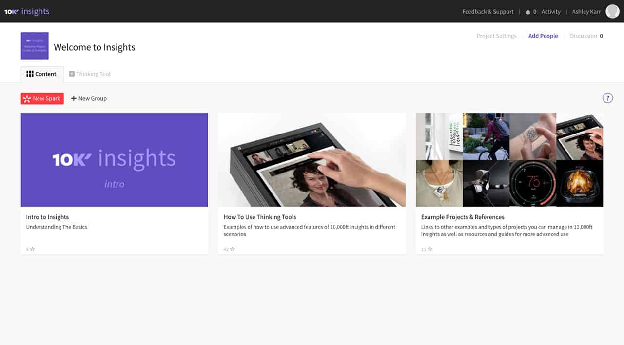
- 10K’ populates the main content area with example projects and files. This is an interesting way to support Show Mes and Let Mes with the same design elements. Let Mes can engage users by opening and interacting with files and projects, while the Show Mes can teach users about the app via the content within the sample files and projects.
- There is a strong New Spark call to action (CTA) in the top left. Users presumably don’t know yet the value of a Spark, but they can find out by engaging with the sample content or just seeing what happens when they click the red button.
- The 10K’ Insights Intro presumably has useful and compelling information to help new users onboard themselves. I would suggest actually taking the top few most important items in this intro document and exposing them somehow on the landing page, making them more apparent and actionable for users.
Gild
Gild is a talent acquisition and hiring process tool that uses data science, technology and predictive analytics to find, engage and hire the right talent.
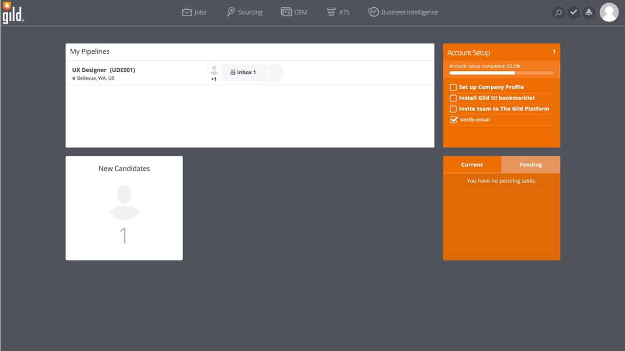
- Gild’s Account Setup section in the top right plays into the user’s penchant for seeing their progress via a progress bar and set completion via a list where they can check off and cross out items.
- If the steps within the list truly helps users (from their perspective) learn about and engage with the app, then these can be quite impactful onboarding tools.
- Despite the presence of this nice Account Setup section, there are no strong CTAs on this page. The user is left not knowing where to begin. Gild could help users by indicating clear CTAs, similar to the InVision example below.
Gmail
Google’s advertising-supported free email service for mobile apps and web.

- Like Gild’s Account Setup section, Gmail’s Setup section plays into the user’s penchant for seeing their status via a progress circle and set completion via checked items in a grid layout.
- There is a strong CTA, Compose, in a red button on the top left. This means that users know how to engage, as well as having the ability to engage without removing the Setup section. Conversely, users can engage with the Setup section without losing the context of the app and the main CTA.
- There are only six items in the list. The number of items that users ought to interact with during onboarding should be kept to a minimum to prevent the feeling of being overwhelmed.
- Users can close the Setup section at any time with the X on the top right. When closed, a message appears telling users they can recall this section within the Settings window.
Harney & Sons
A purveyor of custom blended teas, accessories, and food items.
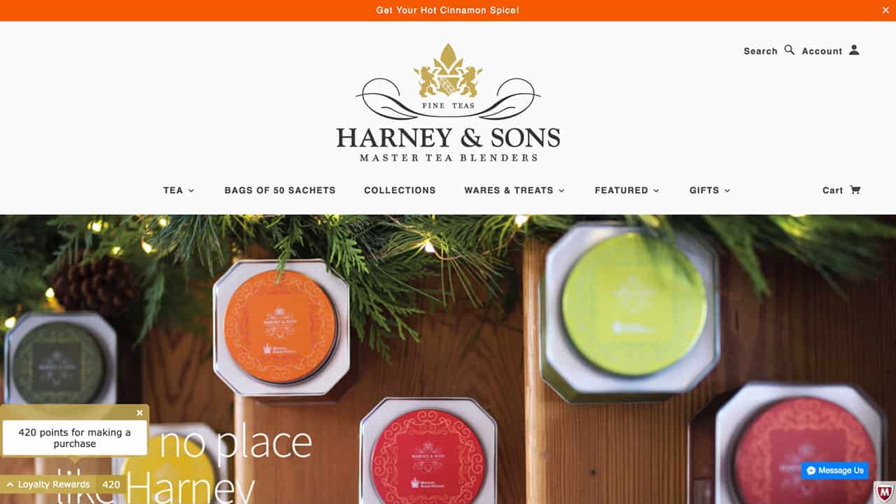
- We can expect customers on a high-end tea purveyor’s site to care about manners. The Loyalty Rewards messages and affordances play into that value by being polite. By designing according to user values, you increase the likelihood that users will engage.
- The messages are noticeable, but not obtrusive.
- They are informative and specific, not pushy.
- A user can close the message if they like (the X in the top right).
- The up arrow to the left of Loyalty Rewards suggests that something more will appear upon clicking. The user is not forced into this experience, so they maintain control. The user can continue with their tea purchase, close the messages, or click to see more.
A prototyping, collaboration, and workflow app.
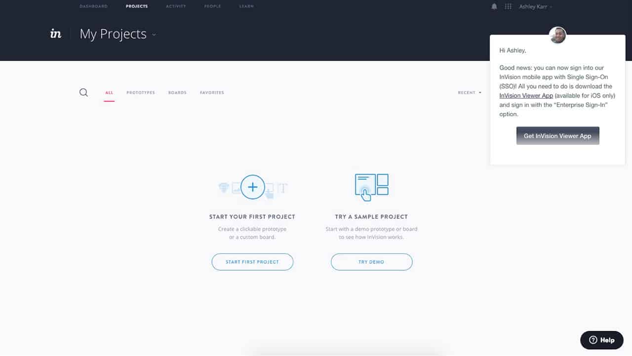
- In the main content area, InVision clearly indicates to users how they can best begin engaging with the app via strong CTAs - Start First Project or Try Demo. These two CTAs support two common yet opposing psychographics for new users: one is a user who wants to learn by doing (Let Mes), the other is a user who wants to learn by being shown an example (Show Mes). There is no way to predict which type any given user prefers, so having the design support both types of users hedges your bets.
- The message in the top right gives a personal touch and politely informs the user of some type of peripheral action that could help them in the near future. However, it does not get in the way of the user starting a project, and the user can dismiss this message at any time.
- The Help option in the bottom right is apparent, but unobtrusive. If a user does decide they need more help, they can click on the Help button for additional support and the support will be contextually relevant to what the user has been doing leading up to entering the Help section.
MS Office
A suite of applications, services, and servers.
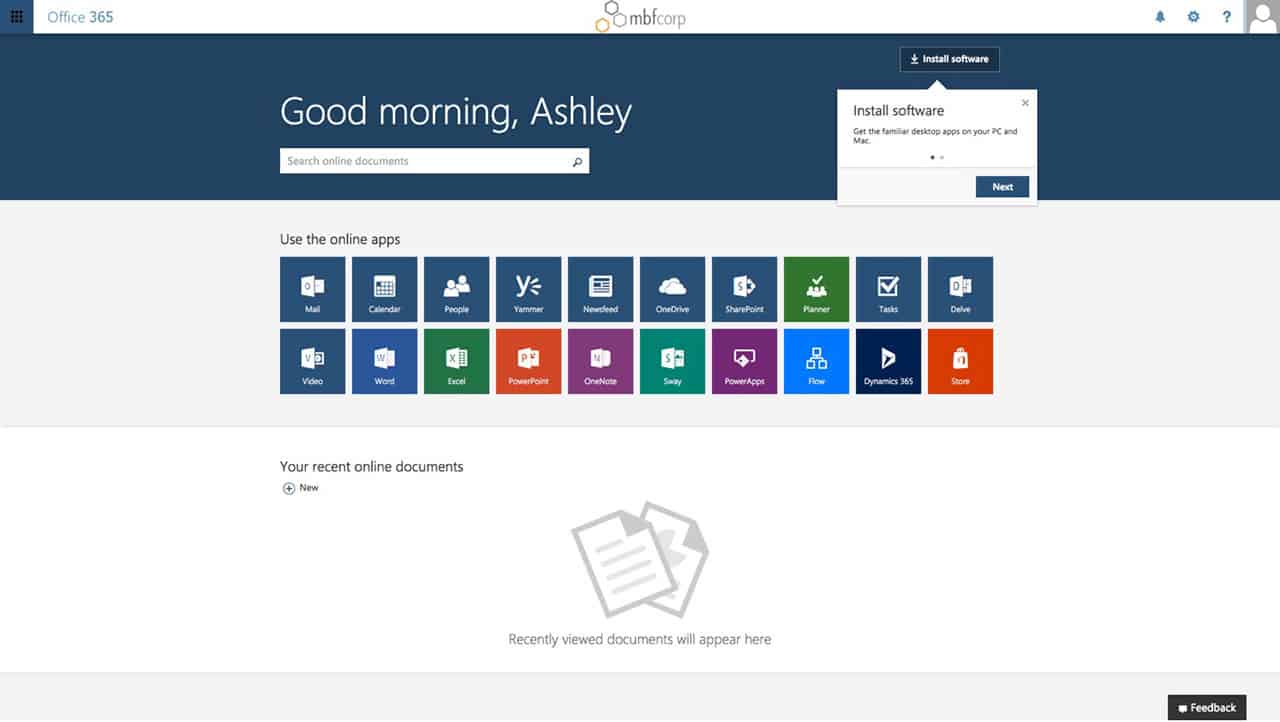
- MS Office is suggesting too many things all at once for a new user: install software, go to the next tip, search, use one of 10 online apps, create a new document online, and give feedback. Additionally, the kind of document you can create is unclear - there are 10 apps above this tiny CTA.
- Microsoft should make it more apparent which of these 15 actions is the most important for a new user.
- Where is the support for the Show Mes? The design is only supporting Let Mes. How can the Show Mes get some type of help or framework to follow when beginning to use the suite of apps?
Pandora
A free, streaming radio service with automated music recommendations.
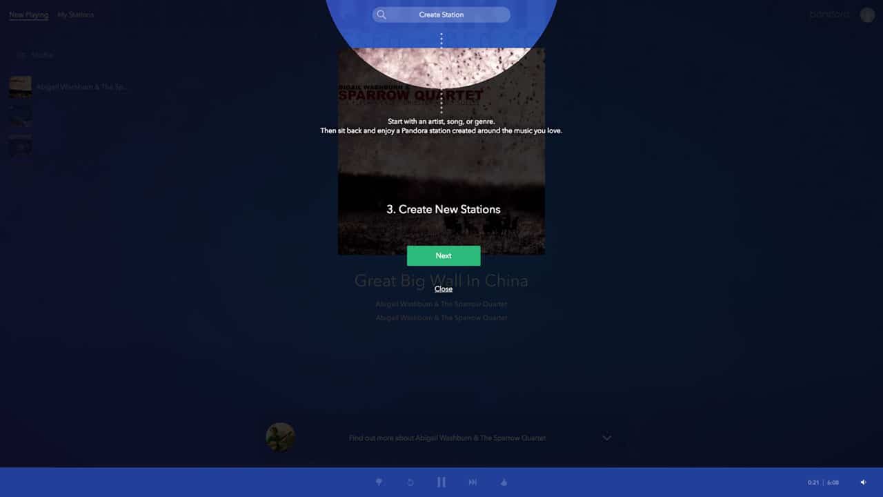
- Not all users like walkthroughs - especially when they are forced into them. However, many users do appreciate walkthroughs when they are in control of whether or not they engage. This means opt-in walkthroughs are worth designing, and Pandora does a wonderful job showing a walkthrough done right.
- Users can see key features within the context of their app. The feature being discussed is highlighted with a spotlight effect, but users can still see the app behind a semi-opaque layer.
- The titles are informative enough. There is no need to read the smaller text near the highlighted feature (which is a good thing, because that text is small and hard to read).
- Users can easily progress through the walkthrough or close it, which keeps the user in control.
- I would add an indication of how many steps there are in the walkthrough, and either enlarge the text or get rid of it all together.
PayPal
The world’s largest online payment and money transfer company for individuals and businesses.
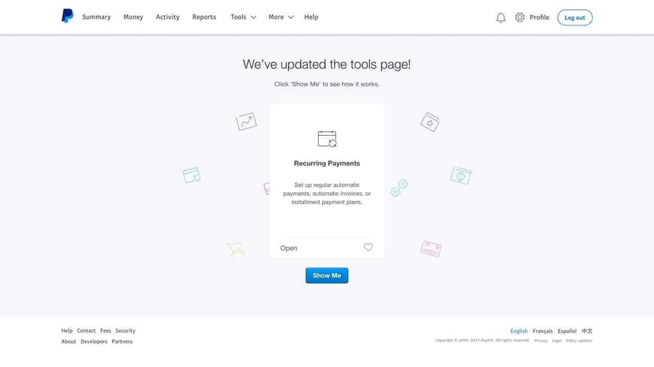
- PayPal has attempted to make users feel like they are in control of this new feature onboarding experience by using the term Show Me as the primary CTA. However, there are a few points that suggest users are not, in fact, in control of this experience - this will cause them to bounce.
- This message appears upon logging in. The user does not log in so that they can see marketing messages - they log in so that they can do some type of financial transaction or record keeping. When we interrupt a user’s workflow like this, we run the risk of annoying them, which lowers the probability of them paying attention to the important messages.
- The content doesn’t connect to the title. Why are recurring payments the content beneath a title about the tools page? The content should represent why the tools page is important and how users can benefit from it.
- Lastly, users cannot dismiss this message and progress to the regular landing page - this further removes their control and encourages them to bounce.
Slack
Cloud-based services and tools for team collaboration.
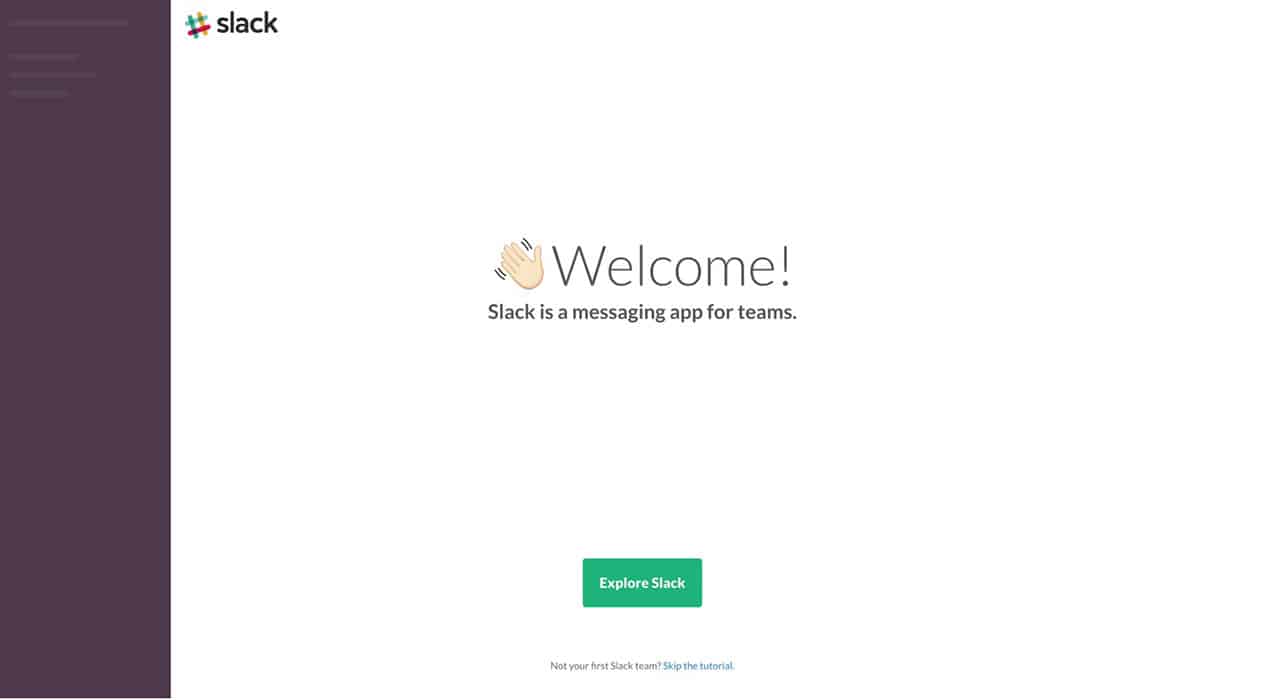
- Slack’s in-app landing screen is incredibly simple, and many users will appreciate that. The two options essentially support the Let Mes vs. the Show Mes.
- The Show Mes can choose the option to Explore Slack - and note that Slack gives the users the right to choose, keeping the control in the hands of the user.
- Slack then gives the Let Mes the chance to opt-out of the guided exploration and just get down to the business of messaging their team.
- In seven words, Slack clearly and succinctly explains itself.
Teachable
Course-creation platform.
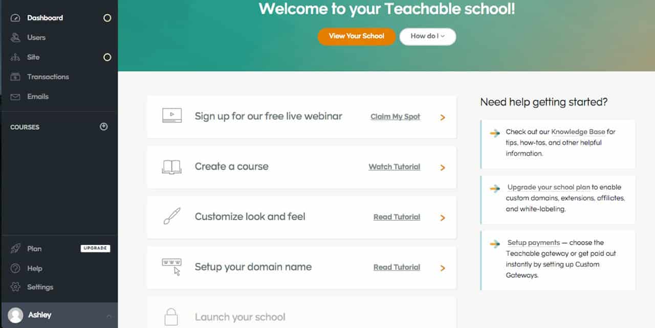
- Teachable has split up the main content area into two sections: one is all about engagement, the other is all about learning. This supports different types of users in terms of psychographics - the Let Mes vs. the Show Mes.
- On the left side of the main contact area are five clear actions the user can take to become onboarded. The final step is launching your school, which is incredibly encouraging. The user can see their end goal when entering the free trial landing page.
- The Need help getting started? section presumably surfaces the most common questions asked or stumbling blocks experienced by new users.
- The How do I section surfaces even more helpful tips for a new user.
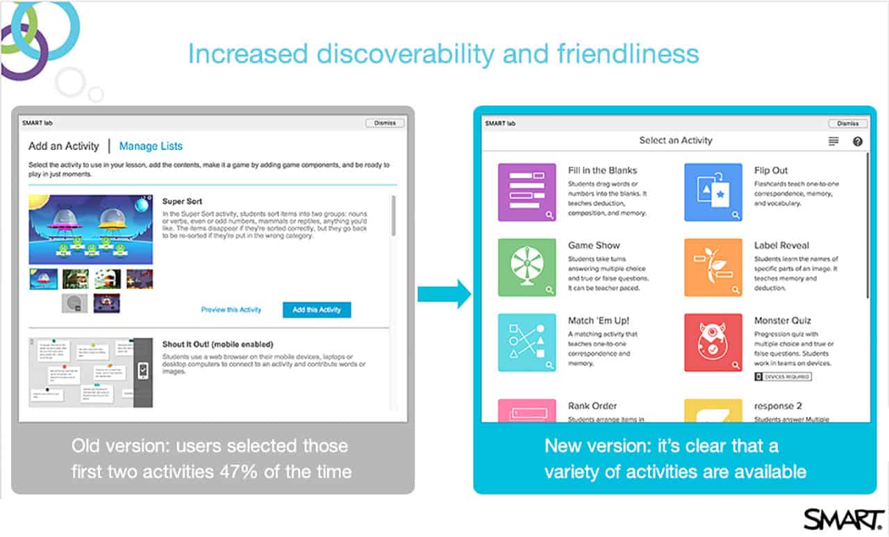
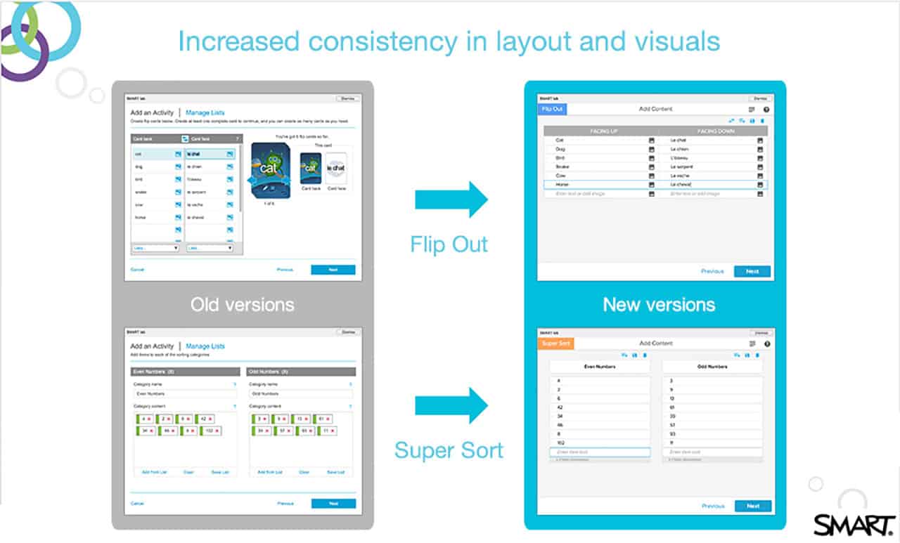
SMART Lab UX Onboarding Case Study: Before and After
SMART lab is part of the SMART Learning Suite of products. It’s a game-based activity builder that makes learning fun for school-aged children. Teachers use the products to enhance lessons and gain insight into students’ understanding. They can use any device to create activities in under five minutes using templates.
After some time in use, it was clear to Cargile that the onboarding needed a refresh. “After an initial user onboarding experience was designed for SMART Lab, and after some deep research with teachers and usability testing, we saw the need to create a simpler, more accessible way for students and teachers to make use of the app. We knew that it should feel like fun and that it should feel more natural, and more in line, which our end users are familiar with - and we also wanted the user onboarding to create excitement in itself. Now the onboarding follows best practices and we’ve gamified that process as well,” explains Cargile.
Here are some examples of the changes that were made to upgrade the user experience to increase discoverability and friendliness, align more closely with the app visuals, and simplify workflow. You can learn more about SMART Lab here.

User Onboarding/UX Resources
Karr has an essential book list for user experience designers and stakeholders who want to understand best practices for the following areas of the discipline:
Method: UX Strategy by Jaime Levy
Pre- Design: Mapping Experiences by James Kalbach
Design: The Elements of User Onboarding by Samuel Hulick, and Value Proposition Design by Alexander Osterwalder, Gregory Bernarda, Trish Papadakos, Yves Pigneur, Alan Smith
Stickiness: Mental Models by Indi Young
Ethics: Evil by Design by Chris Nodder
Understanding the Major Objective of UX: Hooked by Nir Eyal, and Contagious by Jonah Berger
Deliver User Onboarding that Drives ROI with Smartsheet
Empower your people to go above and beyond with a flexible platform designed to match the needs of your team — and adapt as those needs change.
The Smartsheet platform makes it easy to plan, capture, manage, and report on work from anywhere, helping your team be more effective and get more done. Report on key metrics and get real-time visibility into work as it happens with roll-up reports, dashboards, and automated workflows built to keep your team connected and informed.
When teams have clarity into the work getting done, there’s no telling how much more they can accomplish in the same amount of time. Try Smartsheet for free, today.