The Origins and Key Criteria of IT Dashboards
Let’s first clarify what dashboards are and their origins. The concept of the business dashboard arose in the 1970s with the advent of decision support systems, and the dashboard really took shape with the internet boom in the 1990s. Enterprises began to gather and integrate data from information systems in place throughout their organizations.
The process, which initially was highly manual, became more refined. Some companies developed their own applications to compile data into a dashboard and still rely on them today. But many ready-made solutions including software and software as a service (SaaS) are now commonly used.
According to PwC Chief Technologist Chris Curran, the five critical characteristics of an IT Dashboard are:
- One page in length
- Easy to read
- Data does not need decoding
- Accurate
- Up to date (though not necessarily in real-time)
Dashboards vs. Scorecards
It’s important to discuss the relationship between dashboards and balanced scorecards, terms that are often used interchangeably. Scorecards focus on measuring progress toward specific strategic goals, while dashboards look at real-time performance measurement.
Many organizations want to see both types of information, so the distinctions between the two are becoming less defined. Historically, the differences would stack up like this:

The Most Influential IT Dashboard
The most famous IT Dashboard probably belongs to the U.S. federal government. Launched in 2009, this dashboard offers a view of more than 7,000 federal IT investments from 26 agencies and their progress including performance vs. budget and schedule.
Creation of the dashboard increased the transparency and accountability of the government’s IT programs. The initiative took a huge and influential leap forward in 2011 when the White House released the software code for the IT Dashboard under an open-source license. This made the tool a model for other governments and private-sector players seeking to make their IT programs more cost efficient and effective.
“What makes it attractive to them is that the Dashboard sets a baseline level of accountability that many senior managers feel will help them detect problems early, yet does so without imposing too great a burden on the people closest to the projects, that is, those responsible for the inputs from which the overviews are generated,” Karl Fogel, who worked on open-sourcing the government IT Dashboard, wrote in a post on Civic Commons.
Before You Create an IT Dashboard, Know Your Purpose
To have an effective dashboard, you need to be clear about its purpose. Often, businesses are inundated with data, so separating the meaningful from the noise is crucial. The most meaningful data will vary depending on your goals, but IT Dashboards generally should contain a limited data set that helps make clear where problems lie. Some of the metrics that CIOs want to see include things like time to close critical support requests, system status, and the departmental project pipeline.
Metrics that correlate closely with future results offer predictive value that make them highly actionable. Some lagging indicators can lend insight but often they have less utility. For example, monitoring the number of change requests can highlight pending resource demands and allow the CIO to triage. Measuring cost overruns or missed milestones enables you to document the effects but with little opportunity to change the outcome.
Some of the needs that IT Dashboards fulfill are:
- Showing progress towards goals
- Tracking targets set by senior management
- Documenting the value that IT provides to the enterprise
- Summarizing what is happening across IT
- Providing information to support real-time decision making
Depending on your goal, the dashboard may contain very different things. For example, if your focus is on aligning the IT department with enterprise objectives, you could map a broad cost-cutting campaign to IT employee goals for reducing the department budget. Relevant dashboard indicators might include percentage complete for related initiatives and a heat map of how different teams are progressing.
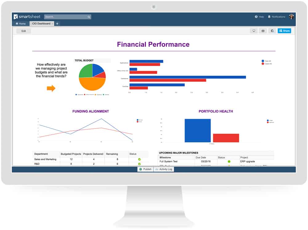
Alternatively, a CIO dashboard looking at the IT department’s portfolio management might capture metrics related to the project mix, project sequencing, and execution performance. These could include a pie chart of how the portfolio breaks down into short-, medium- and long-term projects, a snapshot of how much of the project load is running on time and on budget, green/red/yellow project status indicators, and issue resolution rates.
Make sure you can gather data that accurately measures what you want it to. The dashboard will only be as valuable as its inputs. In short, know why you are building an IT dashboard before you build it.
Other important considerations in developing your dashboard, include understanding your audience and how they will be consuming the information. Is it for IT managers, other departments, or senior management? If they will be viewing the IT Dashboard on handheld devices, keep that in mind when creating it. Mobile screens are smaller and will need to be formatted differently than what is shown on a desktop or even a print-out.
What Should Today’s IT Dashboard Measure?
We asked experts for their thoughts on IT Dashboards. They provided thoughts on everything from the importance of IT Dashboards, strategies for identifying useful information, and how to think outside-of-the-box when creating one. Sometimes a hybrid of multiple types of traditional dashboards could be the best solution.
Chris Curran of PwC puts forward four types of IT Dashboards and your ideal dashboard might use a mix of characteristics of more than one of them:
- Portfolio Dashboard (much like the federal government dashboard discussed above) that would look at gauges such as projected spend-by-project and risk/return-by-project.
- Linkage Dashboard that looks at the link between IT metrics and business metrics with a focuses on a goal such as improved customer service and an IT capability such as CRM system performance.
- Service Dashboard that presents metrics on service to internal customers (for example, average time to close helpdesk tickets, number of bug fix requests).
- Improvement Dashboard that is based on three to five improvement goals such as cost reductions or staff trained in core skills.
Roger Girard, a consultant and formerly CIO for the Canadian province of Manitoba e-Health, which provides information systems to healthcare providers including electronic patient records, said the dashboard is critical for client-focused IT departments serving their internal business units. “Their satisfaction levels drive your future. You are allowed to do more things, with more budget, if your clients are confident in you. So you are constantly trying to prove in quantitative terms that you are providing the best service possible.”
The top priority is to include a real-time indicator of user experience of IT systems such as customer satisfaction and response and resolution rates in the IT Dashboard. “The customer is entitled to a hassle-free experience. This is at the coalface of your relationship,” Girard added.
Secondly, Girard believes the dashboard should include system indicators that look at problems and clusters of problems, so that IT staff are held accountable to fixing them and maintaining robust system performance. Finally, he argues for a business indicator that is strongly connected to overall organizational goals. For example, when Girard worked as a CIO at a pharmaceutical manufacturer, the speed at which orders could be received, processed, and fulfilled was strongly tied to the IT function and important to the overall mission.
“It’s important that the IT shop connect with the company, not be just a back-end utility. The service is integral to the success of the business," said Girard.
James Martin, a legendary British IT guru, lobbied in favor of IT Dashboards, but said too many have focused only on output measures rather than the processes which drive them. “Thinking about a car dashboard, this is much like providing all the dials and warning lights, but no steering wheel, pedals, or switches. Sure, you can see what is happening, but you have no control; you are just along for the ride,” Martin wrote. “This is one of the recurring problems with metrics: you tell management you are doing 45 miles an hour heading south and they ask you to go 60 miles an hour heading east. The metrics make it obvious you are not doing what they want and it will probably be a struggle to change direction and accelerate at the same time. A good set of metrics can, therefore, be a double-edged sword if you do not also have control.”
Most dashboards need indicators that look at money, service delivery, problem areas and risk, he said. So tracking budget and incidents such as outages or security breaches are important. Beyond that, he urged focus on a small set of metrics, at least in the beginning, and those should consist of information you already actively use and information you would like, but do not yet track.
Carol J. Skarlat, CIO of financial services information provider BAI, believes today’s IT Dashboard needs to show system performance and uptime stats, project milestones, resource loading, and budget performance. For a user system or website, the dashboard should include peak performance times, user access counts, pageviews and time on site, as well as Google analytics. “The dashboard should also list system defects, outstanding backlog by system and an overall roadmap,” Skarlat said.
What Should IT Dashboards of the Future Look Like?
Looking to the future, Skarlat said IT leaders should prepare for more complexity, “I don't see many metrics being dropped...only more added. As technology changes like mobile sites, the CIO must constantly review and evolve the dashboard. Having a three-year technology roadmap with capital and expense estimates can also help the business prioritize investments.”
“Volume and velocity are going to be a challenge as we produce more data. It's going to be hard to resist adding another metric, yet it becomes necessity to aggregate more data and have more metrics in place to help you navigate the storms ahead,” Alireza Pourshahid of Klipfolio agreed. “I think in light of having more metrics in place, exception management and notifications become very important. Finding a tool that not only supports wallboards but also allows you to send reports to your collaboration tools like Slack is important.”
Data Integration Challenges to Overcome in Future IT Dashboards
In looking to the future, IT leaders agree that one of the biggest challenges for the IT Dashboard is to integrate data from the multiplicity of business systems that exist, both in-house applications and cloud solutions. An inability to tie all that information together seamlessly, rather than extracting and merging it into spreadsheets, limits its utility for the IT Dashboard and optimal decision-making.
In a data-driven world, data must be accessible and integrated to be useful. “You are always going to have yet another system that you want to monitor, so finding a monitoring system that can integrate with many different APIs and systems and has the ability to ingest different data formats becomes more and more important,” said Klipfolio’s Pourshahid.
Girard cited the example of a large healthcare institution that deals with hundreds of applications, thousands of servers and software from many companies. Integrating metrics from a variety of these sources is very hard. Other industries may be well served by end-to-end enterprise resource planning suites. In those cases, an ideal dashboard can be compiled relatively painlessly. “The most difficult part of building the right dashboard can be getting the data,” he said.
Improving Visibility with IT Dashboards for Healthcare Organizations
There is a vast amount of business-critical data and information that healthcare organizations need visibility into to make the right decisions at the right time. This data includes patient history and status, facilities information, maintenance requests, and more. To ensure that stakeholders have access to the right resources at the right time, healthcare IT teams must ensure that all systems are running smoothly. One way to do this is with a real-time IT dashboard.
Healthcare organizations deal with private information that must remain secure and HIPAA compliant, such as protected health information (PHI) and personally identifiable information (PII). To improve insights, provide data protection, track and manage confidential information, and provide a high-level overview of performance to ensure the best patient experience, healthcare organizations need a tool that provides a useful, visual snapshot of business operations.
Smartsheet is a work execution platform that enables healthcare companies to improve work efficiency, scale business processes, and securely manage and store PHI, while meeting or exceeding all of HIPAA’s regulatory requirements. Streamline reporting, track and manage assets and resources, and organize all business-critical information in one centralized location to ensure your business runs efficiently. Roll up reports and information into a comprehensive real-time dashboard to improve transparency and accountability.
Interested in learning more about how Smartsheet can help you maximize your efforts? Discover Smartsheet for Healthcare.
Make Better Decisions, Faster with IT Dashboards in Smartsheet
Empower your people to go above and beyond with a flexible platform designed to match the needs of your team — and adapt as those needs change.
The Smartsheet platform makes it easy to plan, capture, manage, and report on work from anywhere, helping your team be more effective and get more done. Report on key metrics and get real-time visibility into work as it happens with roll-up reports, dashboards, and automated workflows built to keep your team connected and informed.
When teams have clarity into the work getting done, there’s no telling how much more they can accomplish in the same amount of time. Try Smartsheet for free, today.