What Is a KPI Business Dashboard?
A key performance indicator is a business metric used to evaluate factors that are crucial to the success of an organization. KPIs differ per organization; business KPIs may be net revenue or a customer loyalty metric, while government might consider unemployment rates. Whatever metrics are selected, they must impact your business’ bottom line.
A KPI dashboard is an easy way to have a window into all of your work, with the information you need in one place to share with your team and track your progress toward goals, or tell you where you need to make adjustments to reach them.
Dashboard designs are unique because the design of each dashboard has to fit the specific needs and culture of the organization. Flexibility and customization are essential for holding good information design and making data at every level easy to access and understand.
See how Smartsheet can help you be more effective
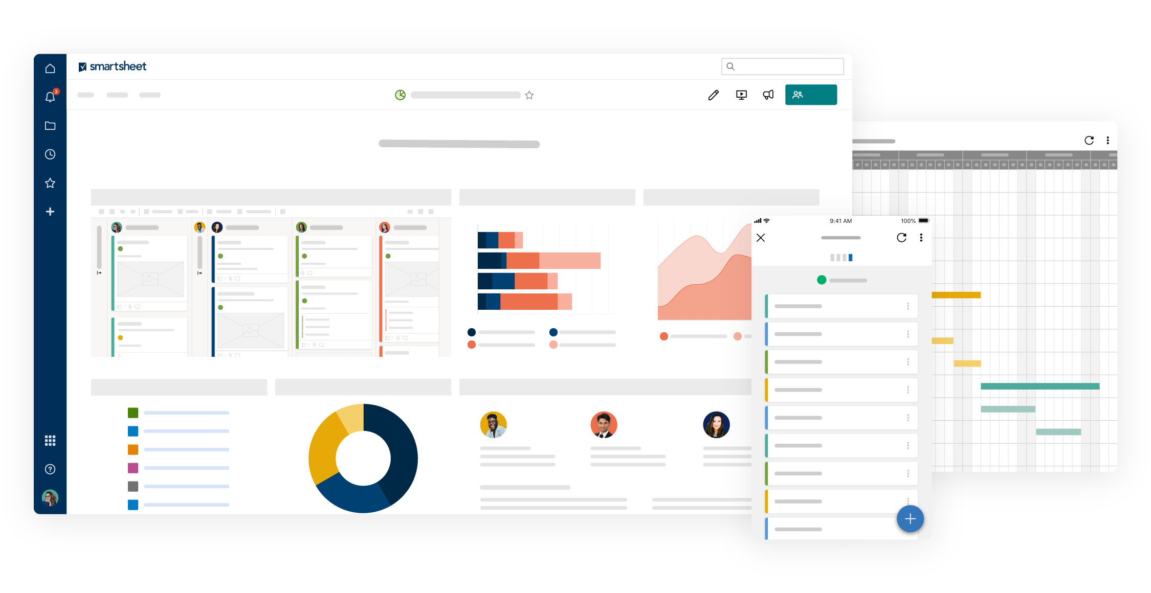
Watch the demo to see how you can more effectively manage your team, projects, and processes with real-time work management in Smartsheet.
Who Invented KPI Business Dashboards?
The father of KPI and the dashboards that track them could be considered to be Peter Drucker, writer, professor, management consultant and self-described “social ecologist,” who explored the way human beings organize themselves and interact. He was the organizational expert who said, “A strategy without metrics is just a wish. And metrics that are not aligned with strategic objectives are a waste of time.”
Despite the availability of enabling technologies, dashboard use didn't become popular until the late 1990s, with the rise of key performance indicators (KPIs), and the introduction of Robert S. Kaplan and David P. Norton's Balanced Scorecard. Today, the use of dashboards forms an important part of Management by Objectives (MBO), a management model that aims to improve performance by clearly defining objectives that are agreed to by both management and employees and align to overall organizational objectives.
A principle of Management by Objectives is the establishment of a management information system to measure actual performance and achievements against the defined objectives. MBO benefits include improving employee motivation and engagement, and better communication between management and employees.
The Benefits of a KPI Framework
The State of Performance Improvement and Key Performance Indicator Practice Report by The KPI Institute has found that 68% of respondents noticed a positive impact on their business development after implementing a KPI Framework. Further, 43% of respondents noted improvement, defined as being able to ‘objectively evaluate the level of results achievement,’ and 33% reported that they integrate KPI results into their decision-making process. A KPI Framework groups related KPIs together to provide greater structure and context, and optimize efforts and understand how performance of certain KPIs impact other KPIs.
Examining individual and cross-organizational metrics and making use of the information is much easier with a well-designed KPI dashboard. You can make comparisons, see trends over time, see distribution, and see relationships between different areas of the organization. Sharing information across multiple parts of the organization supports more streamlined problem-solving, collaboration, and forecasting.
In the report cited above, 32% of respondents stated that the most challenging aspects in performance measurement was to identify the right KPIs for their business. We’ll help you do that in the next section.
How to Identify and Review Company KPIs
Before you begin building your KPI dashboard, you need to identify the key performance indicators to help you learn about your customers and what they want. That means understanding your business and its objectives, translating your business objectives into measurable goals, and then selecting KPIs for each of these goals.
Here are some steps to consider as you identify your KPIs:
- Make metric identification a team effort. Involving employees ensures that the metrics are relatable and realistic. By working in concert, employees are engaged, develop a clearer understanding of goals and how their work relates to company strategy, and gain a greater sense of commitment to meeting objectives.
- Use SMART criteria. S.M.A.R.T. goals are designed to provide structure and guidance throughout a project, and better identify what you want to accomplish. This method is especially effective in setting goals that align with company strategy. Each measure must be: Specific to the purpose of the business, Measurable, Achievable, Relevant to the success of the organization, and Time phased, which means the value or outcomes are shown for a predefined and relevant period.
- Choose three priority goals and have no more than three KPIs per goal. Focus on linking KPIs or measures to the goals that are most direct and supply the most evidence.
- Resist the urge to add more metrics. KPIs should be actively managed to be effective. While there may be pressure to add more KPIs, metrics must be critical to the operation or tightly linked to improvement objectives.
- Review on a structured basis. The business environment and other factors change over time, so it is important to be nimble. KPIs may need to be adjusted, but when they are, keep them relevant, and keep the overall number of KPIs lean using SMART criteria.
- Use reviews as an opportunity to share successes. Taking a look with team members on a regular basis is an opportunity to acknowledge great work, keep motivation high, and ask for input. When there are areas that need attention, the team can work together on ideas to get back on track.
The 5 Elements of a Well-Designed KPI Dashboard
The term dashboard originates from the car or aviation dashboard—it’s the spot where major functions are monitored using visual representations. Properly designed, KPI dashboards let you know if your business needs maintenance or if it is running at peak performance.
A great KPI dashboard design is:
- Easy to read and understand. Group data logically by category and KPIs in a visual environment that enables quick comprehension. One way to do that is to follow the webpage templates used by major information-rich websites like Amazon or Yahoo. Since they are continuously tested by experts for usability, they are a good resource for design and navigation ideas.
- Easy to update. As your business grows and conditions change, choose an intuitive platform or one that you already use that works with your systems and workflow. Easy revisions also facilitate more widespread adoption.
- A storehouse for current status snapshots and historical trends. Using the categories you have identified and the one-to-three supporting KPIs, you will be able to quickly understand progress gained, what has worked in the past, and what will need to happen to move efficiently to goals.
- Aligned to best practices around visual presentation of information. Less is more, so eliminate ‘decoration.’ Dashboard interfaces in cars hold a great key to designs that work well for users. Use animation or other visual elements only when they add to understanding.
- Constructed to enable decisions to be made at a glance. A good rule of thumb is no more than seven objects on a dashboard, but display density can depend on the audience and exposure over time. Novices can be confused by seeing data all at once, but they may want to use fewer clicks to view related information as they adjust to using KPI dashboards.
Types of KPI Dashboards
Now that you know your KPIs, you can begin to put big data and everyone in your organization on the same page with data visualizations: tables, line charts, bar charts, and gauges to track KPIs. Your dashboard will consolidate and automate the multiple data points that make your business grow.
There are three main types of dashboards:
- Strategic/Executive. Managers and executives at all levels of the organization can see the information they need to understand the health of the organization and identify potential opportunities for expansion and improvement. Strategic dashboards don’t provide all the detailed information needed to make complex decisions, but should clearly identify opportunities for further analysis. A strategic dashboard should be simple and contain aggregated metrics.
- Analytical. Data is used to understand trends by making comparisons across time and multiple variables. Analytical dashboards often contain more information than strategic or operational dashboards. Since understanding is the goal, analytical dashboards can be more complex than strategic or operational dashboards. While analytical dashboards should facilitate interactions with the data, including viewing the data in increasing detail, it is important to maintain the ability to compare data across time and multiple variables.
- Operational. These monitor operations in real time to alert users to deviations from the norm. Operational dashboards should provide users with specific alerts and provide them with exactly what information they need to quickly get operations back to normal.
While these are the major categories/forms dashboards can take, there will likely be instances when a hybrid of two types may be needed. No matter what type of KPI dashboards you use, managers and staff should be able to get the answers to questions in real time and take action with all the data consolidated in one place.
You can support short, mid, and long range actions for CEO-level KPIs and actions, management-level KPIs and actions, and employee-level KPIs and actions. Test, evaluate, tweak and use them consistently to make your business grow.
KPI Dashboard Template in Excel

Download KPI Dashboard Template
This KPI dashboard template in Excel allows you to view multiple KPIs in both tablular and graph formats. You can compare metrics and view averages and targets per KPI. There are graphs for goal and actual budget, total budget, goal and actual revenue, total revenue, profit margins, and debt to equity ratio.
There are two tabs in this Excel template: one sheet for the KPI dashboard with all the graphs and another sheet for KPI data, where you can add and edit the raw data that makes up the dashboard. You can add your own KPI information by going into the KPI Data tab and changing all the numbers to match your company information. Each table also has pre-made formulas that will add up each column as well as calculate other metrics like profit margins, net expenses, and more.
Make Better Decisions, Faster with a KPI Dashboard in Smartsheet
Empower your people to go above and beyond with a flexible platform designed to match the needs of your team — and adapt as those needs change.
The Smartsheet platform makes it easy to plan, capture, manage, and report on work from anywhere, helping your team be more effective and get more done. Report on key metrics and get real-time visibility into work as it happens with roll-up reports, dashboards, and automated workflows built to keep your team connected and informed.
When teams have clarity into the work getting done, there’s no telling how much more they can accomplish in the same amount of time. Try Smartsheet for free, today.