What Is a Bar Chart?
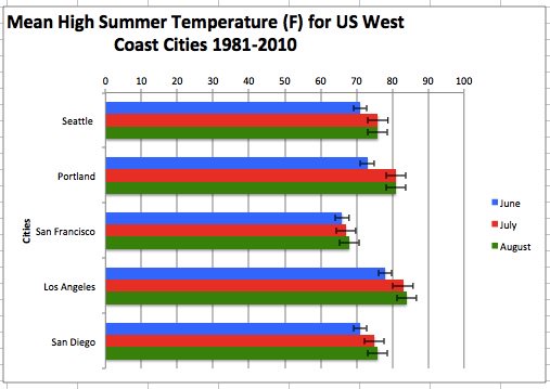
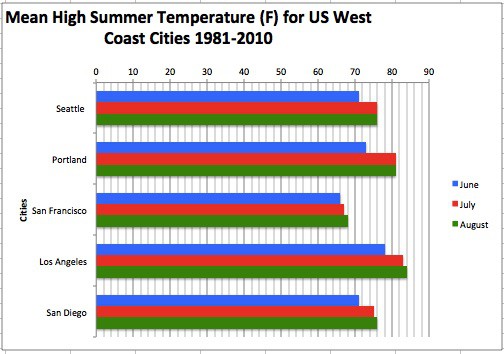
A bar chart (also called a bar graph) is a great way to visually display certain types of information, such as changes over time or differences in size, volume, or amount. Bar charts can be horizontal or vertical; in Excel, the vertical version is referred to as column chart. Here are some examples using fabricated data.

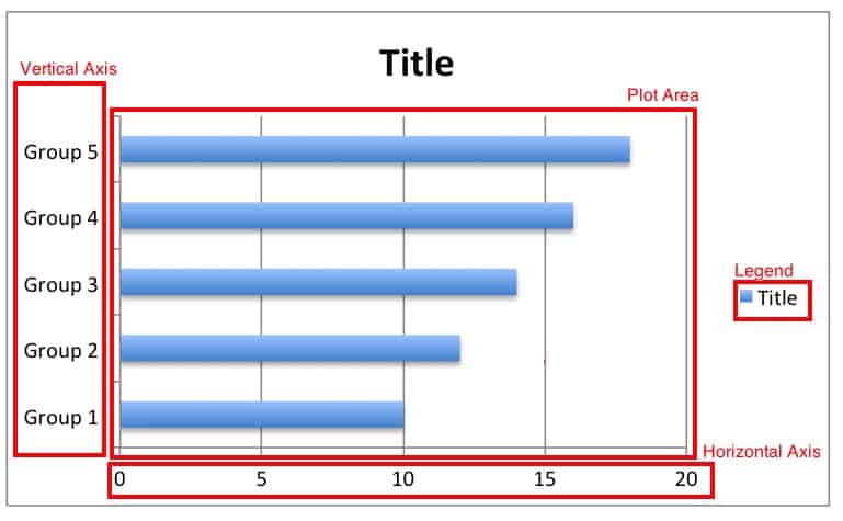
The key aspects of a bar chart are highlighted below:
Different Kinds of Bar Charts
Excel provides variations of Bar and Column charts. Here’s a quick summary of each:
- Stacked: A chart that shows the dependent variables stacked on top of each other. This chart is also called segmented.
- Clustered: A chart that displays a group of dependent variables, also called grouped. A double graph is a clustered graph that has two dependent variables.
- 3D: A chart that shows the dependent variables in a 3D format.
What Are Bar Charts Best Used For?
The bar chart was created in the 1700s by William Playfair, an engineer and economist from Scotland. He is also credited with creating the pie chart. Playfair’s first published use of the bar chart was in a book about imports and exports between Scotland and other countries.
Today, bar charts are a useful tool for illustrating patterns or for comparing discrete groups of data. There are both horizontal and vertical layouts available. Use a horizontal layout when comparing duration. If the data labels are long, this layout makes them easier to read. Use the vertical layout for comparisons of height, to show growth, or if some of the values are negative.
In the finance world, vertical bar charts are often used to represent the trading price of a security for a day. The top of the bar is the highest price, the bottom the lowest, and the opening and closing prices are also indicated.
How to Make Bar Chart in Excel
In this section, we’ll provide steps and images to create a bar chart in Excel 2011 for Mac. Any differences in Microsoft-supported versions (2010, 2013, 2016 for Windows), or 2016 for Mac are called out in the text below. Previous versions of Excel included a chart wizard, but that was removed after the 2007 release. The term “right-click” is used throughout this article. If you don’t have a mouse, use a two-fingered tap on the trackpad, or press control+tap on your keyboard.
Step 1: Enter your data into Excel columns.
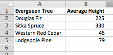
Step 2: Click and drag your mouse across the data that will appear in the chart.
Confirm the highlighted columns contain one independent variable and one dependent variable (multiple dependent variables are discussed in the next section), and the column headers if desired (Excel will make one of the headers as the chart title).
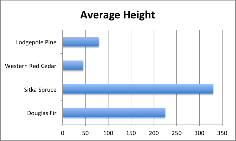
Step 3: From the ribbon, click Chart, click the Bar icon, and then click 2-D Clustered Bar (with a single dependent variable as we are using here, the results will be the same no matter which option you choose).
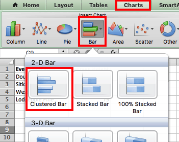
Other versions of Excel: Click the Insert tab, click Bar Chart, and then click Clustered Bar (in 2016 versions, hover your cursor over the options to display a sample of how the chart will appear).
The chart will appear on the same page as the data. Your default might be to include the legend — you can remove it by clicking it and pressing the delete key on your keyboard.
Create a Chart with Multiple Dependent Variables
Unlike data with a single dependent variable, the type of chart chosen (clustered or stacked) makes a difference for data with more than one dependent variable. For this example, we’ll use clustered. The legend that Excel creates will also be valuable.
Follow the same steps as above to select at least two columns of dependent variables.

Moving or Copying a Chart
To move a chart on the same sheet, click an edge of the chart and drag it where you want it to appear on the Excel workbook sheet. To move your chart to another sheet in the same workbook, right-click on the chart and click Move Chart…. Select the desired sheet, or create a new sheet, and press OK. To add the chart to any other program, click Cut or Copy from the same menu.

If the chart is kept in the same workbook, any changes made to the data will be reflected in the chart. If you paste the chart into a document in another Microsoft Office program, the same is true if the documents stays on the same computer. If you paste the chart into a non-Microsoft program, the chart won't update if the data changes. Read “How to Make a Spreadsheet in Excel, Word, Google Sheets, and Smartsheet for Beginners” to learn more about creating and sharing data across different platforms.
Excel Chart Formatting Options
Once created, you can customize charts in many ways. Themes are preset color and shape combinations available in Excel. Changing the theme affects other options, as well as any other charts created in the future. If you only want to change the current chart, use the Chart Styles option.
To change the theme, click the Home tab, then click Themes, and make your choice.
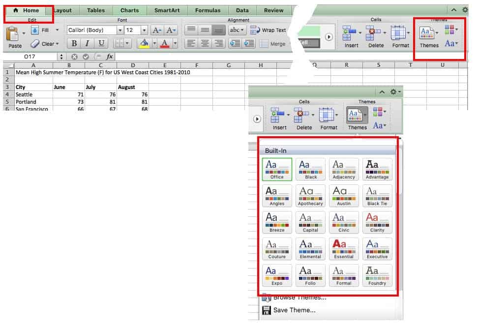
Other versions of Excel: Click the Page Layout tab, click Themes, and then make your choice.
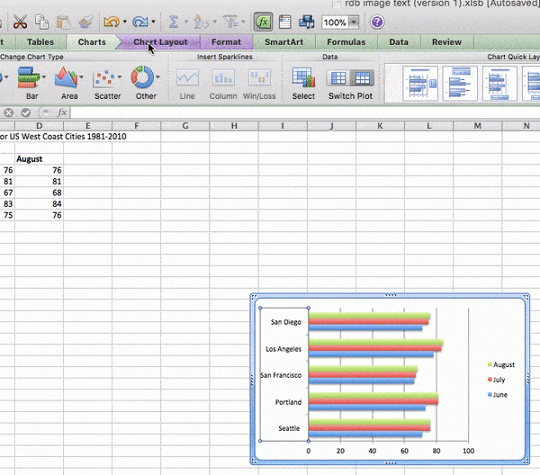
To change the style, click Charts, and scroll through the options under Chart Styles on the same ribbon.
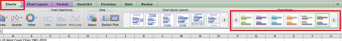
Other versions of Excel: Click Chart Tools or Chart Design tab, and click Layout to scroll through the options under Chart Styles. If you have a Chart Design tab, the different layouts will appear in the ribbon, similar to the image above.
Adding Titles
If the data presented in the chart isn’t quite clear, a title can help. Titles aren’t needed for charts with a single dependent variable.
Click on Chart Layout, click Chart Title, and click your option. Using the overlap/overlay option may cover part of the chart, so be sure the title doesn't cover key information.
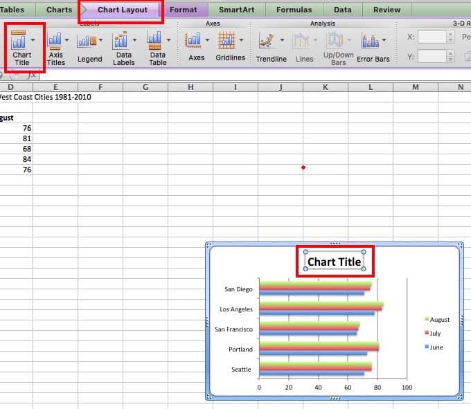
Other versions of Excel: Click Chart Tools tab, then click Layout, click Chart Title, and click your option.
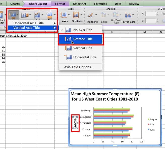
If the categories in the horizontal or vertical axis need a title, follow the steps above. However, select Axis Titles instead, and then choose the horizontal axis or vertical axis.
To change the font and appearance of titles, click Chart Title and then click More Title Options. Additionally, in some versions of Excel, you can click on the title in the chart and a side menu will appear with options to customize the text.
To reword a title, just click on it in the chart and retype.
Adjusting Axes
To adjust the horizontal or vertical axis, you can resize by clicking on a square in the corner and dragging an edge.


For finer adjustments, right click the axis and choose Format Axis…
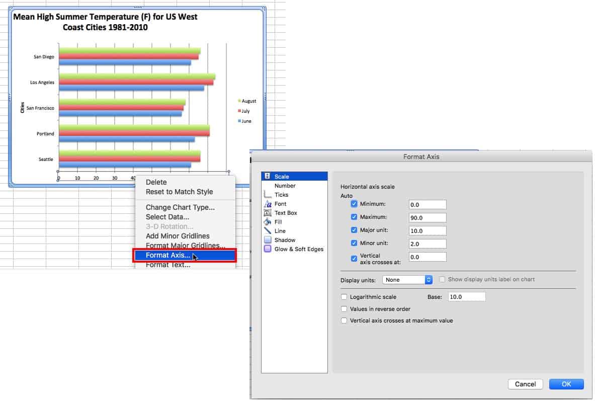
For a numeric axis, you can change the the start and end points, as well as the units displayed. Simply change the numbers in the boxes to make the starting and ending point the minimum and maximum, respectively.
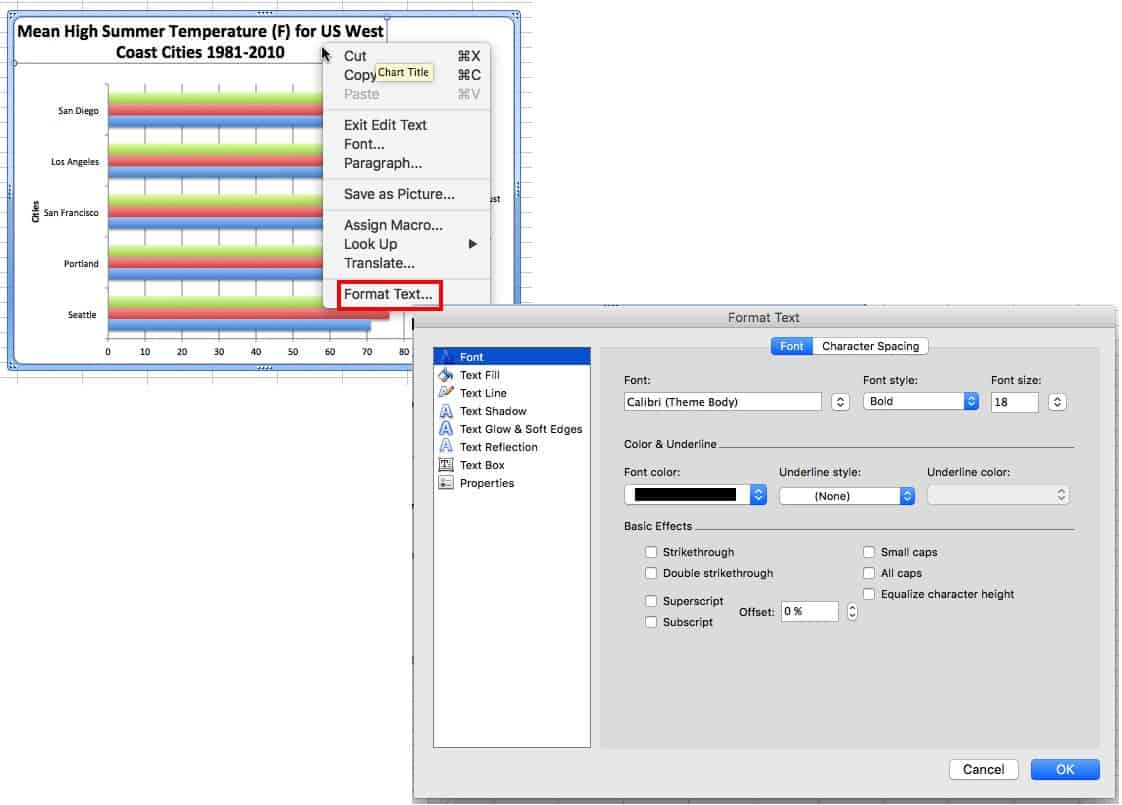
Formatting Text
To format the copy, right-click any text in the chart and click Format Text (or Format Title or Format Legend, etc. — depending on your version of Excel and the area of the chart you wish to change). From this menu, you can change the font style and color, and add shadows or other effects.
Adding Data Labels
Data labels show the value associated with the bars in the chart. This information can be useful if the values are close in range. To add data values, right-click on one of the bars in the chart, and click Add Data Labels. This will create a label for each bar in that series. For clustered charts, one of each color will have to be labeled.

Moving the Legend
Click and drag the legend to a new location on the chart, or click on it and press the delete button on your keyboard to remove it completely.
Data Order
The items will appear in reverse order from the spreadsheet. Rather than changing the order there, it’s easier to right-click the axis, click Format Axis…, and then click the box next to Categories in Reverse Order. This change will also affect the order of the data clusters, if that was the chart format chosen.


In some versions of Excel, you can also change the data order by selecting one of the bars and editing the formula bar.
Adjusting Axis Text
If the text on an axis is long, pivot it on an angle to occupy less space. Right-click the axis, click Format Axis, click Text Box, and enter an angle.
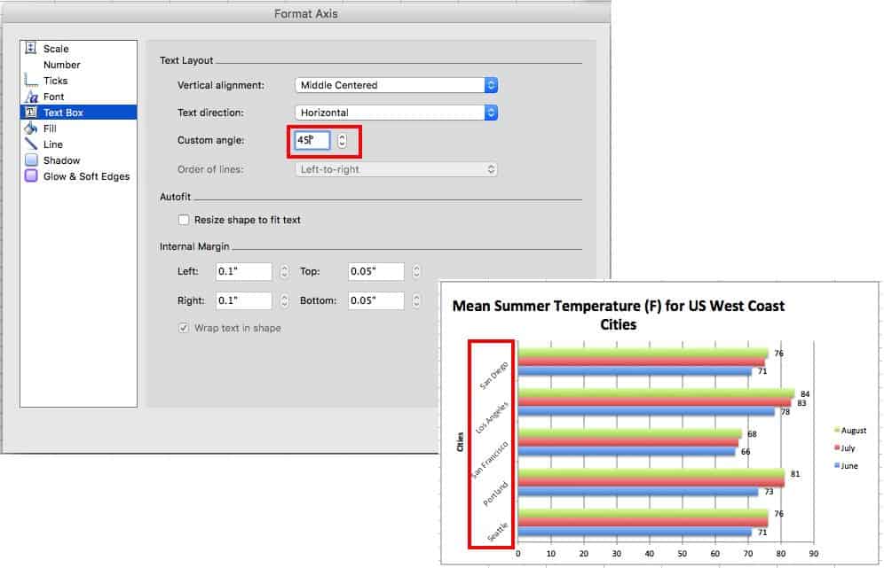
You can also opt to only show some of the axis labels. Right-click the axis, click Format Axis, then click Scale, and enter a value in the Interval between labels box. A value of 2 will show every other label; 3 will show every third.

If you want to create a cleaner, less cluttered chart, hiding some labels is a good option. But the context of the hidden text is still obvious.
Changing Chart Values
Update the spreadsheet and the values in the chart will update, too. But remember, if the chart has been copied to a non-Microsoft Office document, it won’t update — in this case, copy the updated version and replace it in the document.
Changing the Look of the Bars
Right-click a bar, then click Format Data Series… and make adjustments. In addition to changing the color, you can also add a gradient or pattern, as well as many other effects.
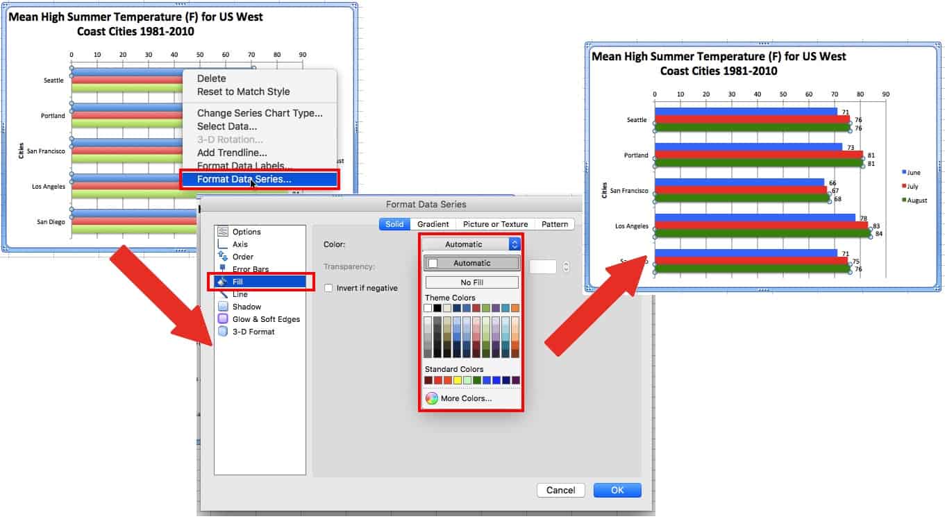
For clustered bar charts, any changes will only affect the bars associated with the same dependant variable of the selected bar. Repeat to update all the bars in the chart.
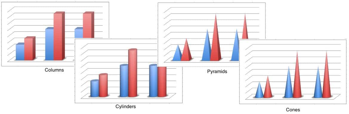
If bars don’t look right, select the chart, right-click the chart and click Change Chart Type.... In addition to the 2D bars demonstrated in this tutorial, there are options for 3D bars/columns, cylinders, cones, and pyramids.
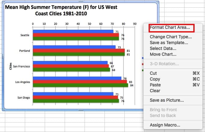
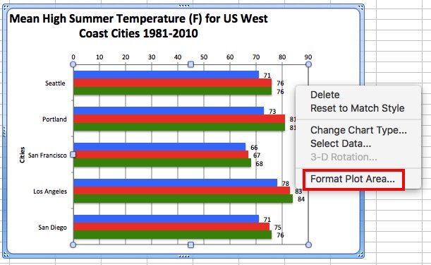
Changing the Background of the Chart and Plot Area
To change the background, right-click in a blank area of the chart and click Format Chart Area… or right-click the plot area and click Format Plot Area…. Like the bars, you can change the color, add a gradient or pattern, adjust the color and size of lines, as well as other effects.
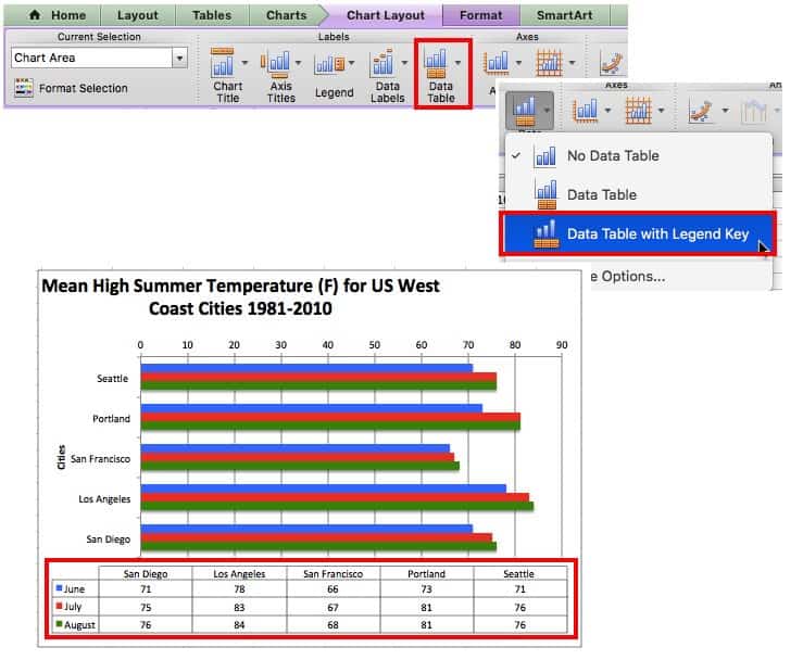
Adding a Data Table
A data table displays the spreadsheet data that was used to create the chart beneath the bar chart. This shows the same data as data labels, so use one or the other.
To add a data table, click the Chart Layout tab, click Data Table, and choose your option. If the legend key option is chosen, you can remove the legend as demonstrated in the image below.
Changing Chart Orientation
To swap the vertical and horizontal axes, right-click on the chart and click Change Chart Type. If you chose a column chart, chose bar chart instead, and vice versa. There are other ways to do this, but this is the simplest.
Advanced Formatting Options
Trend lines show the overall trend of your data (falling or rising) if the numbers are somewhat scattered. Trend lines are only available on column charts.
To add a trend line, click the Chart Layout tab, and click Trendlines.
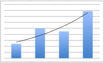
Unlike most of these options, trendlines will accumulate rather than being replaced if you change the chosen type.
Error bars show the margin of uncertainty in data. You’ll have to add them to each data series separately.
To add an error bar, click the Chart Layout tab, and click Error Bars.
To customize the error bars, click Error Bars and click Error Bar Options….
Minor grid lines can help show fine differences in the data.
To add grid lines, click the Chart Layout tab and click Gridlines.
Other versions of Excel: For the three options above, click the Chart Tools tab, click Layout, and choose the option. Depending on your version, you can also click Add Chart Element in ribbon on the Chart Design tab.
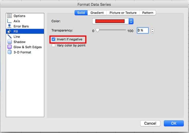
You can add a different color for negative values to make them stand out. After you create your chart, right-click one one of the bars, click Format Data Series…, click Fill, and check the box next to Invert if negative.
You may need to select a solid color for the data series bars in order for the change to take effect.
How to Make a Bar Chart Easier to Read
You can improve the readability of charts by using some of the formatting options mentioned above (like adding data labels or minor grid lines). Many categories can make it difficult to read the labels, so apply some of the formatting options mentioned earlier (like skipping some labels or putting the labels at an angle) to alleviate this problem.
How Do I Make a Comparison Graph in Excel?
A comparison graph is another name for a line chart. Creating a comparison graph is identical to creating a bar chart, except you choose Line instead of Bar or Column. There are a number of versions available, so you can experiment with which option looks best.

How to Make a Percentage Graph in Excel
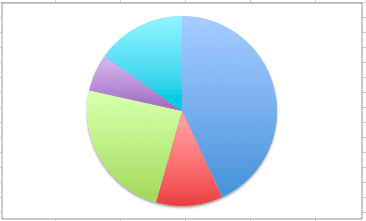
A percentage graph is another name for a pie chart. To create one, follow the steps to create a bar chart, but choose the Pie option. Pie charts are best for comparing the parts of a whole. There are a number of versions available, so you can see which works best for your needs.
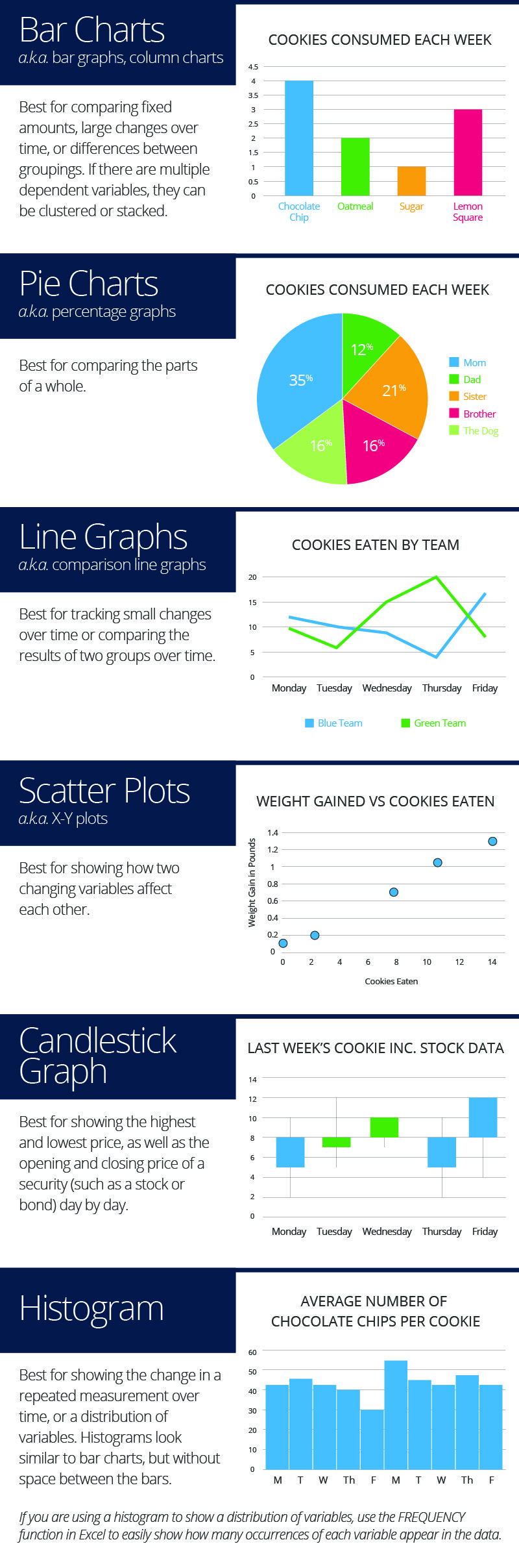
What’s the Difference Between a Bar Chart and Other Charts
Different chart styles are useful for displaying different information. Here’s a summary.
Make Better Decisions, Faster with a Bar Chart in Smartsheet
Empower your people to go above and beyond with a flexible platform designed to match the needs of your team — and adapt as those needs change.
The Smartsheet platform makes it easy to plan, capture, manage, and report on work from anywhere, helping your team be more effective and get more done. Report on key metrics and get real-time visibility into work as it happens with roll-up reports, dashboards, and automated workflows built to keep your team connected and informed.
When teams have clarity into the work getting done, there’s no telling how much more they can accomplish in the same amount of time. Try Smartsheet for free, today.