What Is a Bubble Chart?
In a design-first, technology-driven world, using visualizations like bubble charts to communicate a people-centered story is paramount. Bubble charts have the potential to compress and condense large datasets for hundreds, sometimes thousands of data points in a single view.
While scatterplot chart is ideal for showing the correlation between two values, a bubble chart adds a third dimension to visualize data, either in small multiples or across a few variables. Bubble charts are optimal for showing the relationship between data using the size of the data plot as the third visual element. The data is plotted and displayed using bubbles, or categorized circles (discs).
Instead of traditional charts that use two axes (x and y) such as column or line charts, bubble charts display a third dimension of data (sometimes referred to as the z-axis). The x- and y-axis of a bubble chart are numeric, not categorical, so the position of the data plotted is an indicator of two values. A bubble chart is capable of presenting four dimensions of data. The color (or color temperature) of the data bubble is the fourth dimension used to differentiate data points.
Bubble Charts for Sales and Marketing
Bubble charts, like all data visualization, are a form of storytelling. Sales and marketing professionals use data visualization to gain insight and communicate using raw data. A marketer might use bubble charts in a presentation instead of a list of bullet points to describe key advertising metrics that include multiple data series across different time periods. A single chart on a single slide tells the story of top-performing digital marketing campaigns that emphasize ROI from different online segments.
When to Use a Bubble Chart
Bubble charts create a digestible story for the viewer, providing a quick assessment of the relationship between different data — something bar and line charts don’t always accomplish. A bubble chart visually explores correlation (or association) between data.
Well designed bubble charts effectively display three fields of data using the position and proportion of the bubbles plotted. This type of chart is a helpful tool for analyzing data sets with multiple inputs, visualizing patterns, and finding trends using data analysis. For example, a period of time (x-axis), a value figure (y-axis), and a percentage of growth (bubble size).
A bubble chart is a dynamic tool for analyzing finance scenarios beyond standard time-series or whole-to-whole comparisons using line and bar charts. For example, comparing investment returns using formula-driven data from spreadsheets, over a period of time, for multiple categories of investments (mutual funds, index funds, stocks, bonds, etc.).
It is easier to explore the correlation between ROI and the investment category when the data appears in a bubble chart instead of presenting it linearly. Bubble charts contribute to the storytelling element of visualization for finding correlation for a data series.
Bubble Chart Tips
The bubble chart is an effective data visualization tool. However, like other charts and reports, a bubble chart is only as compelling as the data it represents.
Remember to keep the purpose of a bubble chart in mind before plunging forward with the work. If you have multiple data series that tell a story, or you’re looking for insight from your data and need to visualize the relationship between different data sets, consider using a bubble chart.
Here are some additional tips to consider when deciding whether a bubble chart is the right visualization to use.
- Use Restraint: Data visualizations like bubble charts benefit from carefully thought out design. The idea of using colorful bubbles to display data is tempting because line and bar charts are ubiquitous and lack the unique visual appeal that colorful discs provide. However, if you do not have at least three dimensions of data, consider using a different chart for data visualization.
- Clarify Intent: A detailed bubble chart with multiple data inputs conveys a lot of information at once. Help users navigate complexity with a clear introduction to the data and the intent of the chart by using a message as its title. Use visible axis titles, a data legend, and chart design principles such as clear borders, gridlines, and easy-to-distinguish colors to make the data stand out.
- Embrace Proportion: The size of the bubble is critical to a user interpreting the data efficiently and accurately — particularly when the range of data is spread out over a specific axis. If the total area (instead of radius or diameter) of individual bubble plots convey meaning, make sure to clearly document the scale.
- Odd Shapes: The temptation to get creative and substitute bubbles for other creative graphics minimizes the effectiveness of bubble charts. Stick to bubbles (round discs) to represent data and accurately plot data. The exception is when you want to present negative (or zero) values. Use another standardized and easily recognized shape like a triangle or square to differentiate this data from the bubbles.
How to Create a Bubble Chart in Excel
This section is a step-by-step tutorial on creating a bubble chart and plotting data using Microsoft Excel 2016 (Office 365 edition). We adapted the data for this tutorial from a Google Analytics demo account for the Google Merchandise Store. Follow the steps below to create the bubble chart shown in this image:
-
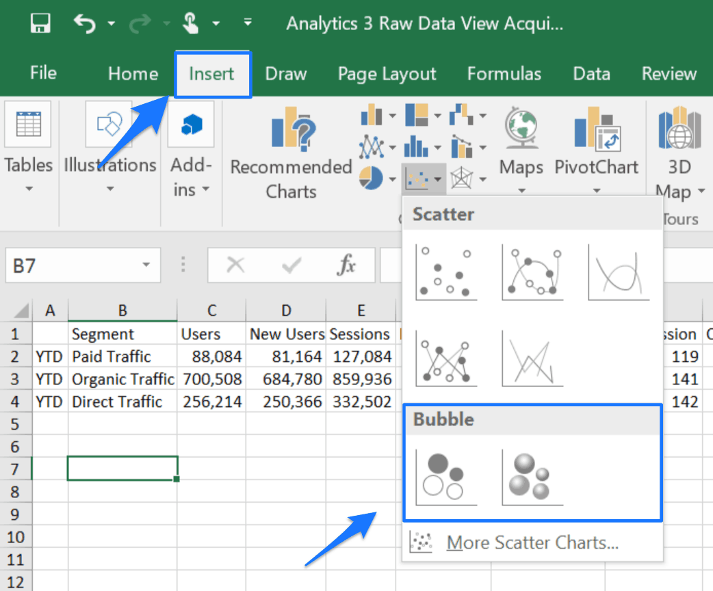
Insert Bubble Chart
Open the Excel spreadsheet with your data and click Insert from the menu. Hover and click the drop-down menu arrow for Scatter (X, Y) or Bubble Chart from the Charts sub-menu. There are two options under Bubble — standard Bubble or 3-D Bubble. This tutorial uses the standard Bubble option, so click Bubble. A blank square will appear on the spreadsheet.
-
Add Data Sources
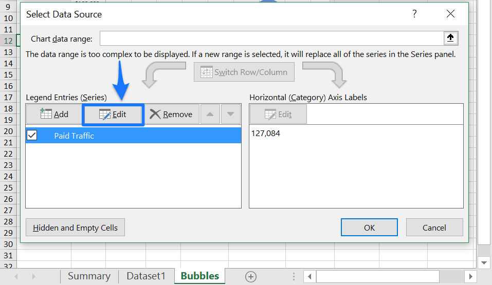
Right-click the chart and click Select Data from the menu.
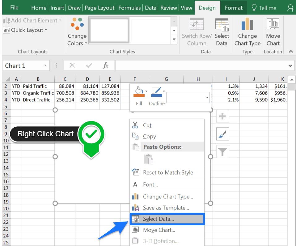
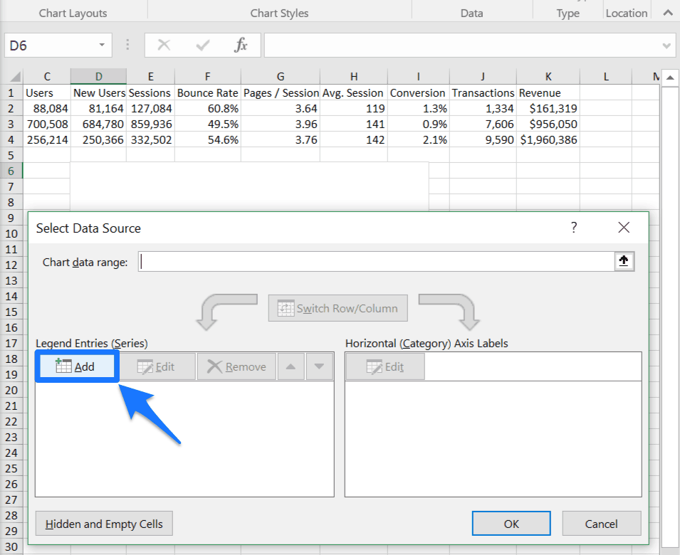
From the Select Data Source window, click the Add button under the Legend Entries (Series) section.
-
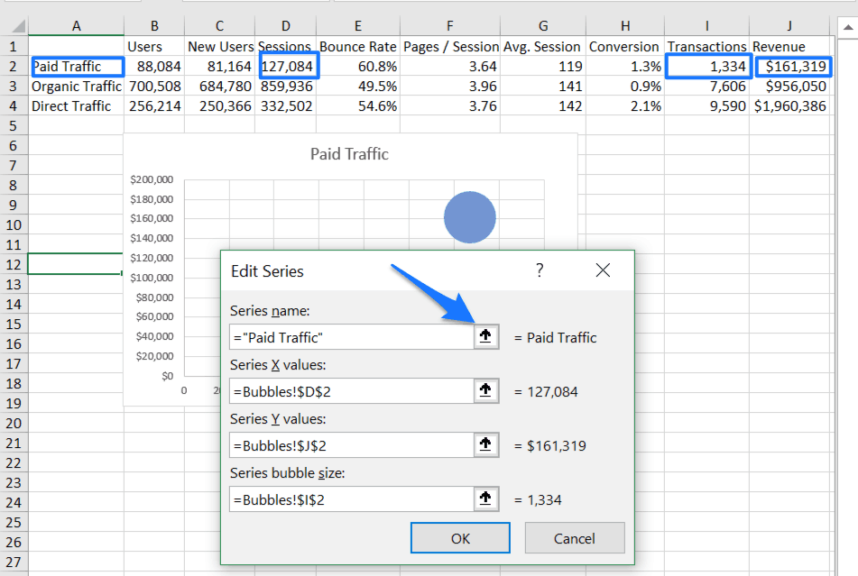
Edit Data Series
To edit data previously added to the bubble chart, click Edit from the Select Data Source window. Click on the appropriate data in the spreadsheet that corresponds to each series cell listed in the Edit Series window:
-
Click on the data or (type the name) of the series in the Series name cell.
-
Click on the data for the x-axis in the Series X values cell.
-
Click on the data for the y-axis in the Series Y values cell.
-
Click on the data for the z-axis (or size) of your bubble chart in the Series bubble size cell.
-
Click OK.
To make changes to existing data series, click Edit in the Select Data Source window. Click the OK button to finalize the data source selections and return to the inserted bubble chart.
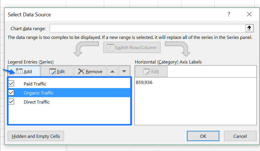
Click Add to include multiple data series in the bubble chart and repeat the Edit Series steps above for each new Legend Entry (Series). Add the data for Organic Traffic and Direct Traffic which will place more than one bubble on the chart.
-
Format and Design
The final step to creating your bubble chart is formatting the data and adding design elements like axis titles and data labels. This step turns a raw bubble chart into a compelling data visualization. Size, color, and various formatting choices help make the chart more visually appealing.
Format Axes
-
Excel generates automatic axes and unit intervals based on the data series for the bubble chart.
-
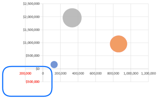
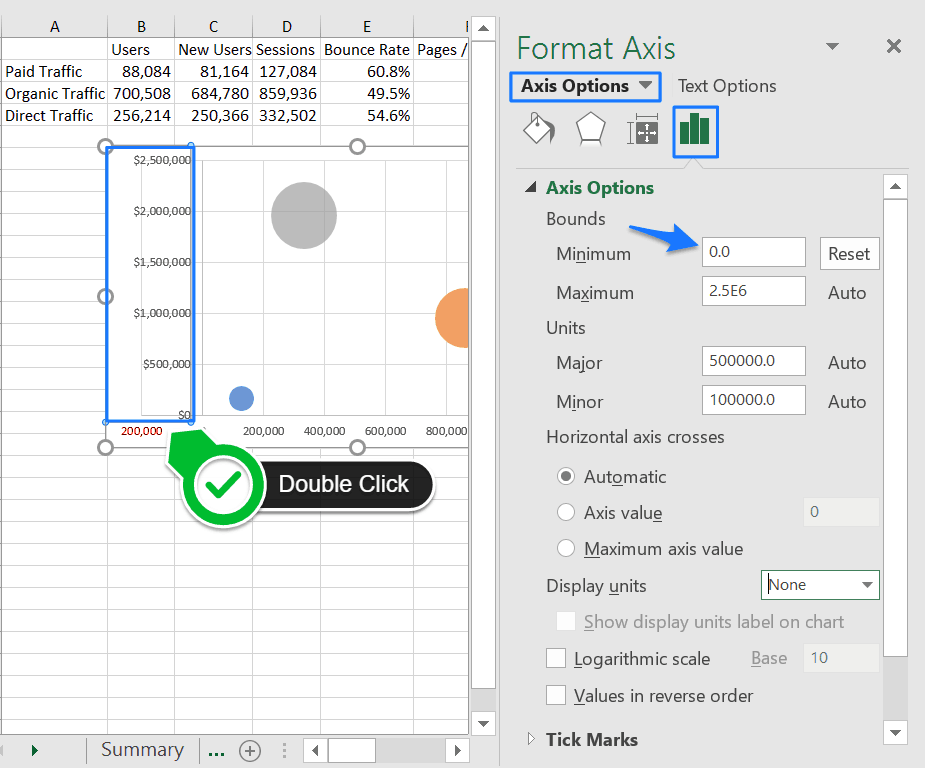
To change Axis Options like bounds and unit intervals double click on the vertical y-axis area of the chart and use the Format Axis menu.
-
For this tutorial, we’re changing the Bounds > Minimum to zero, but you can click on the tabs (Fill & Line, Effects, and Size & Properties) to make other alterations.
-
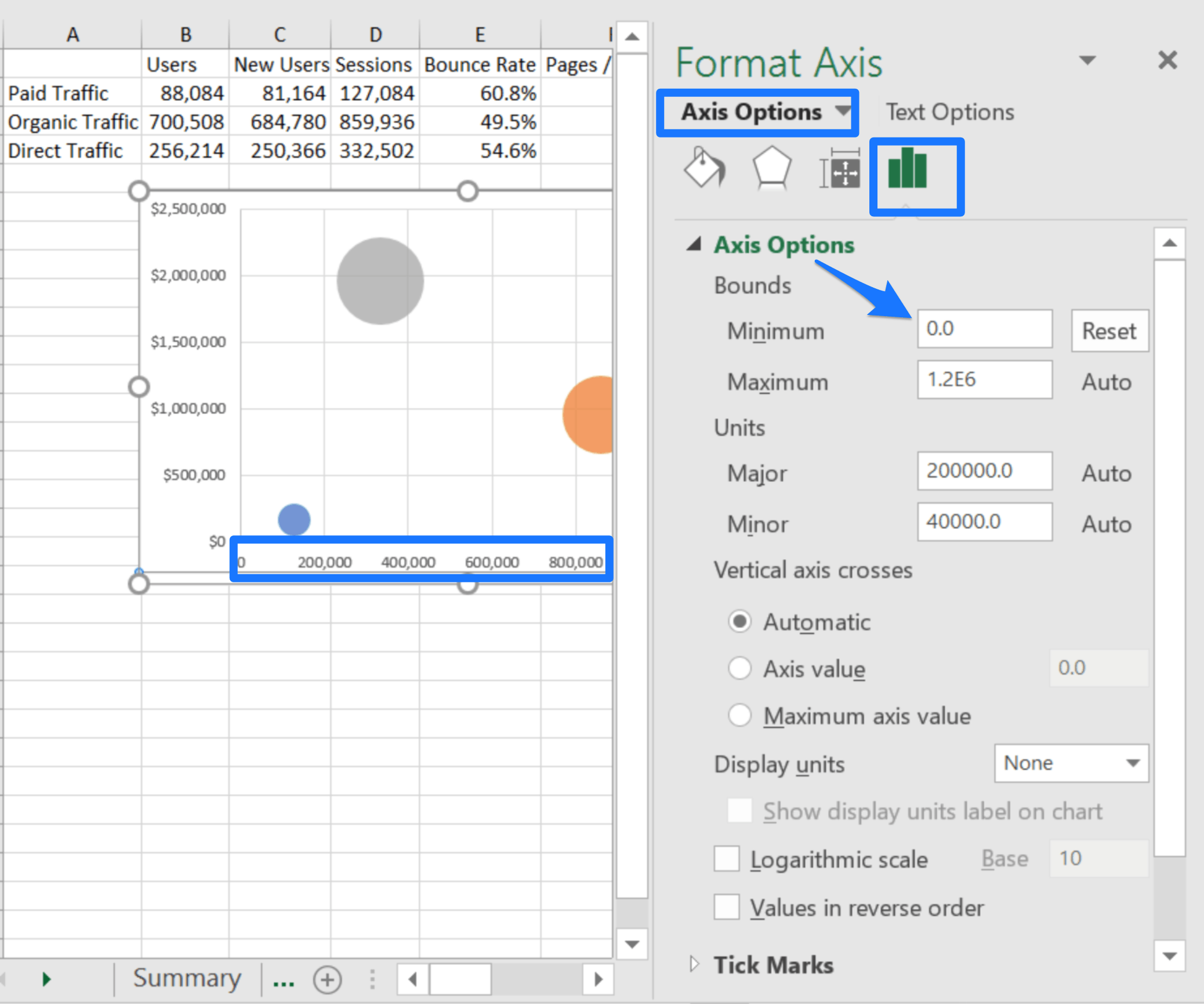
Repeat this step to format the Axis Options for the horizontal x-axis by double clicking the bottom area of the graph.
-
For this tutorial, we are also changing the Bounds > Minimum of the x-axis to zero (shown below).
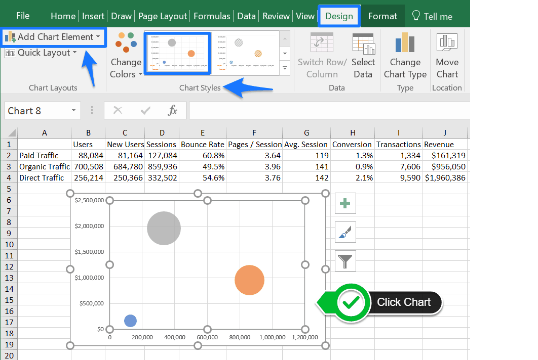
Add Chart Style and Elements
Click the bubble chart and the Design sub-menu options appear in the top ribbon. Select a pre-formatted Chart Style or click the Add Chart Element and click options like Chart Title, Legend, and Data Labels to make adjustments.
-
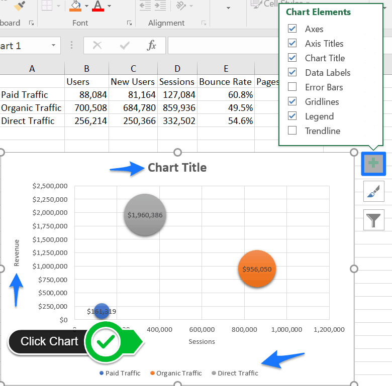
There is a shortcut to the Chart Elements. Click the bubble chart and three icons appear on the right. Select the Chart Element icon to add or remove elements like Axis Titles, Gridlines, and Error Bars.
-
For Microsoft Excel 2013, click the Design tab and click Add Chart Element. Select from Centered Overlay or Above Chart options from the Chart Titles option.
-
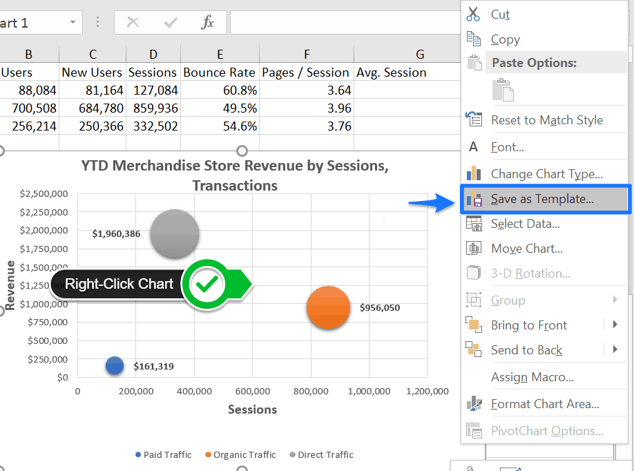
Excel Bubble Chart Template
To save time and experiment with different styles and formats, save your bubble chart as a template in Excel. Right-click the bubble chart and click Save as Template. Name the chart template in the File name cell. Click Save.
More Data Visualization Tools for Bubble Charts
Microsoft Excel is one of many software tools you can use to create and manage bubble charts. The market for data visualization tools continues to evolve and offer features that provide new ways of turning raw data into a compelling message.
- Google Data Studio: Business intelligence and dashboard tool from Google. Connect data sources from Google Sheets and Google Analytics accounts and convert data into dashboards featuring bubble charts and other reports. Data Studio offers “connectors” that link data across products like AdWords and YouTube Analytics, and allows for multiple data sources in a single report.
- Infogram: Create visualizations and reports with more than 35 interactive charts, including bubble charts, and more than 500 maps. Infogram features a drag-and-drop editor tool and a large database of GIFs and images to customize data visualization.
- RAWGraphs: An open source framework that merges spreadsheet applications with vector graphics editors (for example, Adobe Illustrator). RAWGraphs is a web-based application with no server-side operations so it does not store or make data available to anyone but the user.
- Slemma: Report generation without the code. Slemma Chart Designer allows non-technical users to build customized reports with bubble charts and other data visualization. Connects with third-party services and software integrations such as cloud databases, CRM, and social media platforms.
- Tableau: Self-service business intelligence platform for data discovery, visualization, and reporting. Drag-and-drop editor interface for non-technical users to navigate, create, and share customized dashboards featuring interactive visualizations including bubble and scatterplot charts.
What Is a Bubble Chart in Software Engineering?
Software engineers create web-based bubble charts with different programming languages instead of a graphics-based interface like the previously listed bubble chart makers or spreadsheet software. If you have the technical proficiency, or just want to practice creating bubble charts by writing code, here’s a list of data visualization tools that software engineers use:
-
Google Charts: Provides a free chart gallery with ready-to-use chart templates, including scatterplot charts and bubble charts. Google Charts recommends using JavaScript to embed the bubble chart on a web page, and uses HTML5/SVG technology for mobile-friendly data visualizations and cross-browser compatibility. A user will not need to install plugins or additional software to view a bubble chart made with Google Charts.
-
AnyChart: A flexible JavaScript (HTML5) based tool for embedding interactive bubble charts and other data visualizations into web-based or mobile projects. AnyChart offers integration with Google Sheets and provides dashboards for on-premises or SaaS systems with out-of-the-box capabilities for data visualization.
-
ChartFX: Business intelligence and data visualization for developers from SoftwareFX. ChartFX emphasizes visualization and data analysis with tools such as OLAP and IDE integrations that span seven development platforms including Microsoft Visual Studio, Java, HTML5, and iOS.
-
Python Graph Gallery: Developed and managed by Yan Holtz, this project is an online gallery to promote data visualization with Python. This graph gallery features hundreds of Python charts, including scatterplot and bubble charts, all with associated reproducible Python code.
-
ZingChart: A dependency free, JavaScript charting library for visualizing data in web applications. ZingChart provides dozens of built-in chart formats including bubble charts and bubble pie charts.
Make Better Decisions, Faster with Charts in Smartsheet
Empower your people to go above and beyond with a flexible platform designed to match the needs of your team — and adapt as those needs change.
The Smartsheet platform makes it easy to plan, capture, manage, and report on work from anywhere, helping your team be more effective and get more done. Report on key metrics and get real-time visibility into work as it happens with roll-up reports, dashboards, and automated workflows built to keep your team connected and informed.
When teams have clarity into the work getting done, there’s no telling how much more they can accomplish in the same amount of time. Try Smartsheet for free, today.