How to Create a Gantt Chart in Apple Pages
Enter Project Data into a Chart in Pages
- Open a blank document.
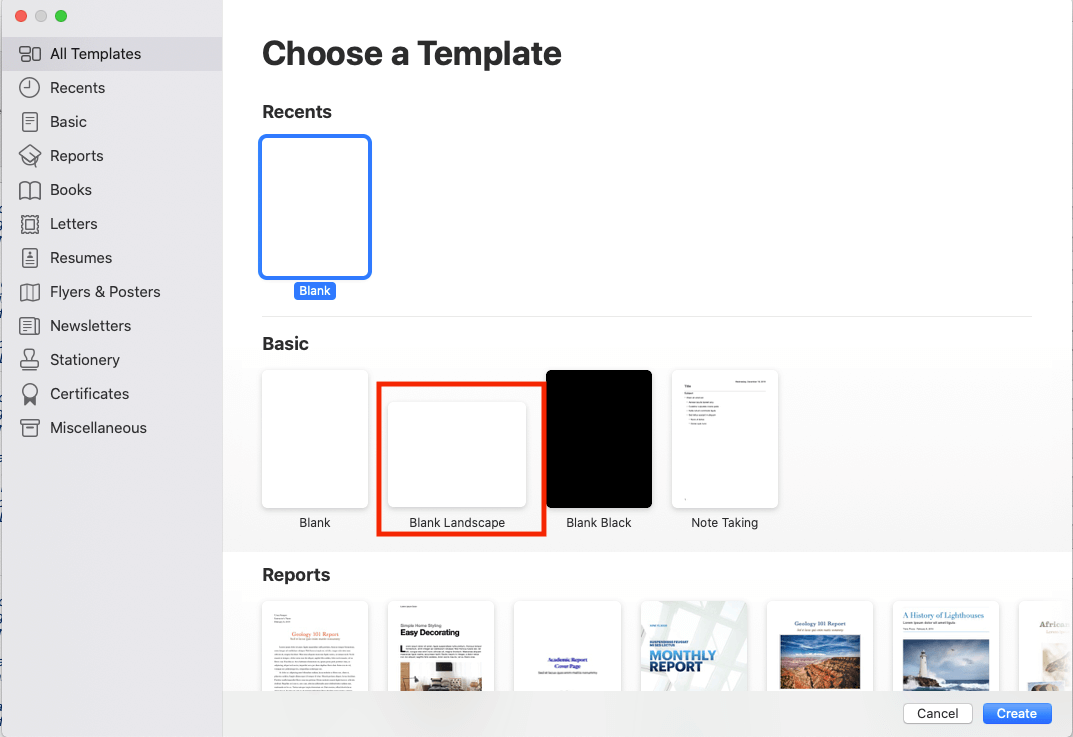
- Open Pages and double-click on Blank Landscape.
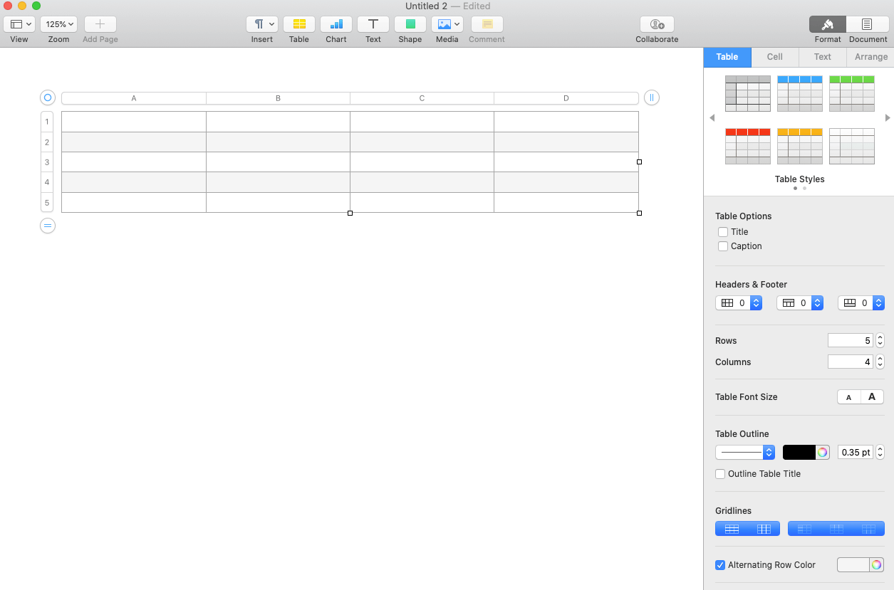
- Add a table.
- Click Table on the Pages ribbon and click on a table.
- Note: Later in this tutorial, you will learn how to customize any table you select.
- Pro Tips:
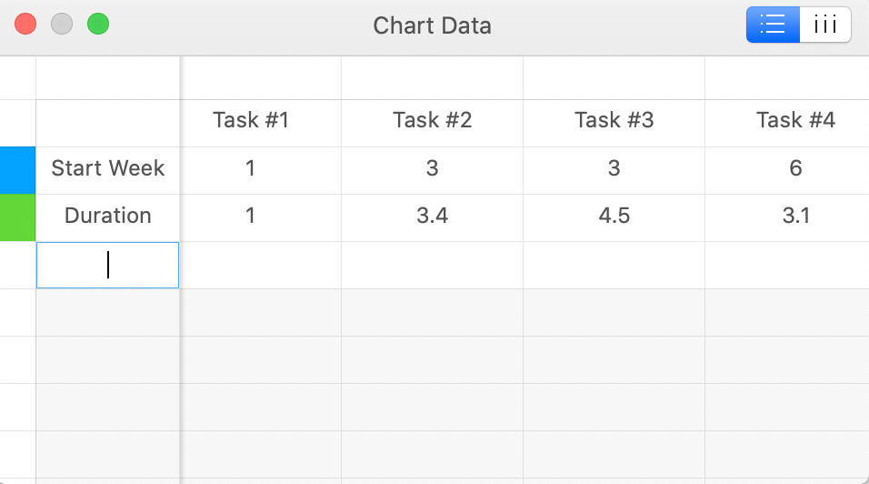
- Your chart should have three rows: one for tasks, one for start week, and one for duration.
- The number of columns in your table should equal the number of project tasks you have. Example: If you have four project tasks, your chart should have four columns.
- Add project tasks.
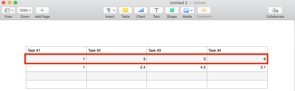
- List your project tasks in the first row.
- Add the first task in cell A1.
- Pro Tip: Keep task names short, so they fit on the graphic.

- Add the start week for each phase.
- In the second row of the table, add the start week for each task.
- Example: Underneath your first project task, enter the start time in weeks.
- Pro Tip: All project tasks should be mapped out in weeks, so the Gantt chart can show accurate timelines.
- In the second row of the table, add the start week for each task.
- Add the task duration.
- In the third row of the table, add the duration of each task (the amount of time required to complete each task) in weeks.
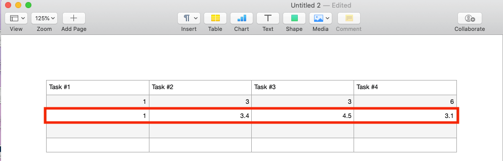
- In the third row of the table, add the duration of each task (the amount of time required to complete each task) in weeks.
Add a 2D Stacked Bar Chart to the Pages Document
- Build out the Gantt chart.
- Click Insert on the Pages menu bar.
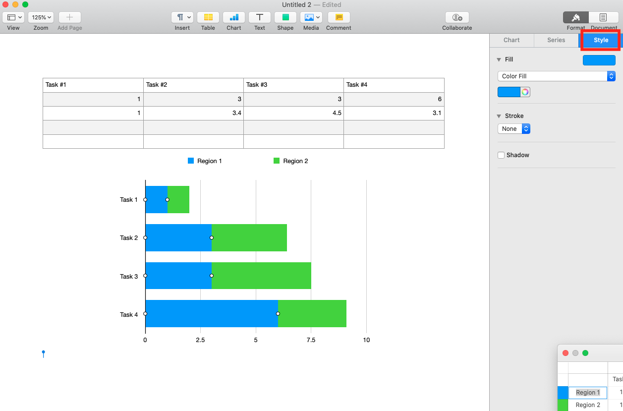
- Click Charts > 2D Stacked Bar to add a basic stacked bar chart to the page.
Input Project Data in Your Chart
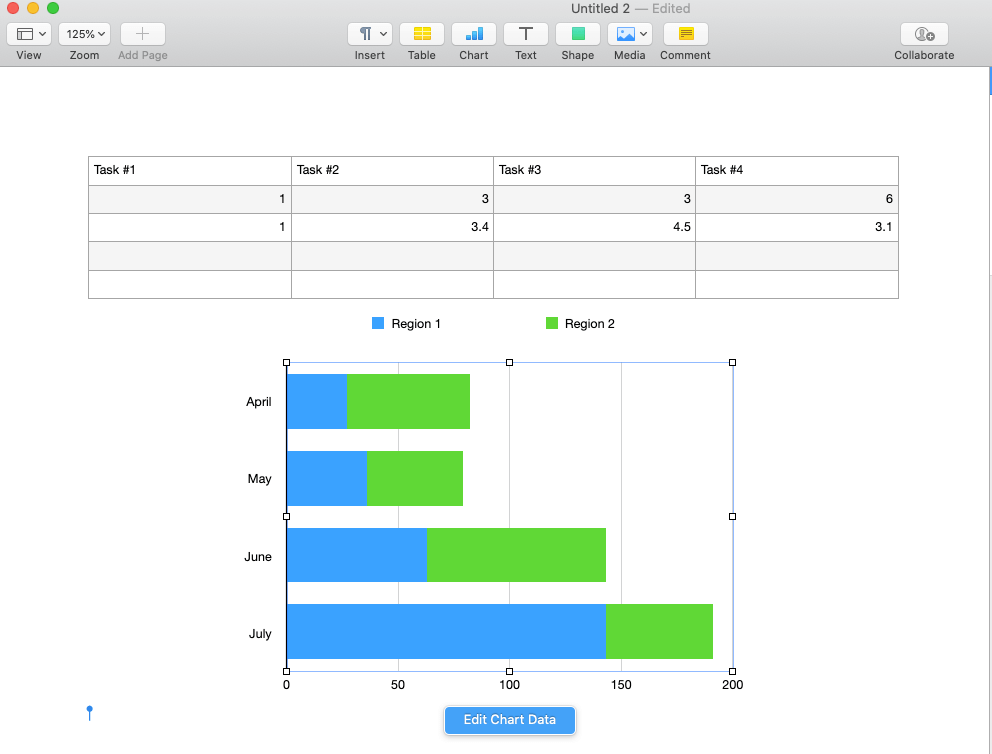
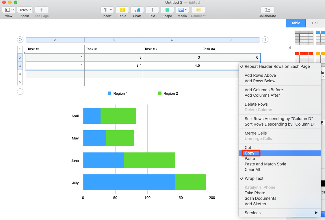
- Select all project data. Highlight the table with the project data, then right-click and click Copy.
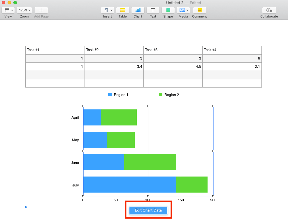
- Edit chart data. Click on the stacked bar chart. Click the Edit Chart Databutton. Pro Tip: This button appears when you select the chart area and disappears when you click elsewhere on the page.
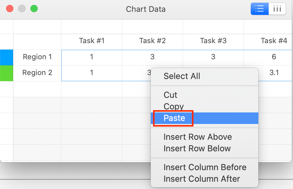
- Paste copied project data in chart.
- In the Edit Chart window, click the second cell in the top row (the cell with the word April).
- Press Command+V on the keyboard to paste the copied data.
- The graphic updates to display your project data.
- Rename rows in the new data table.
- In the first column, click the cell that states Region 1 and type Start Week.
- Click the cell with Region 2 and type Duration.
- Select all project data. Highlight the table with the project data, then right-click and click Copy.
Turn the Chart into a Gantt Chart
- Double-click on a blue bar in the chart.
- Customize the chart style.
- In the Format menu on the right panel of the page, click Style.
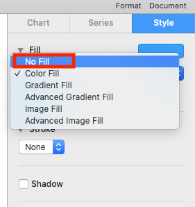
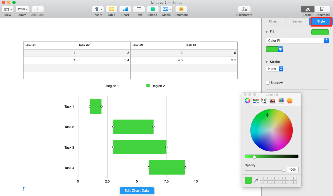
- Remove the color fill.
- Click the Color Fill bar, then click No Fill.
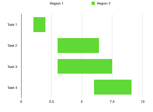
The resulting graphic will look like a Gantt chart that shows the duration in weeks for each task.
How to Adjust Task Durations on a Gantt Chart in Pages
Once you set up all the tasks and task durations on the Gantt chart, you’ll quickly see how tasks overlap. You’ll also be able to see if the duration of a task is too long or too short, or its order placement needs to shift.
Let’s say you’re building a house, and the task paint the walls starts before you complete the put up drywall task. You’ll need to alter the durations or push back some tasks to make your project plan work. To do so, follow these simple steps:
- Click on the chart area.
- Click the Edit Chart Data button. The window with all your chart data will appear.
- Adjust the start weeks and durations by adjusting Start Week and Duration numbers for tasks. You can also add or remove tasks by deleting them from the data set.
As your project progresses, you might need to update or change the dates and durations more consistently.
How to Customize a Gantt Chart in Apple Pages
Adding your own style to the Gantt chart can make it appear more professional and help you to better identify key project tasks. Color-coding tasks is useful if you plan on grouping tasks together and helps you create a better visual overview of your project.
Change the Color of Task Bars on a Gantt Chart
- Click on the chart area and select any of the bars.
- Select a color.
- In the Format tab, click Style.
- Click the color wheel and choose a color.
Change the Color of an Individual Task Bar on a Gantt Chart
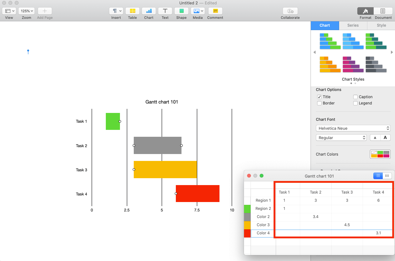
- Add rows.
- Click on the chart, then click the Edit Chart Data button.
- Click on the last row in your chart, then right-click and click Add Row Below.
- Repeat this step to insert 2-3 rows beneath the Duration row in your chart to create a separate series.
- Label each color.
- Name these rows Color 2, Color 3, Color 4, and so on for as many new colors you want to add to the chart.

- Name these rows Color 2, Color 3, Color 4, and so on for as many new colors you want to add to the chart.
- Change the color of a task bar.
- Select the duration value in its original row, then cut and paste it into one of the new rows. Note: You need to keep the value in the same column.
- Pro Tip: Any tasks with Duration values on the same row are part of the same series, so all tasks in that row change simultaneously. Tasks with Duration values on different rows are considered part of a distinct series that you can customize separately.
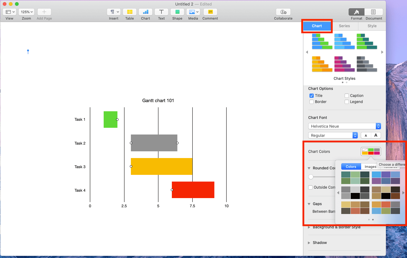
- Customize task bar colors.
- Click on the chart.
- The Chart tab appears in the Format menu.
- Click Chart Colors, then click a color theme. Note: By changing the color scheme, you add the Start Week bars to the chart.
- Follow these steps to remove the color fill, so that you still have a Gantt chart.
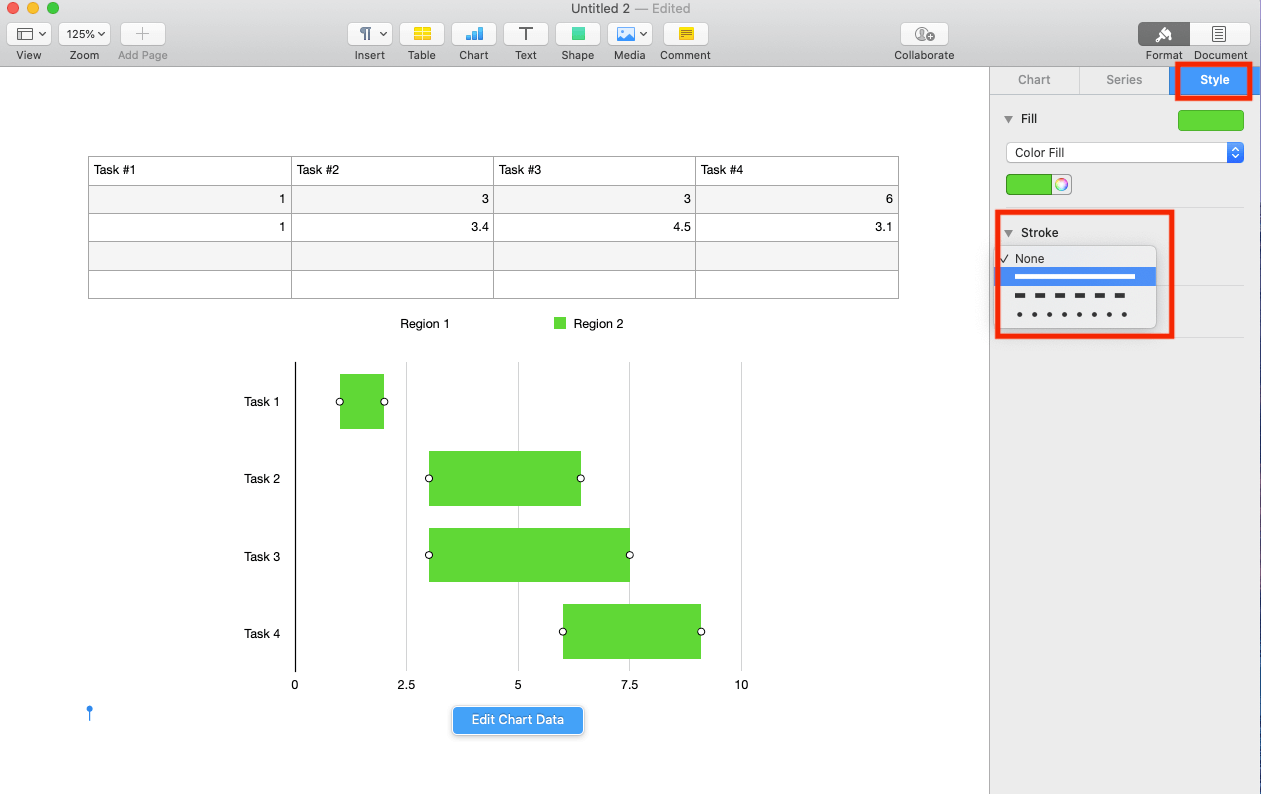
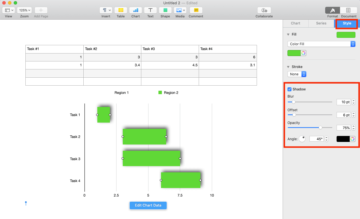
Customize Borders and Shadows of Task Bars
- Click a Duration bar on the Gantt chart.
- Adjust borders.
- In the Style menu, click the Stroke button (add a border to the bar), then click the desired stroke.
- Adjust the color and point (thickness of the border).
- Add effects.
- Click the Shadow box to create shadows.
- Click the Shadow box to create shadows.
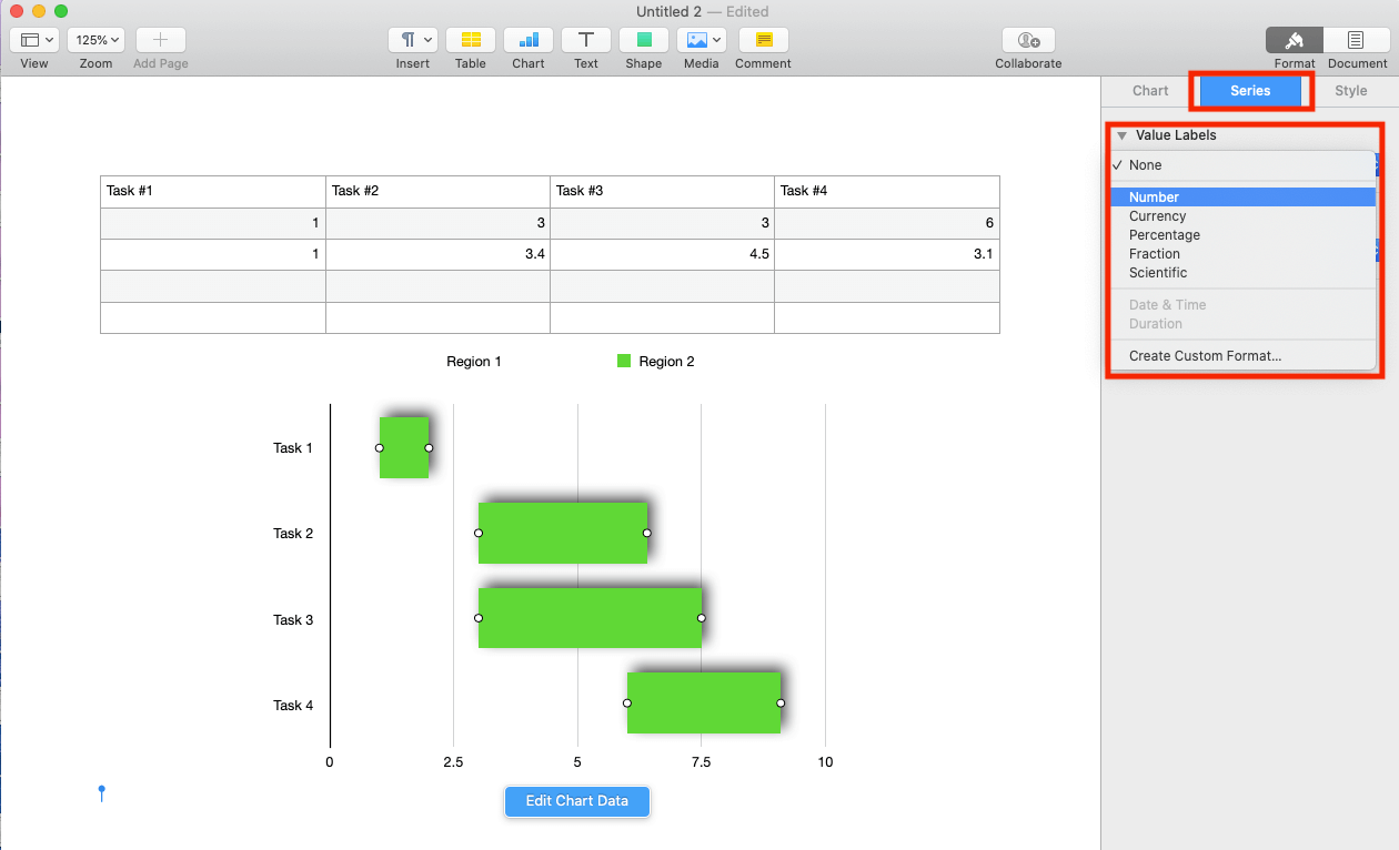
Display Task Durations on a Gantt Chart
- Highlight all bars on the chart.
- Click and hold down Shift on your keyboard while also clicking on each Duration task bar. The Series tab will appear in the Format menu bar.
- Add week counts.
- Click the Value Labels, then click Number from the dropdown menu. The number of weeks the task should take will appear on the task bar.
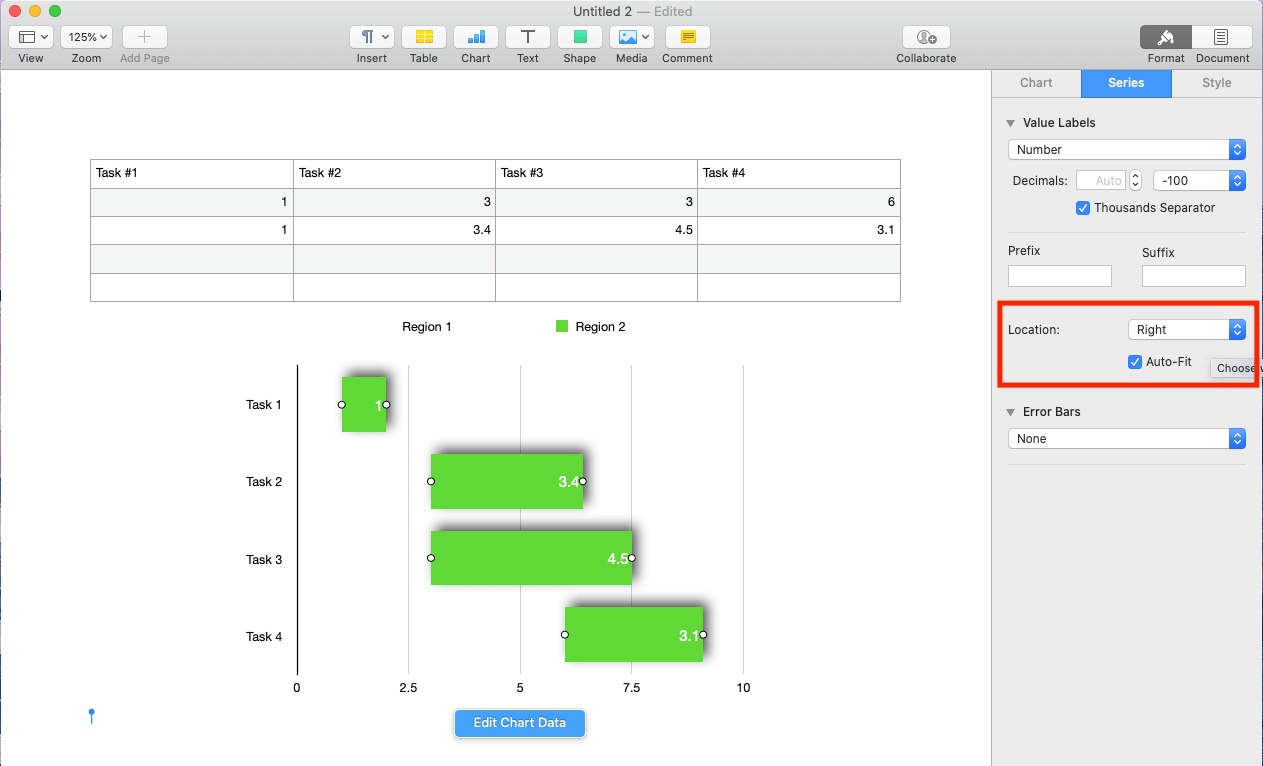
- Change the placement of the value labels on the bars.
- Click the dropdown menu associated with Location.
- Then click on your preference: Right, Middle, or Left.
- Click the Value Labels, then click Number from the dropdown menu. The number of weeks the task should take will appear on the task bar.
How to Customize the Area Around a Gantt Chart
Not only can you customize the task bars, you can also customize the area surrounding the Gantt chart.
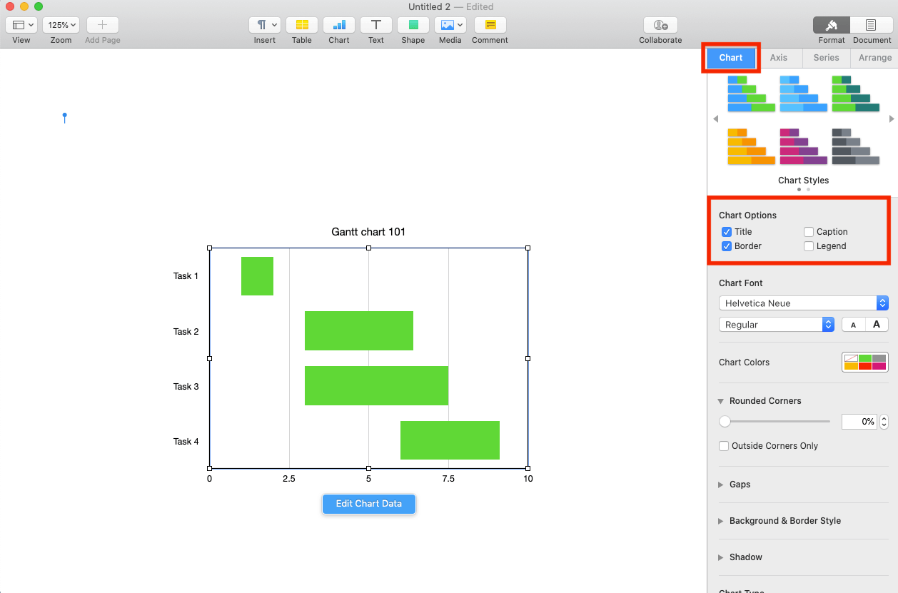
Add a Title and Borders to a Gantt Chart
- Click and highlight the entire chart.
- Click on the Chart tabs in the Format menu.
- Click the Title and Border boxes.
- Click on the word Title at the top of the chart, and type your title in the resulting box.
- Use the options in the Chart Title tab in the Format menu to adjust font, color, style, and alignment.
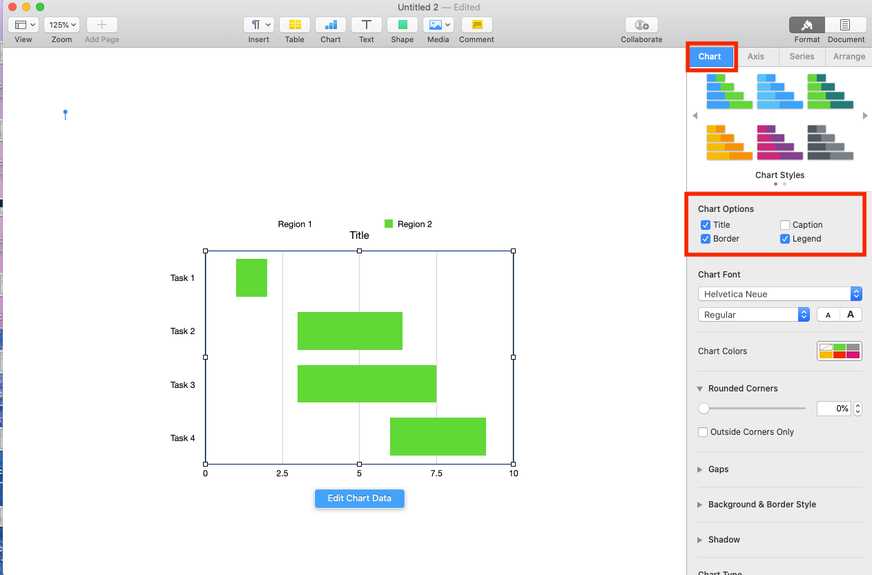
Remove the Chart Legend
- Click and highlight the entire chart.
- Click the Chart tab in the Format menu.
- Uncheck the Legend box.
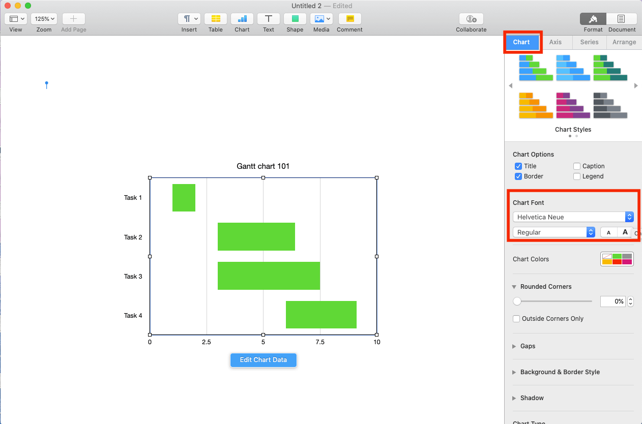
Customize the Font of a Gantt Chart
- Click and highlight the entire chart.
- Customize the font and font size.
- Click the Chart tab in the Format menu.
- Navigate to the Chart Font section and select your preferred font and font size.
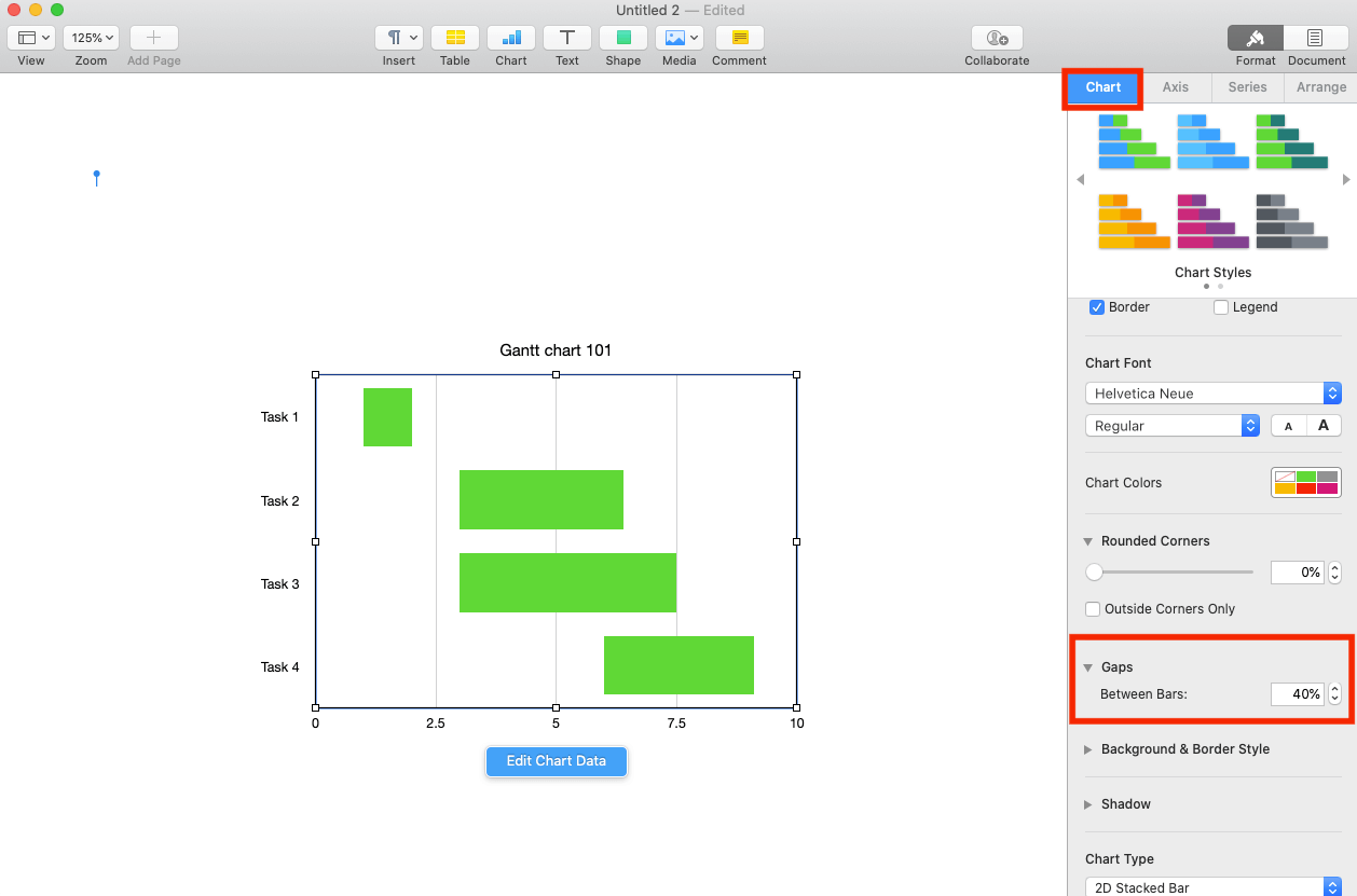
Adjust Task Bar Spacing
- Click and highlight the entire chart.
- Modify the gaps between bars.
- Click the Gap section of the Chart Options section, and increase or decrease the Between Bars percentage number.
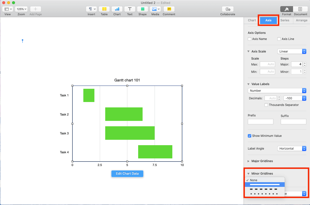
Add Vertical Lines to a Gantt Chart
- Click and highlight the entire chart.
- Select vertical line preferences.
- Click the Axis tab in the Format menu.
- Navigate to the Minor Gridlines section, and click the type of lines to display vertically on the chart.
- Pro Tip: You can use the additional options in the section to customize the color and width of the lines.
- Pro Tip: You can use the additional options in the section to customize the color and width of the lines.
Looking for additional instructions on how to create a Gantt chart on Mac Numbers, another Apple product? Here are step-by-step instructions on how to create your Gantt chart in Mac Numbers.
Gantt Chart Apple Pages Template
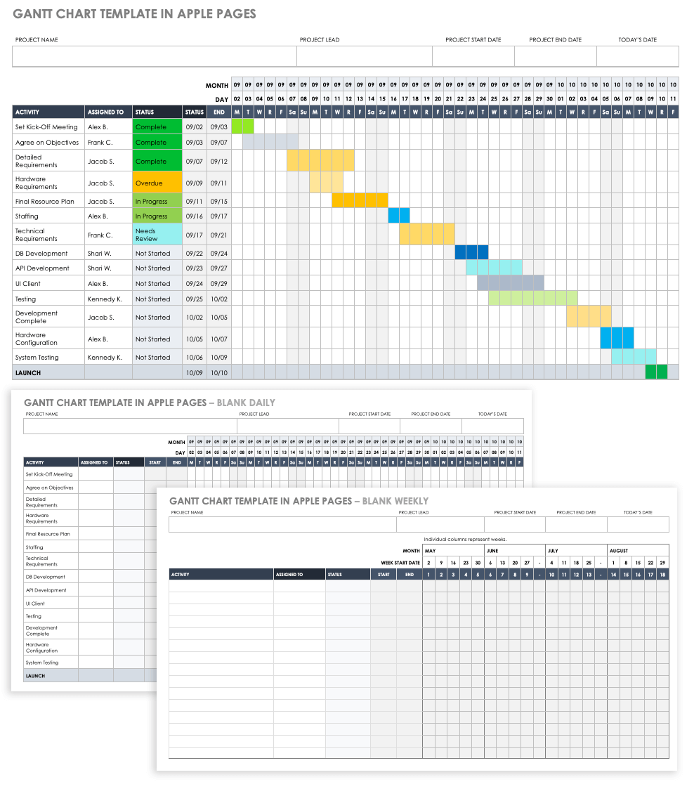
Download Gantt Chart Template in Apple Pages
If you’re looking to use a premade Apple Pages Gantt chart template, download this free version. As with any other Gantt chart, use it to track all project tasks and deliverables on a predetermined timeline.
For additional Gantt chart templates in a variety of formats, visit our article with the largest offering of Gantt-specific templates.
How to Make a Gantt Chart in Smartsheet
Looking for an even easier, faster way to create a Gantt chart with just one click? Watch this short video that shows you how to create and use a Gantt chart in Smartsheet, or get step-by-step instructions for how to create a Gantt chart in Smartsheet.

Get the Most Out of Your Gantt Charts with Smartsheet
Empower your people to go above and beyond with a flexible platform designed to match the needs of your team — and adapt as those needs change.
The Smartsheet platform makes it easy to plan, capture, manage, and report on work from anywhere, helping your team be more effective and get more done. Report on key metrics and get real-time visibility into work as it happens with roll-up reports, dashboards, and automated workflows built to keep your team connected and informed.
When teams have clarity into the work getting done, there’s no telling how much more they can accomplish in the same amount of time. Try Smartsheet for free, today.


