What Are Operations or Operational Dashboards?
Operational dashboards are a perfect fit for fast-paced teams like customer service and sales. These business intelligence visualization and data reporting tools monitor business processes that frequently change to track the current performance of metrics and key performance indicators (KPIs). Compared to other types of dashboards, data in these dashboards updates more often, sometimes on a minute-by-minute basis. Subject matter experts used dashboards to monitor progress towards a target, and may set it up so that it automatically sends alerts when deviations from set standards occur. The information is the basis for any corrective actions and additional analysis. Because of the need for detail, operational dashboards also hold more data than other types of dashboards.
Benefits of Operations Dashboards
Management guru Peter Drucker once said, “What you can measure you can manage.” Businesses everywhere listened. Over time, it’s almost become a cliche, and yet completely appropriate when it comes to understanding the ultimate benefit of operations dashboards: to ensure that operations are running on target. Other benefits of operations dashboards include:
Supporting Proactive Management
Business owners, operational responsibility center managers, and project stakeholders need to stay in control and ahead of problems. Up-to-the minute data and leading indicators help identify emerging patterns and trends, eliminate inefficiencies and redundancies, and support the quick decision-making businesses must make to stay competitive. Operations dashboards are a helpful tool to focus and align strategic and tactical goals, and keep everyone on the same page.
Enabling At-a-Glance Visibility in Real-Time
When real-time data fed from single or multiple reliable sources are analyzed and converted to easy-to-understand visualizations, it’s easy to check the health of your business and take appropriate action. Drill-down capability makes it possible to understand the underlying cause(s) of problems and quickly correct issues. In addition, checking status and reporting from a mobile device makes monitoring at any hour possible and ultimately improves reaction time.
Fostering Continuous Improvement in Every Activity
Operations management is about converting resources into service and goods in the most efficient way possible and ultimately, to create value. Continuous improvement is about making the incremental changes that reduce waste, streamline work, and improve profitability - the basis of excellence in operations management. The dashboard you use to monitor business activity should be adaptable to accommodate any changes needed to improve performance and reach higher levels of productivity.
Different Types of Business Intelligence Dashboards
Operations dashboards are one of the three categories of business intelligence dashboards that companies use. Most organizations make use of all three since they have unique and yet complementary functions.
The Difference Between Analytical and Operational Dashboards
As you can see from the chart, analytical dashboards use historical data to assist in establishing targets. Users are looking for insights into the past and future. On the other hand, operations dashboards exist to manage day-to-day business occurrences. One similarity between the two is that they both are capable of revealing data trends and drill down through current intelligence for alerts to recognize issues that may arise.
Operational Dashboards Examples
Operations managers evaluate all the pertinent data and decide on a course of action. Whether they work in services that generate an intangible products (like government, entertainment, lodging, financial, and healthcare) or manufacturing to make a tangible product. Most products they deal with are a combination of goods and services to be managed.
Operation dashboard examples include:
- Manufacturing/production: Production numbers, goods packed and shipped, and observed defects reports.
- Customer service: Report tickets received, opened and closed tickets, the number of calls made, and customer satisfaction information.
- Daily web analytics: Report on new visitors, unique visitors, bounce rate, and average time spent on site.
How to Choose or Design Operational Dashboards
Dashboards are making a difference in every size and type of business around the world. Despite their ubiquity, dashboards can be challenging to choose or design and implement. To ensure that your operational dashboard meets expectations, consider these ideas:
Top Tips for Effective Operational Dashboards
- Executive sponsorship: Dashboard initiatives need an executive who understands business challenges and carries enough authority to make things happen. Once assigned, the champion should stay involved to keep the project front and center. Projects often begin with enthusiasm but fall by the wayside as focus shifts to other priorities. Without ongoing high-level sponsorship, teams may lose interest, and the dashboard can fade into irrelevance.
- Use the most important metrics & KPIs: Start by asking team members who will use the dashboard what data will make it easier to do their jobs.Then take a top-down approach to developing measurements: start with the priority business decisions the team identifies to develop KPIs, and then determine which data will support those decisions to develop relevant metrics.
- Data should be current and logically organized: Supply real time data and auto-sync it from applicable web APIs, spreadsheet data, and databases. Think about how to group the information: you can create displays by department or functional area and can include product, sales, marketing, finance, and roles. Emphasize the most important data by placing those in the upper left and center areas of the dashboard.
- Audience relevance: Understand the intended audience and the scope of their requirements. Developing and testing with end users is a best practice that will ensure good design and utility.
- Simplicity: This is where good design principles come into play. The dashboard should be easy to implement and use.
Visual Design Tips for Improved Usability
Consider Gestalt principles for the overall look of your operations dashboard. Gestalt is a term that means "unified whole" and refers to theories of visual perception developed in Berlin in the 1920s. It is widely used by professional web designers to create highly usable tools. There are some elements to consider as you design your own dashboard:
- Similarity: Similar things (e.g., color, size, shape) are perceived to be more related than unique things.
- Proximity: Things close to each other are understood to be more related than things spaced farther apart. When looking at an arrangement of individual elements, people tend to see a recognizable pattern.
- Continuity: Objects arranged on a line or curve are understood to be related.
- Experience: People tend to gather elements in a way that reflects experience, either as individuals or as a group.
- Focal Point: A point of interest or emphasis will capture and will tend to hold the viewer’s attention.
- White Space: This refers to the blank area between graphical elements, text, images, and other visuals. White space can be filled with a color but remains free of any elements like text or images. It often indicates design sophistication and elegance, and is a method to organize items and text to guide users attention to certain features.
Operational Dashboard Templates in Excel
Operational dashboards can be found in all departments, but are most common in areas where it's essential to act on critical information quickly such as sales, marketing, or production manufacturing teams. Excel is often an ideal tool for beginning a dashboard initiative because it’s readily available, team members are likely familiar with the program, you don’t need to be a developer to design one, and it should deliver results in a relatively short time frame. As your operations tool program evolves, however, you might consider a more sophisticated operations management tool.
Operations/Productivity Dashboard Template
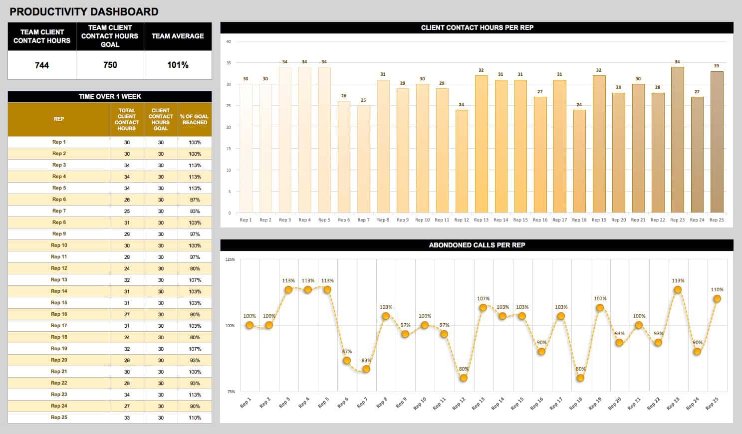
Monitor, evaluate, and manage the quality and productivity from your entire organization. This easy-to-use and adaptable dashboard provides insight into business objectives as well as status of the company culture by checking employee satisfaction metrics against performance.
Download the Operations/Productivity Dashboard Template
IT Operations Dashboard Template
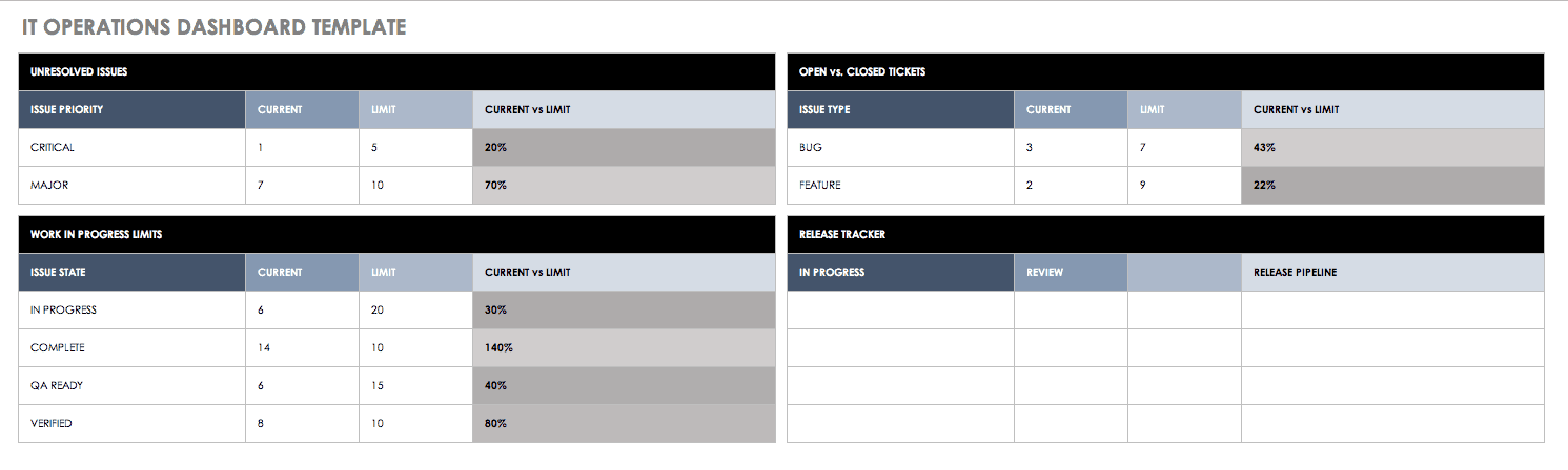
Improve collaboration between IT, operations, and help your team stay on task and on time. Use the panel for communication among an IT team, to monitor performance, and to keep tasks schedule. This Agile-friendly dashboard highlights releases, features, and unresolved issues.
Download IT Operations Dashboard Template
Daily Web Analytics Overview Dashboard Template
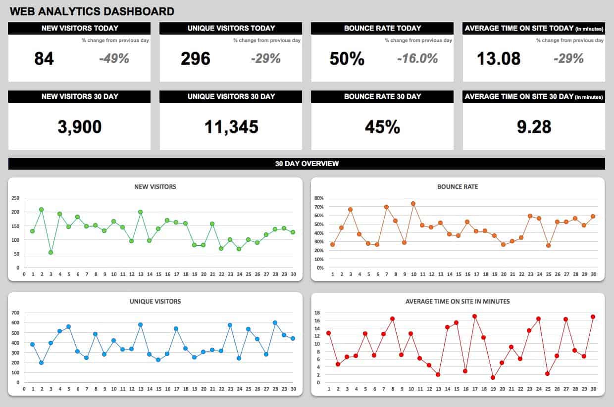
Track website analytics each day and over time. This template is designed for quick visibility into the metrics that matter, like site performance and business goals. Monitor new and unique visitors, bounce rate, and average time spent on site with this customizable dashboard template.
Download Web Analytics Dashboard Template
Sales Operations Dashboard Template
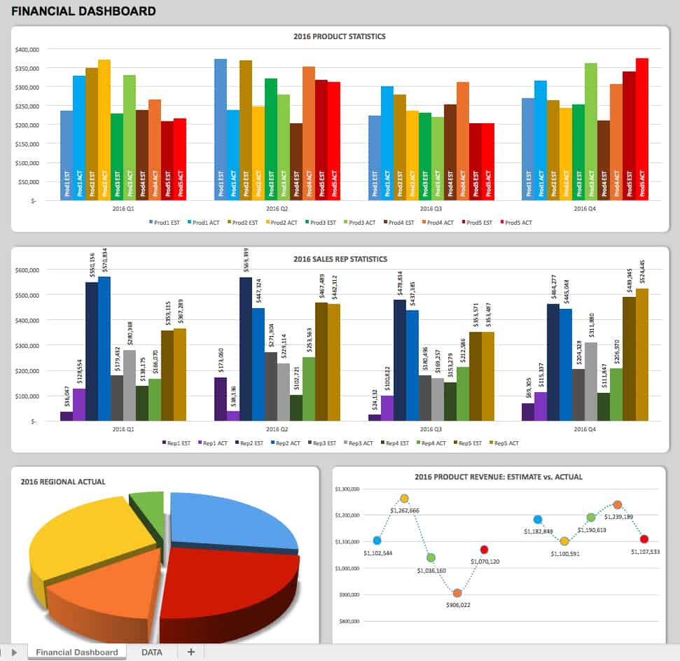
Whether you’re analyzing business growth, tracking revenues, or making strategic decisions based on fiscal performance, this dashboard can clarify where you are with your sales operations and allow you to drill down to understand the data. Compare current sales and product information to past data, and take action.
Download Sales Operation Dashboard Template
Sales Leadership Dashboard Template

Sales leaders can track relevant data by region, product, sales person or any metric they deem important. Having sales data at hand provides insight into any issues that require resolution. With visibility into timely data, leaders can ensure employee accountability and expedite progress to achieve sales goals.
Download Sales Leadership Dashboard Template
Client Service and Support Dashboard Template
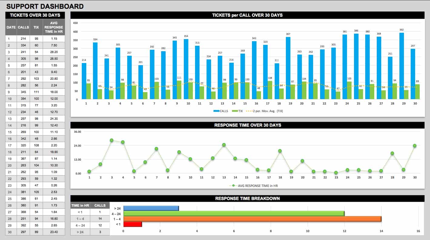
Track response time and monitor performance by the day, week, or month. This dashboard reveals trends and provides the necessary information to remedy areas such as lagging service or provide praise to team members who deliver outstanding client service.
Download Client Service and Support Dashboard Template
Project Management Dashboard Template
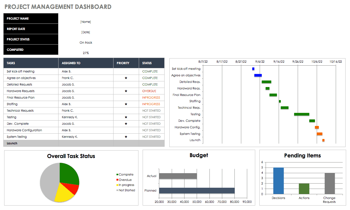
Stay on track and refine your project management process with this dashboard that monitors timelines, tasks, risk analysis, financial data, revisions, and more. Aggregating critical project data facilitates team communication and helps keep projects on budget and schedule.
Download Project Management Dashboard Template
Supply Chain Dashboard Template
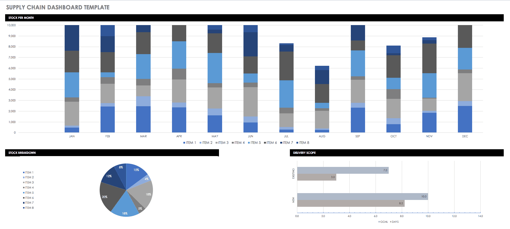
Review orders, inventory, and the efficiency of your processes. Oversee performance using KPIs, and take advantage of opportunities to create more streamlined and profitable systems.
Download Supply Chain Dashboard Template
Marketing Dashboard Template
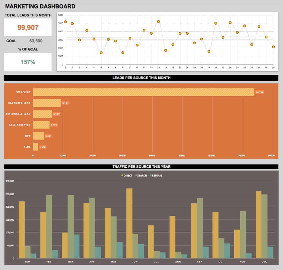
Marketing is all about tracking metrics, and this easy-to-use, adaptable template displays the success of your efforts at a glance. Use up-to-the-minute data to help attain your goals.
Download Marketing Dashboard Template
Human Resources and Recruiting Dashboard Template
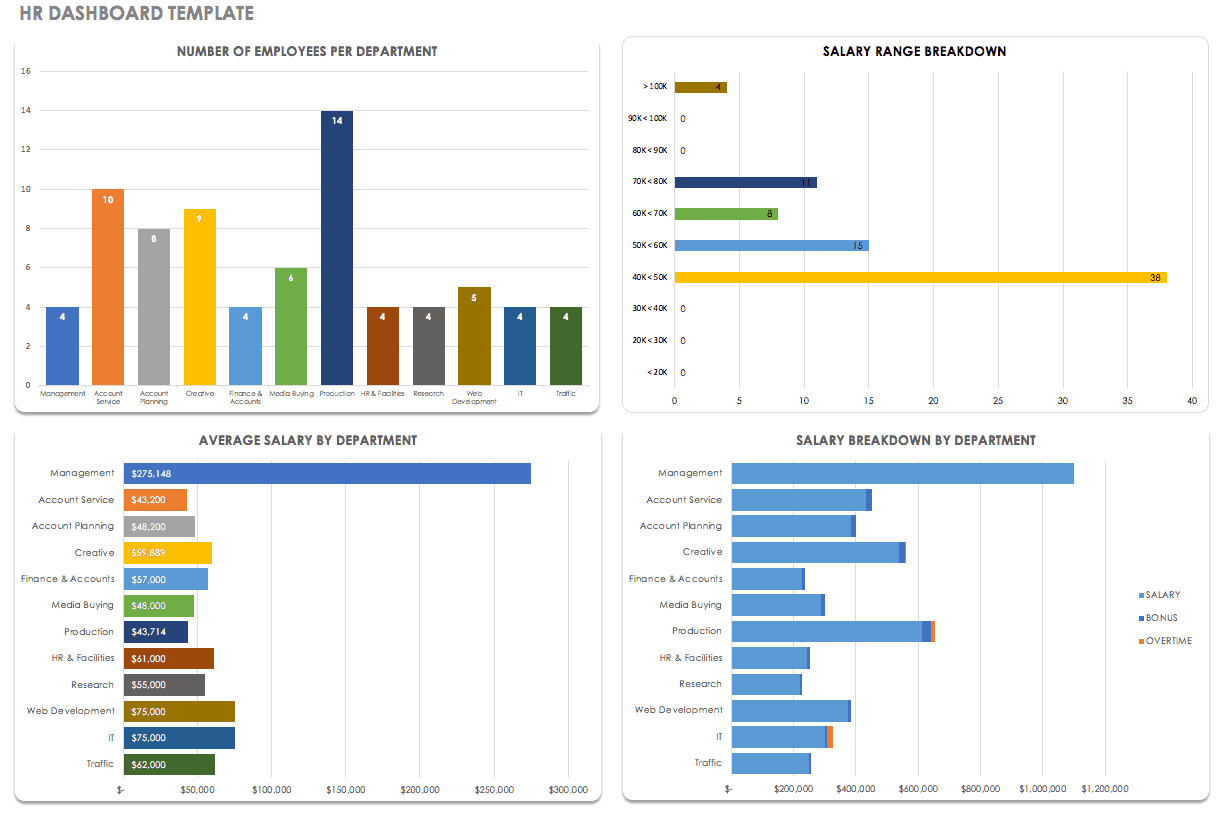
Managing hiring and personnel is easier when you can visualize your HR data. This dashboard is completely customizable, so you can modify it to feature the metrics that make the most sense for your organization, from salaries to employee satisfaction to benefits.
Make Better Decisions, Faster with Smartsheet Dashboards
Empower your people to go above and beyond with a flexible platform designed to match the needs of your team — and adapt as those needs change.
The Smartsheet platform makes it easy to plan, capture, manage, and report on work from anywhere, helping your team be more effective and get more done. Report on key metrics and get real-time visibility into work as it happens with roll-up reports, dashboards, and automated workflows built to keep your team connected and informed.
When teams have clarity into the work getting done, there’s no telling how much more they can accomplish in the same amount of time. Try Smartsheet for free, today.

