Definitions: What Is Dashboarding?
At their most basic, dashboards are tools that let a reader or user see any grouping of information at a glance. Modern dashboards can be customized to include data from numerous sources, so successful dashboarding hinges on the user’s choices. For enterprises, business intelligence (BI) dashboards synthesize the information to display key performance indicators (KPIs), such as new customers gained per month, gross loss, and targets vs. actuals.
To add context to these at-the-moment data points, dashboards also employ performance scorecards to present data over time and rate them against a goal. Performance scorecards are a graphical representation of a KPI’s health and help measure the business trajectory. They’re used to integrate data from spreadsheets and analytics tools for work in sales, marketing, human resources, asset management, and security, to name a few.
Download Project Management Excel Dashboard Template
Here is an example of a basic executive-level dashboard, presenting several types of information, KPIs, trends, and other data.
Many dashboards are proprietary to one data source; a popular example is Google Analytics, which is used by millions of businesses to track ad attribution, website traffic, and sales conversions. It doesn’t allow full customization of any data you want, but it does have filters and views with specific types of data using widgets to create the summary you need.
Other dashboards are more open-ended and can be built from scratch; for example, Tableau and Smartsheet can store data from the sources you want and create dashboard GUIs with custom widgets. Such dashboard platforms can incorporate data feeds from proprietary widgets for a more complete business overview.
History of Dashboards: How Did We Get Here?
To understand modern dashboards, it’s helpful to understand how the concept began. Dashboards originated from the instrument panels of the first automobiles in the 19th century, when cars featured gauges easily seen and scanned by drivers. These analog displays of real-time engine conditions informed drivers when they were overheating or running low on fuel — data vital to the continued operation of the car. Dashboards eventually became a common feature in trains, motorcycles, and planes, as well.
As computer systems emerged in government and university settings, this concept of centralizing vital information led to the idea of digital dashboards. These decision support systems (DSSs) were a type of management research in the 1970s that was primarily spreadsheet-based. By the 1980s, there was enough investment in internet technology that a rudimentary version of the idea evolved: the executive information system (EIS). These systems recovered data from mainframe units for help in executive decision-making. However, EISs had problems with refreshing data and often delivered incomplete, outdated, or unreliable information.
By the mid-1990s, technology had caught up to the concept, and the strategy behind these systems evolved, too. Robert S. Kaplan led studies with David P. Norton about performance measurement and KPIs, and eventually championed the Balanced Scorecard (BSC), which would inspire dashboards with a simple graphical user interface (GUI) to display both data over time and at a specific moment — all of which could be instantly interpreted. In 1998, Bill Gates of Microsoft described the business intelligence dashboard as a “digital nervous system,” which, like the human body, is “always alert to the most important things, and [blocks] out the information that’s not important.”
How Are Dashboards Different from Scoreboards?
In the modern business world, many organizations treat balanced scoreboards and dashboards as if they were interchangeable. While the designs of each are increasingly converging, their formats are not the same. You can think of them this way: A dashboard shows the status at a specific point in time (for example, your car’s dashboard), whereas a scorecard reports changes over time (for example, a ball game’s period-by-period breakdown).
A balanced scoreboard has what is called a prescriptive format. It should always contain these components:
Perspectives: A chosen selection of high-level strategic areas.
Objectives: Goals and targets pulled from a strategy plan.
Measures: More commonly known as metrics or key performance indicators (KPIs).
Stoplight indicators: Symbols in red (late or far below prediction), yellow (potentially in danger), or green (on track and on budget), which provide an at-a-glance view of a measure’s performance.
Each section of the balanced scorecard covers the business’ critical strategic needs. The scorecard can be a supporting piece of a business dashboard.
The design of a dashboard is less constrained, but expect to see a series of graphics, charts, gauges, and other indicators that can be observed and audited.
6 Key Benefits of Dashboards
Dashboards can help make any business easier to run, and the larger the organization, the more vital they become. The benefits of successful dashboards include:
- Applying a human perspective to the visual perception of information. You can look at your car’s dashboard and see that you have plenty of fuel, but the tire pressure check light is on. From this, you may decide that while you could keep driving for a long time, you should stop to avoid damaging your wheels and alignment. In the same way, a BI dashboard instantly tells you the most important information to determine if your business is doing well. In both cases, that data comes together in a central location where you can monitor and analyze performance, supply, and other important stats.
- Enabling fast, intelligent decision-making with a minimum of distractions. With on-demand, accurate, and relevant data in hand, you can make smarter choices in line with business priorities, which will help your organization stay competitive. For example, if the dashboard shows that the average rate of inventory shipments is too low this month, you can then decide to hire more warehouse staff or lease more delivery trucks before you upset too many customers.
- Increasing executive engagement. Executives aren’t on the front lines, nor should they be. Their authority comes from making good decisions that affect everyone in the business for the long term. A well-built dashboard can get them the high-level information they need without having to dive deep into the data or exchange countless emails with middle managers.
- Analyzing efficiencies and inefficiencies. Why is HR spending so much on headhunters when turnover is trending low? Why does the IT department have such a high number of outstanding tickets when it recently added more staff? Why are so many projects getting held up in client review? A proper dashboard allows you to answer these kinds of questions from a higher-level perspective, or at least present results and trends to the team and motivate employees with precise goals.
- Identifying negative trends for course correction. Failure in larger organizations is often the result of receiving too little information too late. For example, a software development company might see that the number of users of its primary apps and the marketing return on investment (ROI) are both decreasing. Thus, they could conclude that they either need to hire an outside agency to help reposition them or develop new apps because the market is no longer interested in its current offering. Because both decisions require significant upfront costs and time to put into action, the information has to be identifiable quickly — which is where a dashboard could be of service.
- Aligning strategies across departments. Smart leaders can come to good decisions for their team or department in a vacuum, but when operating with every other part of the organization, their choices may not make sense. An executive-level-overview dashboard can take the most important KPIs from each department and compare them against each other to see how they intersect and affect one another. In the process, you would save time by consulting one dashboard that allows visibility into multiple systems instead of running numerous reports.
Important Dashboard Functions
Dashboards fall into three general functional groups, which influence their design. Some dashboards may have overlapping functions, but in general the three types include the following:
Strategic Dashboards
Strategic dashboards help managers of any level by providing an overview of business health and opportunities, current performance, and forecasting. They should show data snapshots for a period of time (say, a week or a month) and inform big decisions. They don’t need to be interactive and typically should show data that is self-evident for planning needs.
Analytical Dashboards
Analytical dashboards show data over time and with comparative abilities. They’re focused not only on the content of the data, but also on the context. This allows analysts and more direct managers to draw meaningful insights without digging through the data themselves. These dashboards are almost always interactive (allowing users to dive deeper into specific data points when need be) and are ideally linked to the actual data sources themselves.
Operational Dashboards
Operational dashboards need to be the most up-to-date and easy to work with because they are used for monitoring events and activities that are frequently changing. Users may need to act on or respond to the information at a moment’s notice. Operational dashboards don’t need to be interactive, but they must display real-time data to truly serve their purpose.
Best Practices for High-Quality Dashboarding
Between the different widgets and apps available and the many ways you can arrange them, it takes work to build an effective, goal-oriented dashboard. Make sure your dashboard has these attributes:
Focused: Keep your dashboard simple so that it communicates information easily. It should adhere to one particular purpose that determines everything included on it. Consider the types of dashboard functions covered above, and think about what they require. What department(s) does it serve? Who will be the users: managers, analysts, executives, clients? Think about what they need to know and what they intend to do with the data, then surface KPIs related only to that intent. The data should be meaningful and helpful to support the business.
Actionable: You must include widgets for data that can be viewed, analyzed, and then used. Include links or buttons that can take users directly to the spot where they can control what’s happening or to the email of the person who should handle it. Remember: You don’t want to create a culture of “knowers” — you are trying to create an environment of “doers,” and widgets with a clear purpose and function can help. Again, it’s best to choose KPIs that don’t require much extra research before moving forward.
Real-time and interactive: A dashboard needs to be accurate in the moment. Real-time data is a given, but it should also be interactive (to return to the car example, press on the gas pedal and a speedometer on the dashboard immediately registers an increase). If a user needs more information on a KPI, they should be able to dive into the source or change the parameters for comparison without leaving the app. Furthermore, today’s best web-based dashboard software needs flexible, powerful features. Don’t settle for a web-based dashboard that looks and feels like a static, read-only internet site from 10 years ago.
User-friendly for everyone: If a user cannot understand the story a dashboard is telling, it isn’t because the user lacks dashboard expertise — it’s because the dashboard isn’t designed properly. The fewer the distractions, the better; they can confuse your users. A dashboard isn’t a database or code; it’s a quick readout like a fuel gauge. What is the current status: good or bad? Anything more complex doesn’t serve the purpose. And while you want to open up dashboards to everyone, don’t pay for too many user licenses until you know the technology has gained wide adoption.
Extendable to other ecosystems (apps): You can’t rely on a single data source, be it Salesforce, QuickBooks, or Google Analytics. Your dashboard must integrate a wide variety of feeds, apps, SQL, and spreadsheet data to maximize its functionality. Your organization’s needs may change over time, so being open-ended is key.
Helpful Questions to Ask When Designing a Dashboard
When designing a dashboard, it can be helpful to start with business-critical questions. The answers, or the answers you want to get, will help inform your dashboard’s design. Here are some sample questions that might help you create visualizations for the right data. Of course, they will vary for your organization.
How many calls has our customer service center handled this week? Was it more or less than last week?
What are the top five products in sales revenue? Given those, where are the opportunities for those products?
What are the traffic sources to the website? Has there been an increase in search?
What does our marketing funnel look like, and is it on target?
What are the results of the latest lead-generation email campaign: click-throughs, demo requests, chats with sales?
As you map out the business-critical questions that need answers, it will become clear how you want to design and build your dashboards.
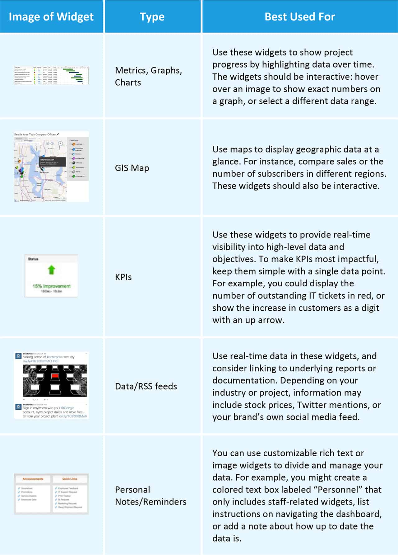
The Building Blocks: The Types of Dashboard Widgets
The component parts of a complete dashboard are called widgets, which are essentially mini-reports that pull data from one source and display it either in text or as graphics to represent a metric. Dashboards are composed of many widgets that together create context for analysis. Select the proper types of widgets with the best data for the dashboard you’re building, then arrange them into aesthetically pleasing reports.
Here are the major types of widgets:
Glossary of Dashboarding Terms
Balanced scorecard (BSC): Balanced scorecards are standardized reports that focus on an organization’s strategic agenda with only a few data items tracked, and are a mix between financial and nonfinancial metrics. They’re used to monitor the staff’s activities and their consequences.
Business intelligence (BI): Business intelligence refers to apps that mine raw data, then analyze, organize, and report on it.
Charts: In dashboards, charts are simple visual arrangements of data best used to display frequency or spread at a given point in time. They can also be special project trackers, like Gantt charts.
Customer relationship management (CRM): Customer relationship management is a type of software that sales teams use to track leads and salesperson activity. This type of data is commonly imported into BI dashboards.
Dashboard: A dashboard is a collection of mini-reports from one or more sources that can be used to quickly understand organizational health at a given point in time and to guide effective decision-making without manually combing through data.
Dashboarding: The practice of selecting, organizing, and optimizing types of data and KPIs for the most effective single-page report on organizational health and success.
Data-aware objects: An object or control panel that uses data from a database, including charts, graphs, maps, and more.
Drag-and-drop: This refers to interactive functionality wherein an element of your dashboard can be moved from one location to another by clicking on said element, holding the mouse button while moving it to the desired location, and releasing it.
Drill down: The act of clicking through a data-aware object or widget to receive more context or a link to its constituent database or source. Often, this data can be further filtered once opened to enable in-depth analysis.
Decision support system (DSS): Decision support systems are sets of programs that work with data to assist in analysis and decision-making. These are the earliest concepts of digital dashboards.
Executive information system (EIS): An executive information system is a type of DSS deployed throughout an enterprise, with a focus on strong GUI elements for ease of use with nontechnical executives.
Filters: A way of sorting data by specific parameters, usually available only after dashboard widgets have been examined. These can be custom-created to help with common analyst needs and improve efficiency.
Forecasting: The act of analyzing dashboard or scorecard data to make predictions. The better a dashboard is constructed, the more accurate the forecasts it allows.
Geographic information system (GIS) maps: Geographic information system maps are widgets that can be placed on a dashboard to show local, regional, national, or global data on the planet’s surface.
Gauges: Graphic widgets made to simulate gauges from traditional car dashboards for quick visual reference.
Graphical user interface (GUI): Graphical user interfaces are the front end of software that allows interaction with visual data elements rather than text, code, or spreadsheets.
Interactive: An interactive dashboard provides additional information and context when a user’s mouse hovers over and/or clicks an item. With an interactive dashboard, you can also change the input elements to observe different scenarios and timestamps.
Key performance indicator (KPI): Key performance indicators are metrics that (either alone or in conjunction with others) can reveal whether or not a business is succeeding.
Metrics: Any measurable value that comes from operating a business, such as inventory level or average customer service calls per month.
Performance management: The discipline of measuring an organization’s output against stated goals, along with all the activities to keep it on course.
Performance scorecard: A type of dashboard that focuses on performance (versus a goal) over a period of time, rather than a snapshot of metrics at one particular moment.
Progress report: Another name for a dashboard. This can be either static or interactive, allowing users to quickly understand project status. These reports are typically measured against an objective.
Real-time: Real-time web-based dashboards receive and reflect updates from data sources without requiring a user to manually refresh.
Return on investment (ROI): Return on investment is the measure of revenue less cost divided by cost of any given activity, such as sales or marketing. This is a common metric displayed on dashboards.
RSS feeds: “Rich Site Summary” or “Really Simple Syndication” covers a family of standard online formats that pull in up-to-date data from frequently refreshed sources like stock tickers, news sites, blogs, and social media. These can often be a type of widget in a dashboard that adds outside perspectives on trends seen in a dashboard’s KPIs.
Visualization: Taking any raw data and giving it a graphical format for ease of understanding; charts, maps, and gauges are all examples of visualization.
Dashboard Design Templates by Industry
Building an effective dashboard is easy to explain, but difficult to pull off. To help you get started, here are templates of dashboards for different types of departments
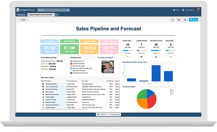
Sales & CRM
Sales managers need quick information on items like where performance is lagging and regional sales data to allocate resources and reach goals.
HR & Recruiting
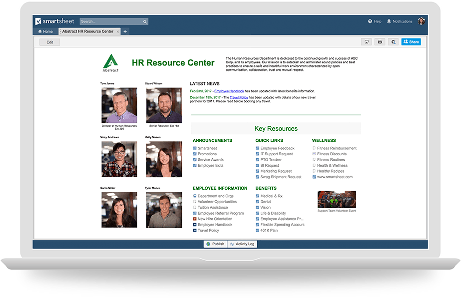
Human Resources dashboards help management track hiring and turnover, along with complaints and staff issues.
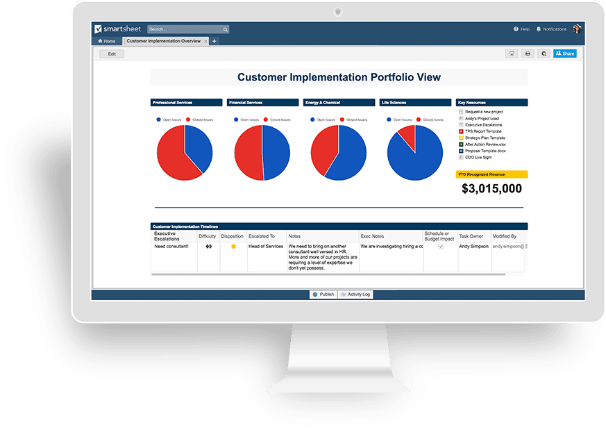
Professional Services
Professional services teams keep track of many moving parts, whether it’s tasks to onboard a client or contracts signed by external vendors, which is why a dashboard is so useful.
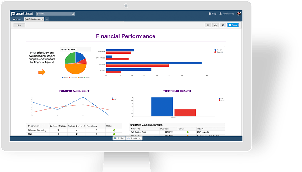
IT
IT dashboards are important for other departments to see things like average outstanding tickets per day to figure out when they can get assistance for larger asks and system migrations.
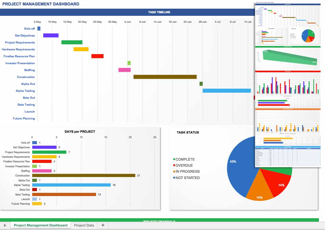
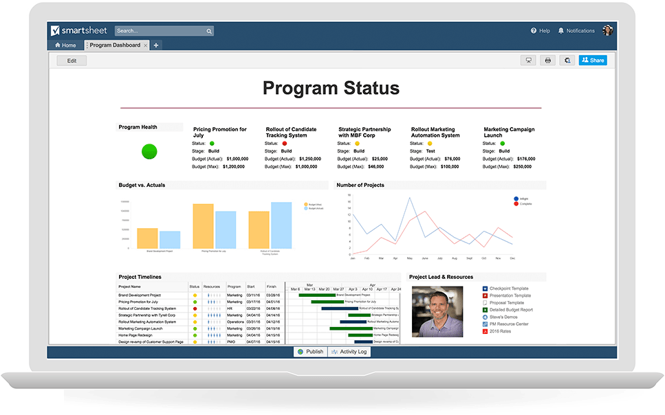
Project Management
Project dashboards help project managers and outside stakeholders get a view into overall effectiveness of the teams executing the work, which projects are at risk of not being completed, and the like.
Make Better Decisions, Faster with Dashboards in Smartsheet
Empower your people to go above and beyond with a flexible platform designed to match the needs of your team — and adapt as those needs change.
The Smartsheet platform makes it easy to plan, capture, manage, and report on work from anywhere, helping your team be more effective and get more done. Report on key metrics and get real-time visibility into work as it happens with roll-up reports, dashboards, and automated workflows built to keep your team connected and informed.
When teams have clarity into the work getting done, there’s no telling how much more they can accomplish in the same amount of time. Try Smartsheet for free, today.

