What Are Graphs and Charts in Excel?
Charts and graphs in Microsoft Excel provide a method to visualize numeric data. While both graphs and charts display sets of data points in relation to one another, charts tend to be more complex, varied, and dynamic.
People often use charts and graphs in presentations to give management, client, or team members a quick snapshot into progress or results. You can create a chart or graph to represent nearly any kind of quantitative data — doing so will save you the time and frustration of poring through spreadsheets to find relationships and trends.
It’s easy to create charts and graphs in Excel, especially since you can also store your data directly in an Excel Workbook, rather than importing data from another program. Excel also has a variety of preset chart and graph types so you can select one that best represents the data relationship(s) you want to highlight.
Tired of static spreadsheets? We were, too.
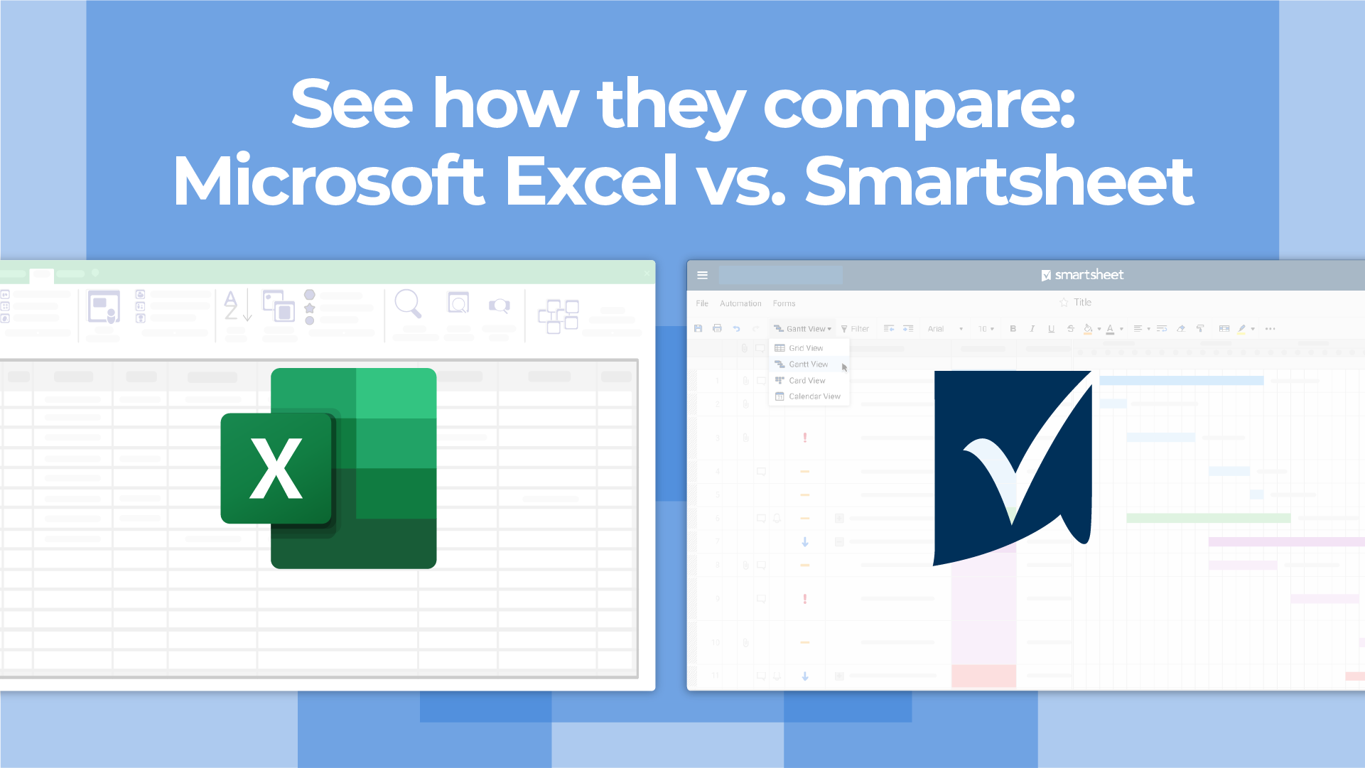
Although Microsoft Excel is familiar, you were never meant to manage work with it. See how Excel and Smartsheet compare across five factors: work management, collaboration, visibility, accessibility, and integrations.
When to Use Each Chart and Graph Type in Excel
Excel offers a large library of charts and graphs types to display your data. While multiple chart types might work for a given data set, you should select the chart that best fits the story that the data is telling.
In Excel 2016, there are five main categories of charts or graphs:
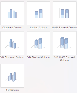
- Column Charts: Some of the most commonly used charts, column charts, are best used to compare information or if you have multiple categories of one variable (for example, multiple products or genres). Excel offers seven different column chart types: clustered, stacked, 100% stacked, 3-D clustered, 3-D stacked, 3-D 100% stacked, and 3-D, pictured below. Pick the visualization that will best tell your data’s story.
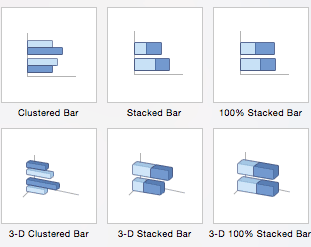
- Bar Charts: The main difference between bar charts and column charts are that the bars are horizontal instead of vertical. You can often use bar charts interchangeably with column charts, although some prefer column charts when working with negative values because it is easier to visualize negatives vertically, on a y-axis.
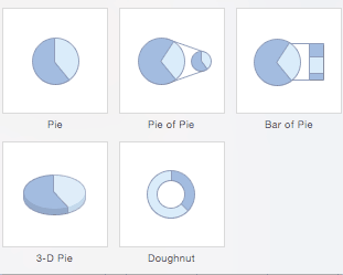
- Pie Charts: Use pie charts to compare percentages of a whole (“whole” is the total of the values in your data). Each value is represented as a piece of the pie so you can identify the proportions. There are five pie chart types: pie, pie of pie (this breaks out one piece of the pie into another pie to show its sub-category proportions), bar of pie, 3-D pie, and doughnut.
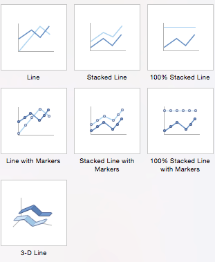
- Line Charts: A line chart is most useful for showing trends over time, rather than static data points. The lines connect each data point so that you can see how the value(s) increased or decreased over a period of time. The seven line chart options are line, stacked line, 100% stacked line, line with markers, stacked line with markers, 100% stacked line with markers, and 3-D line.
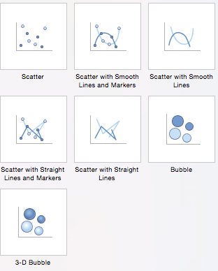
- Scatter Charts: Similar to line graphs, because they are useful for showing change in variables over time, scatter charts are used specifically to show how one variable affects another. (This is called correlation.) Note that bubble charts, a popular chart type, is categorized under scatter. There are seven scatter chart options: scatter, scatter with smooth lines and markers, scatter with smooth lines, scatter with straight lines and markers, scatter with straight lines, bubble, and 3-D bubble.
There are also four minor categories. These charts are more use case-specific:
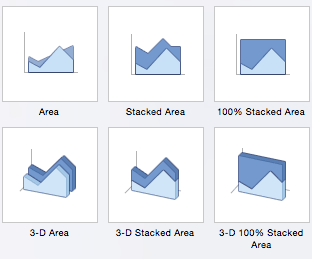
- Area: Like line charts, area charts show changes in values over time. However, because the area beneath each line is solid, area charts are useful to call attention to the differences in change among multiple variables. There are six area charts: area, stacked area, 100% stacked area, 3-D area, 3-D stacked area, and 3-D 100% stacked area.
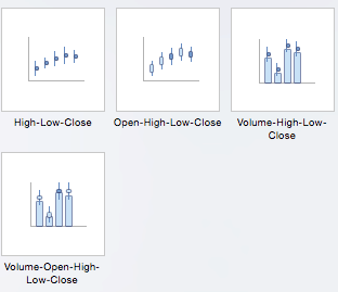
- Stock: Traditionally used to display the high, low, and closing price of stock, this type of chart is used in financial analysis and by investors. However, you can use them for any scenario if you want to display the range of a value (or the range of its predicted value) and its exact value. Choose from high-low-close, open-high-low-close, volume-high-low-close, and volume-open-high-low-close stock chart options.
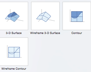
- Surface: Use a surface chart to represent data across a 3-D landscape. This additional plane makes them ideal for large data sets, those with more than two variables, or those with categories within a single variable. However, surface charts can be difficult to read, so make sure your audience is familiar with them. You can choose from 3-D surface, wireframe 3-D surface, contour, and wireframe contour.
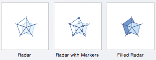
- Radar: When you want to display data from multiple variables in relation to each other use a radar chart. All variables begin from the central point. The key with radar charts is that you are comparing all individual variables in relation to each other — they are often used for comparing strengths and weaknesses of different products or employees. There are three radar chart types: radar, radar with markers, and filled radar.
Another popular chart is a waterfall chart, which is essentially a series of column graphs that show positive and negative changes over time. There is no Excel preset for a waterfall chart, but you can download a template to help make the process easier. For a full walkthrough, read How to Create a Waterfall Chart in Excel.

Top 5 Excel Chart and Graph Best Practices
Although Excel provides several layout and formatting presets to enhance the readability of your charts, you can maximize their effectiveness with other methods. Below are the top five best practices to make your charts and graphs as useful as possible:
-
Make It Clean: Cluttered graphs — those with excessive colors or texts — can be difficult to read and aren’t eye catching. Remove any unnecessary information so your audience can focus on the point you’re trying to get across.
-
Choose Appropriate Themes: Consider your audience, the topic, and the main point of your chart when selecting a theme. While it can be fun to experiment with different styles, choose the theme that best fits your purpose.
-
Use Text Wisely: While charts and graphs are primarily visual tools, you will likely include some text (such as titles or axis labels). Be concise but use descriptive language, and be intentional about the orientation of any text (for example, it’s irritating to turn your head to read text written sideways on the x-axis).
-
Place Elements Intelligently: Pay attention to where you place titles, legends, symbols, and any other graphical elements. They should enhance your chart, not detract from it.
-
Sort Data Prior to Creating the Chart: People often forget to sort data or remove duplicates before creating the chart, which makes the visual unintuitive and can result in errors.
How to Chart Data in Excel
To generate a chart or graph in Excel, you must first provide the program with the data you want to display. Follow the steps below to learn how to chart data in Excel 2016.
Step 1: Enter Data into a Worksheet
- Open Excel and select New Workbook.
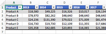
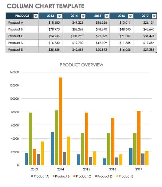
- Enter the data you want to use to create a graph or chart. In this example, we’re comparing the profit of five different products from 2013 to 2017. Be sure to include labels for your columns and rows. Doing so enables you to translate the data into a chart or graph with clear axis labels. You can download this sample data below.
Download Column Chart Practice Data
Step 2: Select Range to Create Chart or Graph from Workbook Data
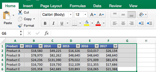
- Highlight the cells that contain the data you want to use in your graph by clicking and dragging your mouse across the cells.
- Your cell range will now be highlighted in gray and you can select a chart type.
In the following section, we’ll walk you through the specifics of creating a clustered column chart in Excel 2016.
How to Make a Chart in Excel
After you input your data and select the cell range, you’re ready to choose the chart type. In this example, we’ll create a clustered column chart from the data we used in the previous section.
Step 1: Select Chart Type
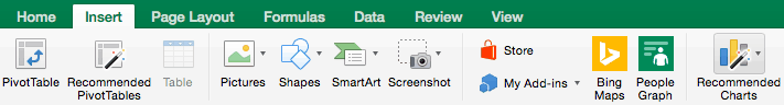
Once your data is highlighted in the Workbook, click the Insert tab on the top banner. About halfway across the toolbar is a section with several chart options. Excel provides Recommended Charts based on popularity, but you can click any of the dropdown menus to select a different template.

Step 2: Create Your Chart
- From the Insert tab, click the column chart icon and select Clustered Column.

- Excel will automatically create a clustered chart column from your selected data. The chart will appear in the center of your workbook.
- To name your chart, double click the Chart Title text in the chart and type a title. We’ll call this chart “Product Profit 2013 - 2017.”

We’ll use this chart for the rest of the walkthrough. You can download this same chart to follow along.
Download Sample Column Chart Template
There are two tabs on the toolbar that you will use to make adjustments to your chart: Chart Design and Format. Excel automatically applies design, layout, and format presets to charts and graphs, but you can add customization by exploring the tabs. Next, we’ll walk you through all the available adjustments in Chart Design.

Step 3: Add Chart Elements
Adding chart elements to your chart or graph will enhance it by clarifying data or providing additional context. You can select a chart element by clicking on the Add Chart Element dropdown menu in the top left-hand corner (beneath the Home tab).

To Display or Hide Axes:
- Select Axes. Excel will automatically pull the column and row headers from your selected cell range to display both horizontal and vertical axes on your chart (Under Axes, there is a check mark next to Primary Horizontal and Primary Vertical.)

- Uncheck these options to remove the display axis on your chart. In this example, clicking Primary Horizontal will remove the year labels on the horizontal axis of your chart.

- Click More Axis Options… from the Axes dropdown menu to open a window with additional formatting and text options such as adding tick marks, labels, or numbers, or to change text color and size.

To Add Axis Titles:
- Click Add Chart Element and click Axis Titles from the dropdown menu. Excel will not automatically add axis titles to your chart; therefore, both Primary Horizontal and Primary Vertical will be unchecked.

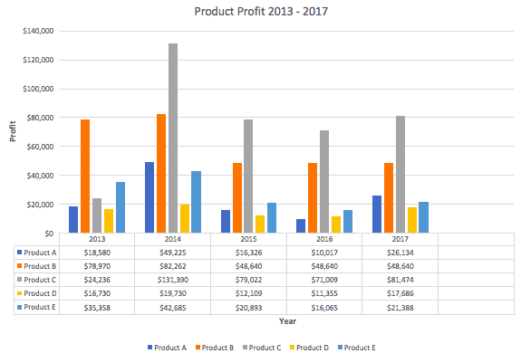
- To create axis titles, click Primary Horizontal or Primary Vertical and a text box will appear on the chart. We clicked both in this example. Type your axis titles. In this example, the we added the titles “Year” (horizontal) and “Profit” (vertical).

To Remove or Move Chart Title:
- Click Add Chart Element and click Chart Title. You will see four options: None, Above Chart, Centered Overlay, and More Title Options.

- Click None to remove chart title.
- Click Above Chart to place the title above the chart. If you create a chart title, Excel will automatically place it above the chart.
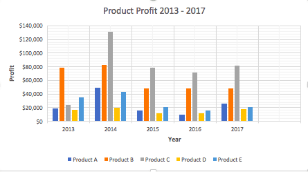
- Click Centered Overlay to place the title within the gridlines of the chart. Be careful with this option: you don’t want the title to cover any of your data or clutter your graph (as in the example below).

To Add Data Labels:
- Click Add Chart Element and click Data Labels. There are six options for data labels: None (default), Center, Inside End, Inside Base, Outside End, and More Data Label Title Options.

- The four placement options will add specific labels to each data point measured in your chart. Click the option you want. This customization can be helpful if you have a small amount of precise data, or if you have a lot of extra space in your chart. For a clustered column chart, however, adding data labels will likely look too cluttered. For example, here is what selecting Center data labels looks like:

To Add a Data Table:
- Click Add Chart Element and click Data Table. There are three pre-formatted options along with an extended menu that can be found by clicking More Data Table Options:

- None is the default setting, where the data table is not duplicated within the chart.
- With Legend Keys displays the data table beneath the chart to show the data range. The color-coded legend will also be included.
- No Legend Keys also displays the data table beneath the chart, but without the legend.
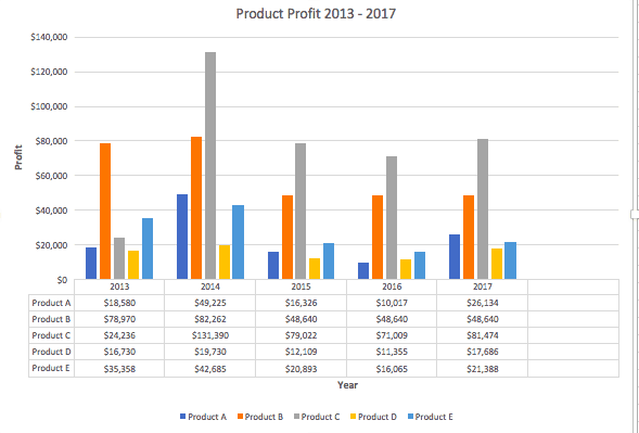
Note: If you choose to include a data table, you’ll probably want to make your chart larger to accommodate the table. Simply click the corner of your chart and use drag-and-drop to resize your chart.
To Add Error Bars:
- Click Add Chart Element and click Error Bars. In addition to More Error Bars Options, there are four options: None (default), Standard Error, 5% (Percentage), and Standard Deviation. Adding error bars provide a visual representation of the potential error in the shown data, based on different standard equations for isolating error.

- For example, when we click Standard Error from the options we get a chart that looks like the image below.

To Add Gridlines:
- Click Add Chart Element and click Gridlines. In addition to More Grid Line Options, there are four options: Primary Major Horizontal, Primary Major Vertical, Primary Minor Horizontal, and Primary Minor Vertical. For a column chart, Excel will add Primary Major Horizontal gridlines by default.

- You can select as many different gridlines as you want by clicking the options. For example, here is what our chart looks like when we click all four gridline options.
To Add a Legend:
- Click Add Chart Element and click Legend. In addition to More Legend Options, there are five options for legend placement: None, Right, Top, Left, and Bottom.

- Legend placement will depend on the style and format of your chart. Check the option that looks best on your chart. Here is our chart when we click the Right legend placement.

To Add Lines: Lines are not available for clustered column charts. However, in other chart types where you only compare two variables, you can add lines (e.g. target, average, reference, etc.) to your chart by checking the appropriate option.
To Add a Trendline:
- Click Add Chart Element and click Trendline. In addition to More Trendline Options, there are five options: None (default), Linear, Exponential, Linear Forecast, and Moving Average. Check the appropriate option for your data set. In this example, we will click Linear.

- Because we are comparing five different products over time, Excel creates a trendline for each individual product. To create a linear trendline for Product A, click Product A and click the blue OK button.

- The chart will now display a dotted trendline to represent the linear progression of Product A. Note that Excel has also added Linear (Product A) to the legend.

- To display the trendline equation on your chart, double click the trendline. A Format Trendline window will open on the right side of your screen. Click the box next to Display equation on chart at the bottom of the window. The equation now appears on your chart.

Note: You can create separate trendlines for as many variables in your chart as you like. For example, here is our chart with trendlines for Product A and Product C.

To Add Up/Down Bars: Up/Down Bars are not available for a column chart, but you can use them in a line chart to show increases and decreases among data points.
Step 4: Adjust Quick Layout
- The second dropdown menu on the toolbar is Quick Layout, which allows you to quickly change the layout of elements in your chart (titles, legend, clusters etc.).

- There are 11 quick layout options. Hover your cursor over the different options for an explanation and click the one you want to apply.

Step 5: Change Colors
The next dropdown menu in the toolbar is Change Colors. Click the icon and choose the color palette that fits your needs (these needs could be aesthetic, or to match your brand’s colors and style).

Step 6: Change Style
For cluster column charts, there are 14 chart styles available. Excel will default to Style 1, but you can select any of the other styles to change the chart appearance. Use the arrow on the right of the image bar to view other options.

Step 7: Switch Row/Column
- Click the Switch Row/Column on the toolbar to flip the axes. Note: It is not always intuitive to flip axes for every chart, for example, if you have more than two variables.

In this example, switching the row and column swaps the product and year (profit remains on the y-axis). The chart is now clustered by product (not year), and the color-coded legend refers to the year (not product). To avoid confusion here, click on the legend and change the titles from Series to Years.

Step 8: Select Data
- Click the Select Data icon on the toolbar to change the range of your data.

- A window will open. Type the cell range you want and click the OK button. The chart will automatically update to reflect this new data range.

Step 9: Change Chart Type
- Click the Change Chart Type dropdown menu.

- Here you can change your chart type to any of the nine chart categories that Excel offers. Of course, make sure that your data is appropriate for the chart type you choose.

-
You can also save your chart as a template by clicking Save as Template…
- A dialogue box will open where you can name your template. Excel will automatically create a folder for your templates for easy organization. Click the blue Save button.

Step 10: Move Chart
- Click the Move Chart icon on the far right of the toolbar.

- A dialogue box appears where you can choose where to place your chart. You can either create a new sheet with this chart (New sheet) or place this chart as an object in another sheet (Object in). Click the blue OK button.

Step 11: Change Formatting
- The Format tab allows you to change formatting of all elements and text in the chart, including colors, size, shape, fill, and alignment, and the ability to insert shapes. Click the Format tab and use the shortcuts available to create a chart that reflects your organization’s brand (colors, images, etc.).

- Click the dropdown menu on the top left side of the toolbar and click the chart element you are editing.

Step 12: Delete a Chart
To delete a chart, simply click on it and click the Delete key on your keyboard.
How to Make a Graph in Excel
Because graphs and charts serve similar functions, Excel groups all graphs under the “chart” category. To create a graph in Excel, follow the steps below.
Select Range to Create a Graph from Workbook Data
- Highlight the cells that contain the data you want to use in your graph by clicking and dragging your mouse across the cells.
- Your cell range will now be highlighted in gray.
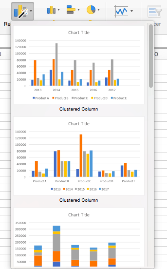
- Once the text is highlighted you can select a graph (which Excel refers to as chart). Click the Insert tab and click Recommended Charts on the toolbar. Then click the type of graph you wish to use.
Now you have a graph. To customize your graph, you can follow the same steps explained in the previous section. All functionality for creating a chart remains the same when creating a graph.
How to Create a Table in Excel
If you don’t need to visualize your data, you can create a table in Excel instead. There are two ways to format a data set as a table: manually, or with the Format as a Table button.
- Manually: In this example, we manually added data and formatted as a table by including column and row names (products and years).
- Use Excel’s Format as Table Preset: You can also input raw data (numbers without any column and row names).
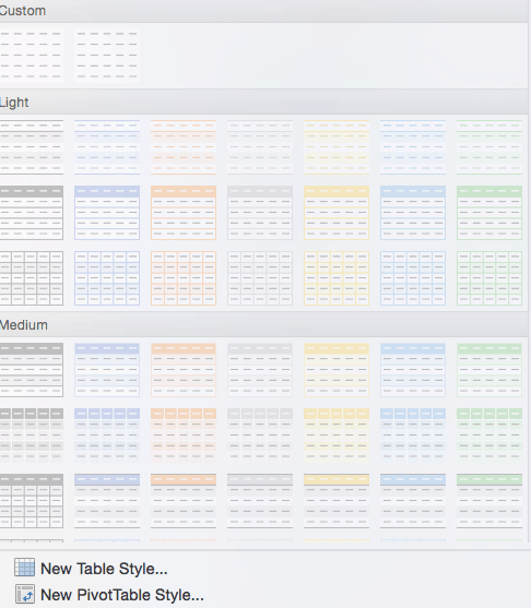
- To format data as a table, click and drag your mouse across the cells with the data range, click the Home tab, and click the Format as Table drop-down menu on the toolbar.

- Click New Table Style… (You will also see an option to use PivotTables. This feature is outside the scope of this how-to, but the concept is explained in the following section).
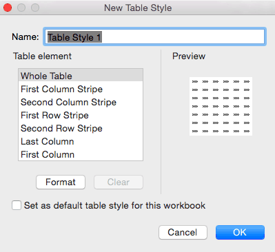
- A dialogue box opens and you can choose which aspects of the selected range to include in your formatted table. Click the blue OK button.
Related Excel Functionality
Excel is one of the most widely-used tools across all industries and types of organizations. Charts and graphs are great tools to visualize your work, but there are many ways to elevate your data in Excel.
We’ve created a list of additional features that allow you to do more with your data:
- Pivot Tables: A pivot table allows you to extract certain columns or rows from a data set and reorganize or summarize that subset in a report. This is useful tool if you only want to view a particular segment of a large data set, or if you want to view data from a new perspective.
- Conditional Formatting: A powerful feature that allows you to apply specific formatting to certain cells in your spreadsheet. You can use conditional formatting to highlight key pieces of information, track changes, see deadlines, and perform many other data organization functions.
- Dashboards: A powerful, visual reporting feature that pulls data from one or several datasets to display key performance indicators (KPIs), project or task status, and several other metrics. This gives the audience (team members, executives, clients, etc.) a snapshot view into project progress without surfacing private information.
- Collaborative Charts: To avoid version control issues and allow multiple team members to edit a chart simultaneously, you’ll want to use a collaborative chart tool. The desktop versions of Excel do not support this, but you can use Excel for Office 365, Microsoft’s cloud-based web application, or several other online chart tools.
- Data Series: A data series is any row or column stored in your workbook that you’ve plotted into a chart or graph. Once you’ve created your chart, you can add additional data series to it: Simply highlight the additional data you want to add and the chart will automatically update.
Make Better Decisions, Faster with Charts in Smartsheet
Empower your people to go above and beyond with a flexible platform designed to match the needs of your team — and adapt as those needs change.
The Smartsheet platform makes it easy to plan, capture, manage, and report on work from anywhere, helping your team be more effective and get more done. Report on key metrics and get real-time visibility into work as it happens with roll-up reports, dashboards, and automated workflows built to keep your team connected and informed.
When teams have clarity into the work getting done, there’s no telling how much more they can accomplish in the same amount of time. Try Smartsheet for free, today.