What Are UX and UI Design?
User Interface (UI) design focuses on the direct interactions a user has with the interface, as well as the layout, look and feel, and response time. UI has an immediate impact on a user, so it must address many user needs to be considered valuable.
User Experience (UX) design, on the other hand, includes the UI, but focuses on outside factors, such as consumer brand perception and marketing. For a more detailed discussion of the difference between UX and UI design, read “User Experience 101: Guidelines and Expert Tips for Creating Top-Selling Apps and Products Your Customers Will Love.”
The basics of UI design seem simple, but they take planning, research, testing, some art, and some science to make everything work seamlessly. UI designers have to balance business requirements with the needs of users (both new and experienced). Additionally, designers have to add new features, ensure that everything looks good and behaves correctly, and keep users grounded with familiar components. Professor Reinhard Oppermann wrote the chapter on UI design in the book Handbook on Information Technologies for Education and Training. In it, Oppermann states, “User interface design is not a task following mechanically well-defined requirements but user interface design is as well a complex combination of ideas, intuition, and experienced competence.”
Why Is UI Design Important?
If an interface doesn’t perform as intended, if users can’t use it to do what they want, or if they just don’t like looking at it, they‘ll find other ways to complete their tasks (i.e. someone else’s app or website).

Kathleen Johnson is a freelance UX designer who has worked for Amazon.com and PayScale.com. “The main benefit of good UI design is kind of simple, you will have happier customers who like your product better and use it more,” she says. “Good UI allows people to find information more easily, buy things they want or need without a lot of effort, and access personal, financial, and social information they can utilize to make the daily tasks of life simpler.”
Designers should keep the following key ideas and areas of expertise top of mind in order to create a functional and compelling UI:
- User Needs: This is the most important part of UI design. Designers need to know and respect what their users want to do.
- Requirements: Interfaces have to meet business goals, and a designer needs to understand the requirements to meet those goals.
- Research: Working with researchers (or being one themselves) will help designers create better designs for the UI. Some key items in research include:
- Expert Reviews: The researcher uses their skills and accumulated knowledge to critique a design and offer suggestions for improvement.
- Tests: Put the UI in front of potential users to see how it will perform in the real world, and use that data to improve the design.
- Prototypes: Create rough versions of the UI for testing, expert reviews, and to verify that concepts work as expected.
- Information Architecture: Awareness of how screen layouts, labeling, and organization across pages affect interfaces will help designers improve the experience.
- Appearance: If a user doesn’t like to look at the final design, they won’t want to use it.
- Updates: Updating software allows designers and engineers to add new features, fix bugs, or adapt to new hardware configurations. Updates should follow the same process as the initial release to insure that the UI is not compromised.
What Is a User Interface and What Are Its Components?
Interfaces are for interaction. People use interfaces for a variety of things: To get quick information (how long is it until the cake is done?), accomplish a more complex, finite task (filling out a form to apply for a loan), or perform an open-ended undertaking (playing a game to pass time). Well-chosen UI components designed with user needs in mind will make accomplishing user goals easier. Read-only text fields and images are basic UI components. Below is a list of more complex components and their role in design.
Input Components
The appearance of some of these components will vary based on the OS of the device and the browser.
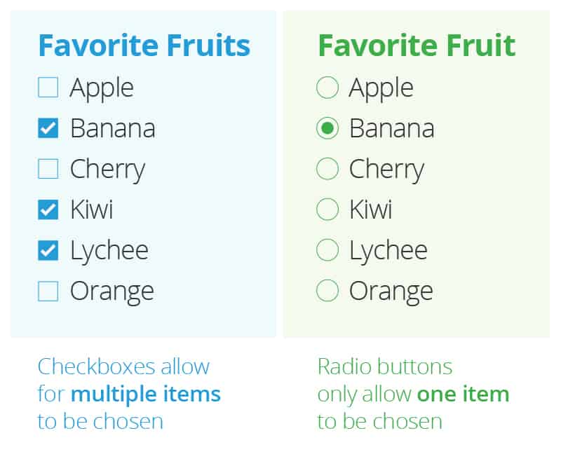
Checkboxes and Radio Buttons: These are used in forms or on settings pages to chose items from a short list. Radio buttons allow a user to select one item. Checkboxes are squares next to items; the user can select one or more from a list. A single checkbox is also an option for times when a user is accepting terms and conditions.
Lists: Menus are lists, as are items to select when filling out a form. When choosing how to order lists, you should consider the contents. If the list of items always appear in a particular order, such as months or days, use that order. If the list doesn’t need to be ordered in a particular way, like states or countries, they can be alphabetical. If research or usage metrics show there is a clear preferred order for the items, like top-level domains (.com, .net. .edu, etc.), list them by popularity.
There are a couple options for displaying lists:
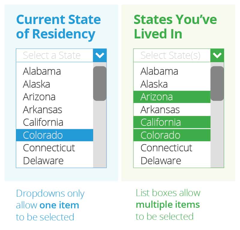
- Dropdown: Use this design to allow users to select one item from a list.
- List Boxes: An ideal choice for when you want a user to be able to select multiple items to be selected.
Buttons: The most basic of interactive elements. Buttons can be a shape, an icon, or plain text. Whatever their form, make sure it’s obvious that a user can interact with it.
For example, in early versions of the now-defunct Windows Phone OS, the apps and contact lists had alphabetical headers.
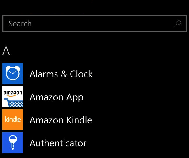
It wasn’t obvious that each letter was a button that exposed a grid of letters, allowing a user to jump anywhere in the alphabet. Many users didn’t know this, and would waste time scrolling through the alphabet.
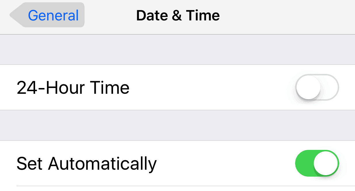
Toggles: Toggles are on-off switches, often used for changing settings. Here are examples from iOS:
Data Entry Fields: When a user needs to provide information, they’ll often use a data entry field. They can be limited in length (passwords), require certain characters (email address fields check for the @ and if there’s a period), or have a limited character set (postal codes). Designers can help users by explaining what is required next to each field (e.g. “Birth date should be in XX/XX/XXXX format”) or by exposing specialized virtual keyboards when available, like the numeric keyboard for a phone number field.
Search Fields: These are specialized data entry fields that are also considered a navigational component.
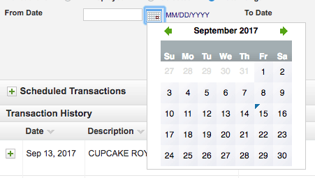
Date and Time Pickers: Another example of a specialized data entry field, designers use this option when deploying a calendar or digital clock to ensure the entry is correctly formatted for the system. Here’s a sample of a date picker from USAA’s website.
Navigational Components
Breadcrumbs: These show you where you are on a website and can take a few forms:
- Path: Because there can be many ways to navigate to the same web page, this method shows you the exact path you took. Nordstrom employs paths:
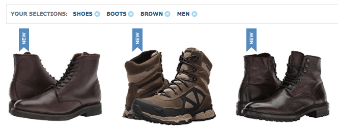
- Filter/Attribute: As you choose options on a web page or app, the site may display filters, which a user can usually remove one at a time. Here’s how Zappos displays filters or attributes.
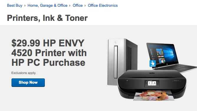
- Hierarchical: You’ll see where you are in the site’s hierarchy, regardless of how you got there, via searching or navigating. Here’s an example from Best Buy:
Sliders: Sliders show where you are in a page and are often built into the browser (look on the right side of your browser window, and you’ll see a slider as you scroll through this site). The size of the indicator shows roughly how long the page is compared to the full document.
Pagination Indicators: If there are multiple pages of results, pagination indicators tell you which page you are on. Some show the total number of pages or provide refinement options.
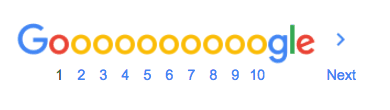
Google displays the page you’re on, but does not provide the total page count.
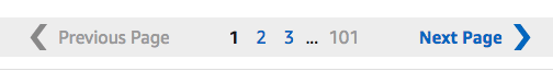
Amazon shows the total number of pages:
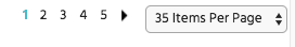
Monoprice shows the number of pages and allows you to display more or fewer items per page (and with a little math, you can calculate the total number of available items):
Icons: Simple images that are tappable or clickable. Icons can represent an app like the image of camera or calendar on a smartphone's home screen, or a function within an app. Designers must choose icons carefully so that users can easily understand their meaning. Some icons are intuitive based on their appearance (such as the printer icon), while some require users to learn about them (like a bird that represents Twitter).
Design Shack has tips on how to create icons.
Tags: Tags group like content, and enable users to jump to items in the same or related categories. Here’s what BBC.com shows at the bottom of a story about the Cassini probe.
The Nielsen Norman Group, a usability consultant firm, follows their own UI design advice and includes tags (and the number of found results for each tag) in their search results.
The Interaction Design Foundation, which teaches UX courses, uses this format at the end of their articles:
Informational Components
Tooltips: A description that appears when a cursor hovers over an on-screen item. Here’s an example from Google Docs:
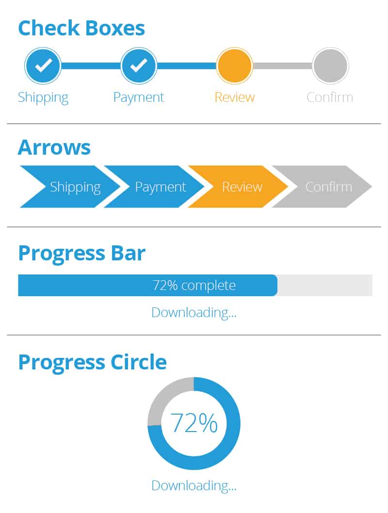
Progress Indicators: A visual representation of how far you are in a process (for example, when downloading a large file, taking a survey, creating a new user profile, or completing a purchase). They generally take the form of a page count bar, or a circle. If there is something going on in the background and the user needs to wait, the indicator should be animated so the user doesn't think it’s frozen. Indicators differ from breadcrumbs in that they indicate how far you are in completing a goal, whereas breadcrumbs only provide information about a user’s current position.
Notifications: These take many forms, from a banner announcing a new email to an unread text message counter in a colored circle on the app’s icon.
Error Messages: Ideally, error messages never appear. When they do, they should be clear and concise:
- Describe the problem (Requested username is too short).
- Explain how to fix it (Usernames must be at least 8 characters).
- Never blame the user.
For more details on error messages, read UX Planet’s take.
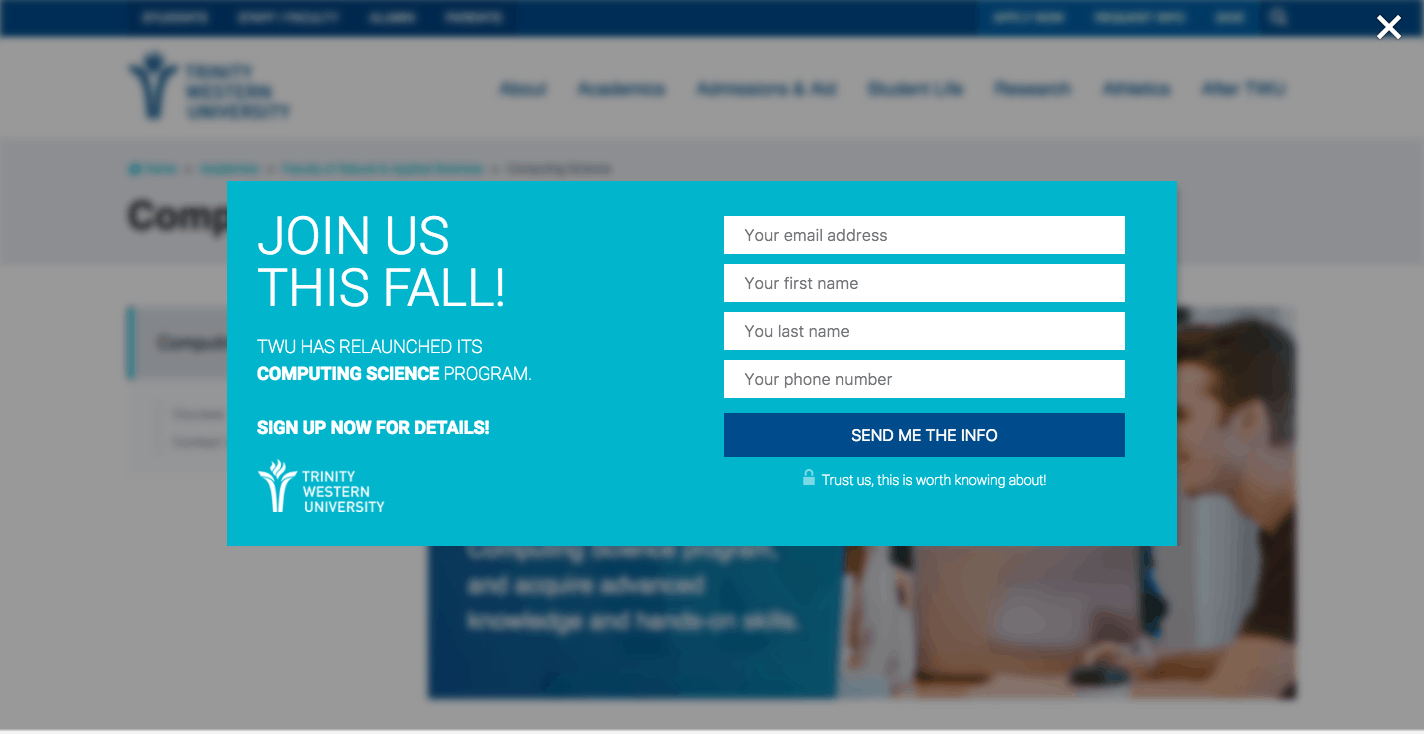
Overlay Windows: This is not a new browser window, but an in-window message that appears in front of the page’s body content (similar to a pop up). Overlays are used to inform (We’ve added a new feature!) or request (Do you want to sign up for our email list?).
When deploying an overlay (also called a modal), designers should darken the body content so users are drawn to the overlay. Some overlays allow a user to tap or click outside of it to dismiss it. Others require a tap somewhere on the overlay, usually on a X or the word close. Regardless of the way you signal how to exit an overlay to a user, it should be easy to find and large enough to click. Here’s a good example from Cracked’s mobile site.
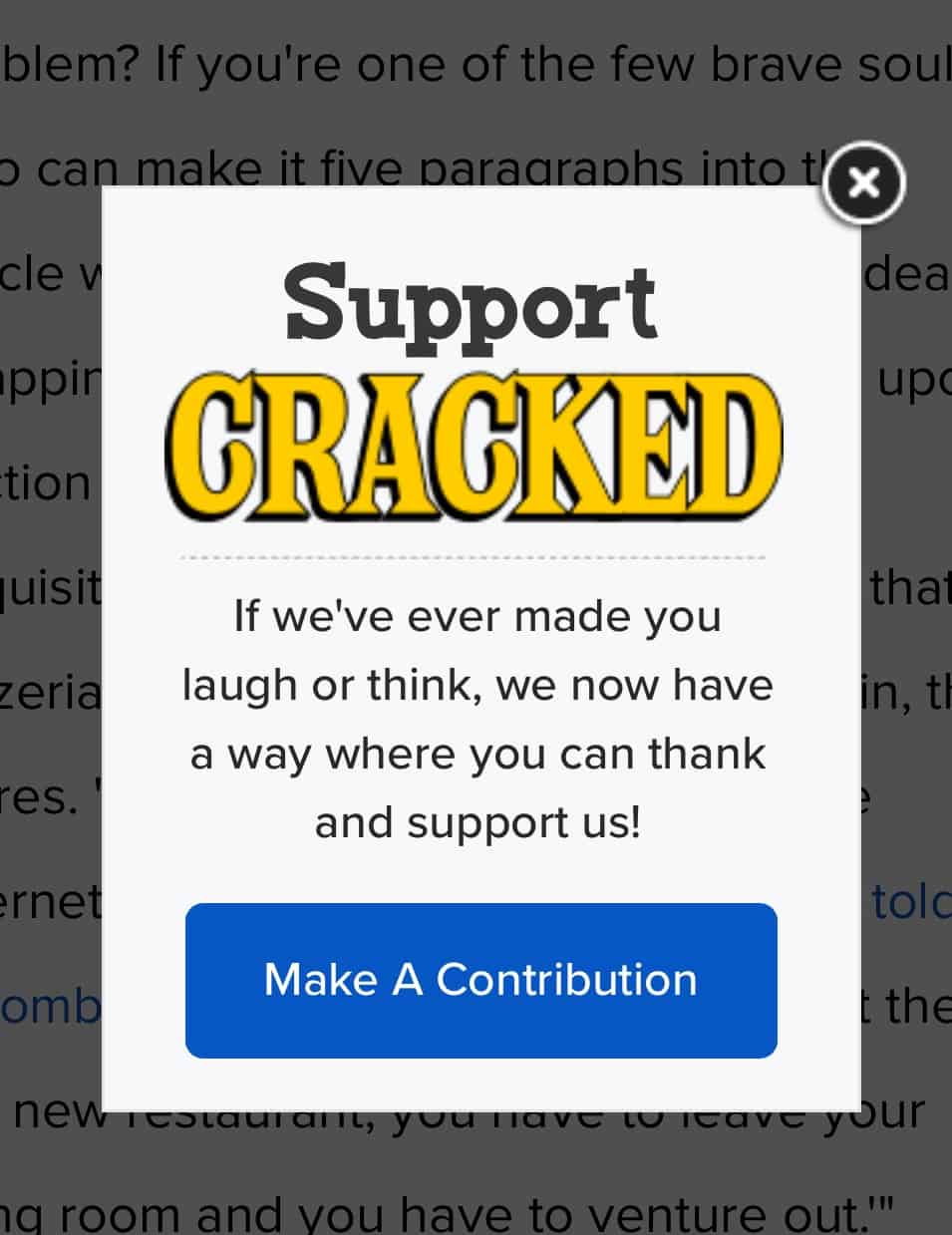
Overlays can be annoying, so use them sparingly. You can find more thoughts about overlays and modals at UX for the Masses.
Other UI Components
Affordances: Affordances are clues about how a user can interact with other on-screen items. Underlining text to indicate a link is a common (and almost invisible) affordance. Affordances can also be found in the physical world, like a door handle which indicates that you pull. A great example of a digital affordance is a peek, which displays part of the next item or line - this informsusers that they can scroll to see more. Here’s an example from the iTunes app, which shows both vertical and horizontal scrolling are available.
Affordances can be scattered throughout an interface. Some are intuitive, while others users will have to learn. Examples of common UI affordances are:
- A triangle next to an icon indicates that it will expose a list of options.
- Greyed out text on a button means it’s not active.
- A company logo in the top left of a web page is clickable and takes you back to the home page. This is an example of a non-intuitive affordance, but it’s common enough that users expect it.
Containers: These offer visual segregation to show related components. They can be explicit (a box) or implicit (extra white space).
Fonts, Colors, and Textures: These may seem inconsequential, but they are at the core of strong UI design. Poor choices can make text unreadable, or an app unpleasant to view. There is some subjectivity in this, but in the spirit of simplicity and clarity, find fonts, textures, and color palettes that make a UI easy to read, and use them consistently.
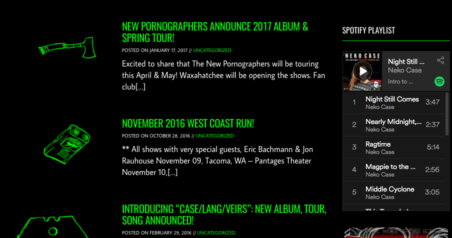
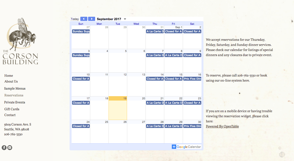
Widgets: These are single-purpose apps that appear on a web page. For example, a band may have a widget on their page that allows a user to play their songs, a restaurant can display a reservation widget next to their menu, or a writer may have their Twitter feed running next to the main content of their blog.
Musician Neko Case has a Spotify widget.
Seattle restaurant The Corson Building has a calendar widget.
Best Practices for UI Design
There are many ideas for UI design practices and principles. It’s important to find or create a set of standards and stick to them in both practice and principle. Adhering to these standards will ensure consistency in appearance and function. If you’re not sure where to begin, Jakob Nielsen’s 10 heuristics is a good starting point. It’s a comprehensive list, but still flexible enough to adapt to multiple situations. Here’s a list of key practices and principles:
User Needs Are Paramount
The users’ needs are the most important concept to keep in mind. A user needs many things from a UI, but at a high level, most users want:
- Freedom and Control: A user should be in charge of what happens, whether to easily back out of process they don’t want to continue or to initiate actions they want to take next. You should not force actions on a user.
- Flexibility: Anyone should be able to user the UI, regardless of experience level. And as someone gains experience, the UI should still be able to meet their needs.
- Efficiency: Be fast and anticipate a user’s needs to make interactions quicker. Kathleen Johnson says, “Toyota.com has a very pretty website with lots of great images, but it is achingly slow. Speed really matters.” Also, anticipate that a user needs to make interactions quicker.
- Clarity: Ensure that the purpose of each component is clear. As a simple example, if usability testing or other research demonstrates that the meaning of an icon is unclear, consider replacing it with text.
- Consistency: Colors and fonts, and the location and function of shared elements shouldn’t vary across a UI.
Reduce Cognitive Load
The more a user can interact without having to figure things out, the happier they’ll be. In other words, take the title of Steve Krug’s book Don’t Make Me Think seriously. This influential book about web design was initially published in the early 2000s and was updated in 2014. Here are some ways to reduce the cognitive load:
- Keep the Interface Simple: It’s easier to find what’s important when it’s not competing with unimportant components.
- Use Common Elements: Most everyone knows that a question mark offers help, two vertical lines mean pause a video or music, and a magnifying glass indicates search functionality. Using these will make interactions quicker and more satisfying for users.
- Provide Feedback: Users should always know their location, what they can do, and what will happen when they do it.
- Write Well: Any messages that users see should concisely explain the situation, and if it’s an error message, should also offer a solution. Most users are not developers, so avoid technical jargon.
- Location Matters: A control should be close or visually connected to the item it controls. An error message should also be close to the place where the error occurred.
The control to close this overlay is too far removed from its message, and therefore easy to overlook.
- Break Actions into Manageable Chunks: Each screen should have a focus (that’s why most ecommerce sites divide the checkout process into multiple steps). But don’t be too reductive. For example, users of the Washington State Employment Security website must answer a series of about 15 questions each week and have one question per page. This takes things too far: It would be better to have a few related questions on each page.
- Anticipate Errors: Ideally, designers will be able to anticipate possible errors and prevent them from occurring. For example, the submit button on a form should be inactive until all required fields are completed (and required fields should be clearly marked, usually with an asterisk). When errors do occur, designers should help users recognize, diagnose, and recover from them. Briefly explain what happened and what to do to fix it.
- Provide Help: When needed, a little help is invaluable. The best place for it is in context. For example, label data entry fields with any requirements (Passwords must be at least 8 characters). Complex systems may require more extensive help; make sure it’s easy to find.
- Be Organized: This is the Information Architect's domain. As Johnson explains, “...Information architecture is the skeleton of the website. The site doesn’t have a good structure or the ability to stand up without a strong and stable architecture.” Logically organize components on a page and across a site.
New Users vs. Experienced Users
Different users have different needs. “New users explore, so the architecture and naming of things is really important,” explains Johnson. “They will also utilize extra help like tool tips and FAQs. Expert users need access to specialized parts of the UI that are lesser used, but very important to their tasks. Being aware of new features that may make their work easier is important. In general, the largest user group is somewhere in between. They are looking for access to specific tools and have a cursory knowledge of the site, so it’s important to allow them to continue learning while being supported with information and direction - as well as gain exposure to advanced features. In essence, the things you build in for new users are also helpful to expert users and intermediate users. Build on that as a strong base and give advanced users quick access to the tools they need.
How the Real World Influences the Digital World
A familiar object can orient a user. Skeuomorphism is a design concept in which a software representation resembles a real-world counterpart. Early in the digital era, the trash can icon on the first Macintosh computer was a clear indicator of where to drag unwanted files.
Other simple examples include a calculator button that appears to depress when tapped or clicked, or the shutter sound that occurs when you take a picture a phone’s camera. More elaborate examples include a calendar app with pages that look like a desk planner (some were even accented with a border that looks like stippled leather), or a collection of books that appears to sit on a shelf (even with shadows) in an E-reader app.
In recent years, skeuomorphism has fallen out of favor with designers, and flat design has become common. In flat design, buttons are two-dimensional rather than three, textures are minimized, and icons are stylized instead of appearing realistic. Flat design reduces visual clutter and can simplify some interactions.
Skeuomorphism is also needed less as the general population becomes more familiar with the functions of computers and smartphones. But vestiges of skeuomorphism remain. Many icons have it at their core: an icon that resembles a 35mm camera to take a photo, an envelope icon to read an email, or an image of gears to change settings.
Skeuomorphism can still be useful, as it gives users the feeling of familiarity. When new functions migrate to the digital realm, having some connection to the analog counterpart will help users make the transition. Using a smartphone is less common than other forms of payment at stores, so the digital payment interface uses the image of a credit/debit card to indicate each account. When smartphone payments catch up to cards, designers will likely create with new visual metaphors.
Think About Defaults
Be careful when selecting defaults, as users probably won’t change them. Here are some common defaults:
- When using a wizard to install software that offers a “typical” and “custom” setup, “typical” is generally the default; most users leave it there and move on. That’s a good practice.
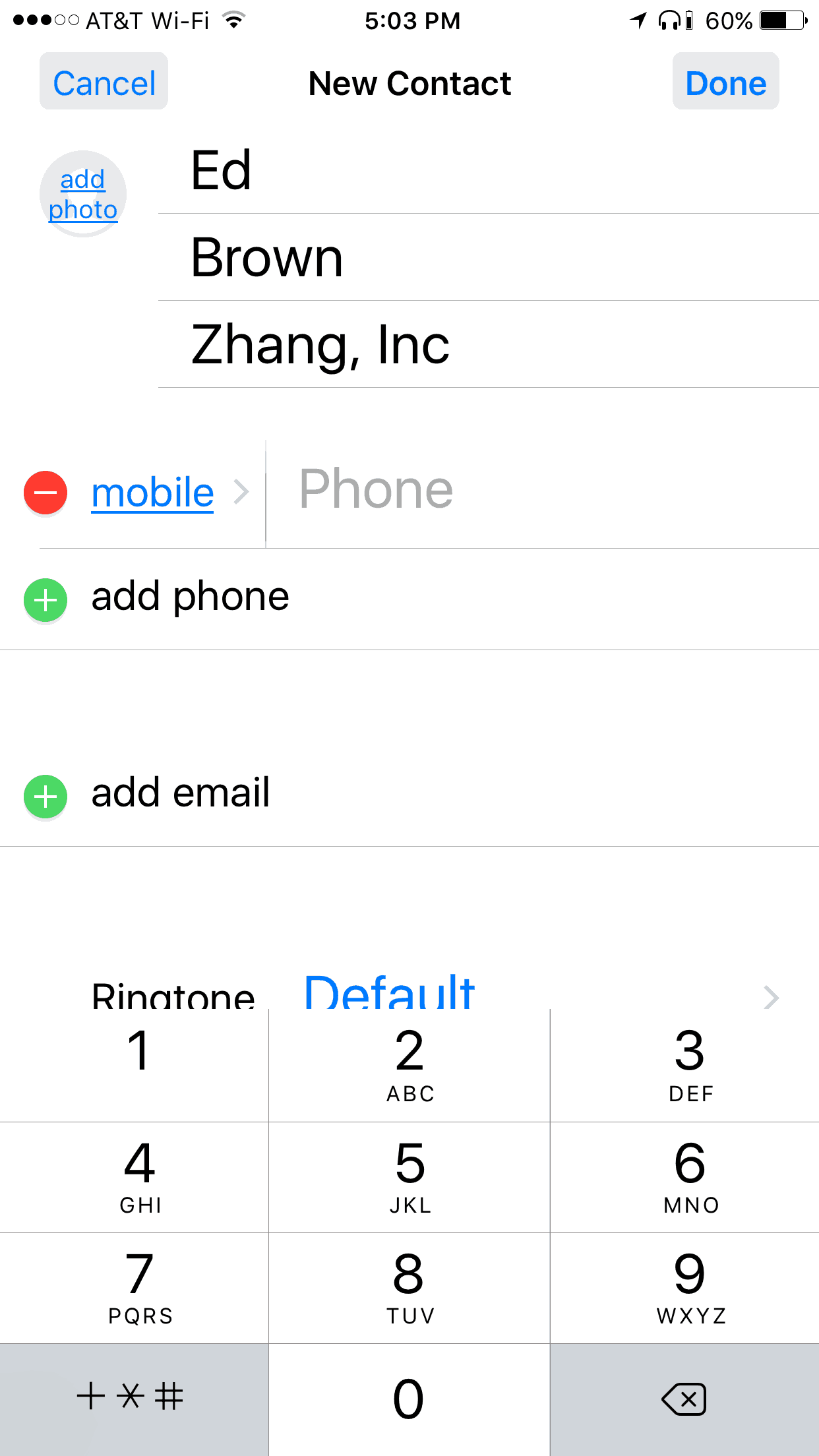
- When manually adding a new person in the iOS Contacts app, tapping add phone displays the category home fax (because it’s the first in their alphabetized list). Almost everybody will have to change this, so it’s not a good practice.
- When users are filling out a form, it’s a good idea to have a default chosen for a checkbox, radio button, or list (if research shows that the majority of users will choose it). For items that users need to think about (e.g. terms and conditions and privacy settings), it’s best to not have a default and force users to make a selection.
Responsive Design
Responsive design is HTML code that adapts a website to accommodate the device a user is using (from a phone to a large-screen display). This is a concrete example of putting user needs first.
Appearance Matters
The appearance of a site or app is where the experience and vision of a UI designer can make a real impact. Consider the following example: Which site makes you want to place an order? This is not a judgement of their product, just their design.
UI Design Principles from Experts
For a couple more sets of principles, consider the following succinct but powerful schemes from leading experts.
Larry Constantine and Lucy Lockwood, pioneers in user-centered design, propose the following principles:
Structure: Purposeful organization that provides clarity and consistency to users.
Simplicity: Make common tasks simple, communicate in a way users understand, and provide shortcuts that are related to longer processes.
Visibility: Every component necessary to complete a task should be visible when it's needed. Dr. Sean Ho, Computing Science Professor at Trinity Western University, adds that you should design screens around a primary purpose, or epicenter.
Reuse: The same action should always produce the same result, and components should reappear throughout the UI. If there’s already something that works, don’t reinvent the wheel. In other words, this repeats the idea that recognition is better than recall.
Tolerance: Building on Constantine and Lockwood’s principle, Johnson says “Your UI should be tolerant. It should never make a user feel like a failure. Give your users an out, and allow them to fail gracefully as they are learning.”
In his book The Human Interface, Jef Raskin adapted Isaac Asimov’s Three Laws of Robotics into Two Laws of User Interface Design:
- A computer shall not harm your work or, through inactivity, allow your work to come to harm.
- A computer shall not waste your time or require you to do more work than is strictly necessary.
Mental Models in UI Design
A UI designer has a deep idea of how the UI will work, and how users will interact with it. This is known as the conceptual model. Users, on the other hand, have a deep idea of how the interface works and how they interact with it. This is known as the user model.
In a chapter on user interface design from the volume on office automation in the Topics in Information Systems book series, authors Alison Lee and Fred H. Lochovsky explain these concepts:
A conceptual (system) model is the system designer's abstract framework on which the system and the world in which it operates are based. It encapsulates the knowledge about the workings of the system and how this knowledge may be used to accomplish tasks….
A user's (mental) model, on the other hand, is a personalized, somewhat high-level understanding of the conceptual model based on the user's knowledge and experiences. It is not only a personal description but also a prescription as well. The user employs his mental model not only to perform tasks that were taught, but also to perform tasks not originally encompassed by the conceptual model….
Since a user bases his mental model on a system's conceptual model, it is very important that the conceptual model be properly conceived (i.e., that it be complete and consistent). A conceptual model that gives a cursory, incomplete notion of the system or is not cohesive or not thorough will make a system difficult to understand, and may result in conflicts between the conceptual and the user's models.
If a designer does their job well and puts together a consistent and clear interface using data from research and known design ideas, and makes it all look really good, then the two models will have a large overlap.
Go Forth and Design Well
There are many theories about UI design in addition to the ones addressed in this article. But they all share the following concepts:
- User needs come first
- Do your research
- Don’t make ‘em think
- Be clear
- Be simple
Improve User Interface Design with Work Management in Smartsheet
Empower your people to go above and beyond with a flexible platform designed to match the needs of your team — and adapt as those needs change.
The Smartsheet platform makes it easy to plan, capture, manage, and report on work from anywhere, helping your team be more effective and get more done. Report on key metrics and get real-time visibility into work as it happens with roll-up reports, dashboards, and automated workflows built to keep your team connected and informed.
When teams have clarity into the work getting done, there’s no telling how much more they can accomplish in the same amount of time. Try Smartsheet for free, today.