What Is a Line Graph?
A line graph (also called a line chart or run chart) is a simple but powerful tool and is generally used to show changes over time. Line graphs can include a single line for one data set, or multiple lines to compare two or more sets of data.
The essential components of a line graph are the same as other charts. They include the following:
X axis (Horizontal Axis): On a line graph, the X axis is the independent variable and generally shows time periods.
Y axis (Vertical Axis): This axis is the dependent variable and shows the data you are tracking.
Legend: This section provides information about the tracked data to help viewers read and understand the graph. A legend is most useful when a graph has more than one line.
Plot Area: The space on which the data is plotted.

You can change the scales of each axis to better illustrate the facts. However, too much manipulation can be misleading. For more about this, read the section below titled “How Line Graphs Can Be Misleading.”
Another variation of a line chart is a timeline graph. Unfortunately, creating one involves some special features (such as the ability to zoom in or out and compress the timeline) that are not available in Excel.
Additionally, note that line graphs aren’t suitable for all kinds of data. For example, they don’t do a good job at demonstrating proportions. Instead, consider a pie chart or stacked area chart.
Scatter Plot Graphs vs. Line Graphs
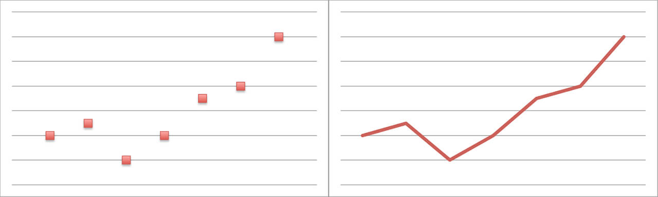
A line graph is similar to a scatter plot graph in that both show a change in variables over time. On a scatter chart, however, the data points aren’t connected.
How to Read a Line Graph
Line graphs provide an easy way to track trends. In many cases, the way the data is trending makes it easy to predict the results of data in yet-to-be-recorded time periods.
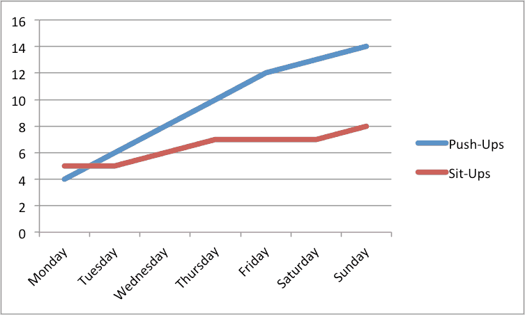
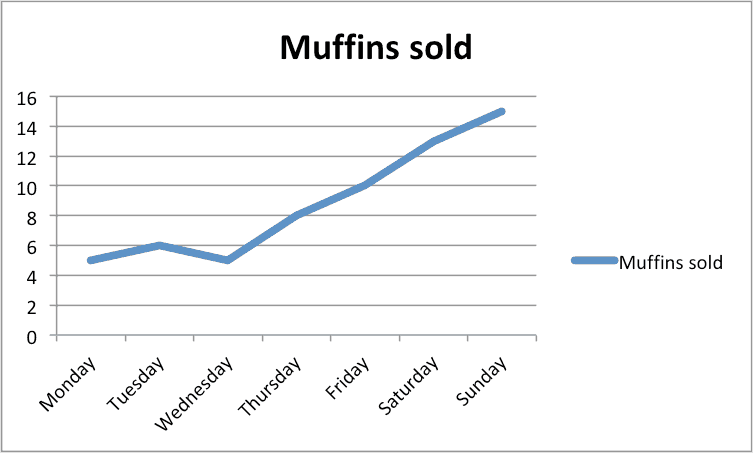
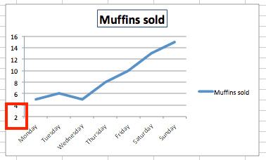
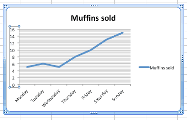
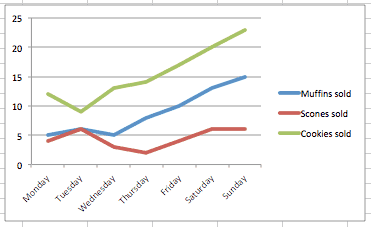
The axes typically intersect at the zero point (called the origin). In the muffins example above, the X axis is a timeline and shows the day before tracking started, while the Y axis starts at zero and charts the number of muffins sold. There’s a one-to-one relationship of variables on the horizontal axis to the vertical axis for each data set (a single Y for each X) — you can’t sell three muffins and four muffins on the same day. However, this is not a reciprocal relationship, as you can sell four muffins on Wednesday and another four on Thursday.
You can also use line graph to compare multiple data sets.
How Line Graphs Can Be Misleading
While line graphs are a great tool, they can be used to mislead in a couple different ways.
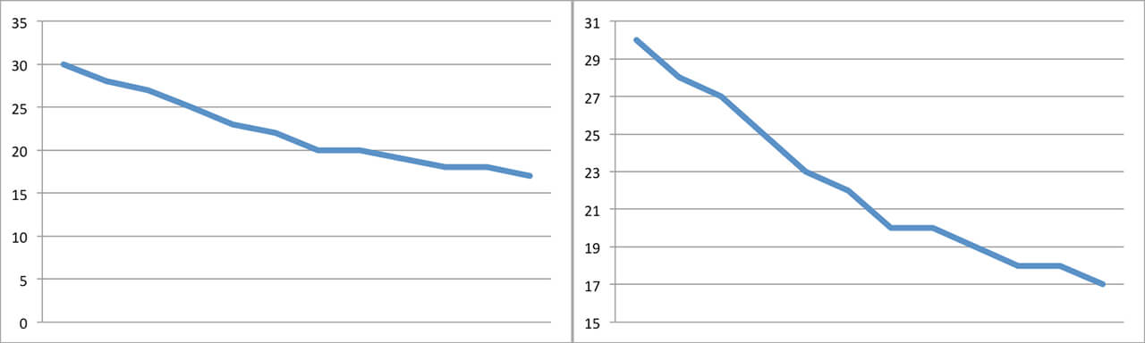
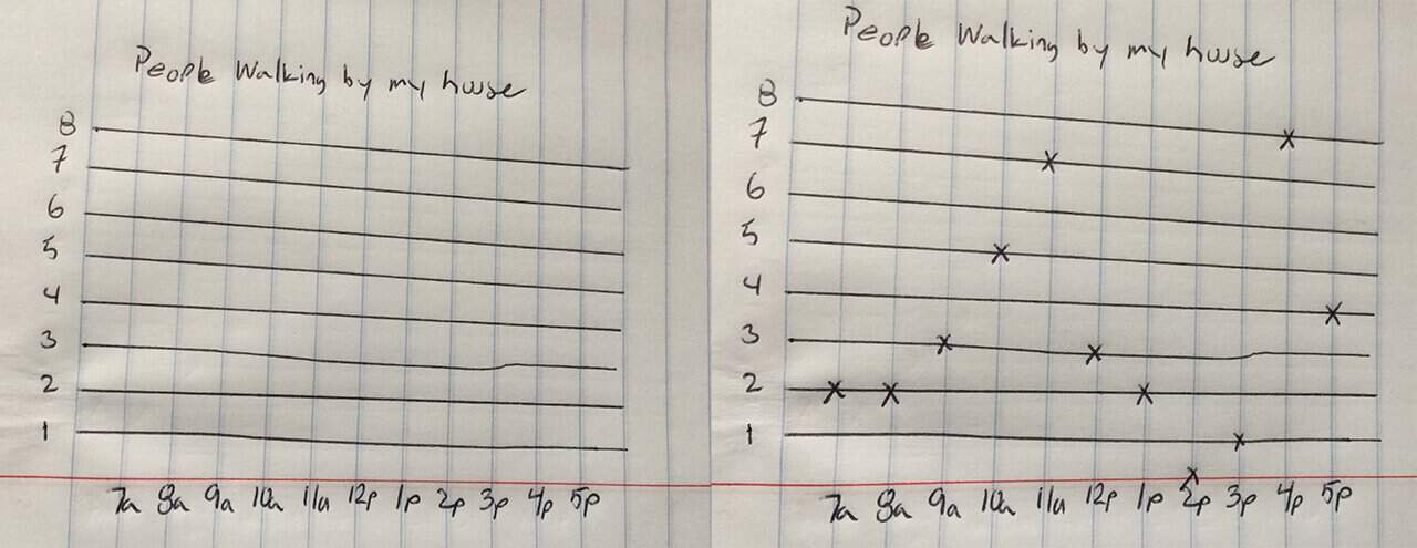
1. Not Showing the Full Scale: For example, if both axes don’t start at the origin, the data can appear as an exaggeration of reality.
The following two graphs show the same data. However, the Y axis scale on the second graph starts at 15 rather than zero, so the decrease appears steeper on that line graph.
2. Using Different Scales: When you use different scales on two graphs positioned side by side, the data can either appear more comparable or more different than it actually is. In both cases, this is a misinterpretation of the data.
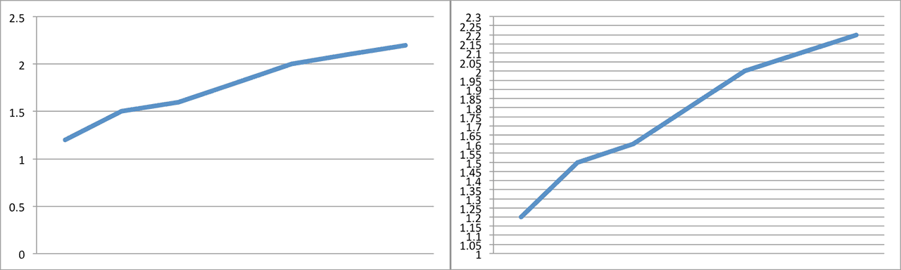
These two charts also show the same data, but the Y axis scale on the second graph has been changed so it appears that the second graph displays a greater increase.
These two techniques can be used in tandem. In the example below, the top two graphs appear to show that muffins and scones sell at about the same rate. When the data is plotted on the same graph, however, it’s obvious not only that scones initially sold more, but also that their popularity is increasing at a faster rate.
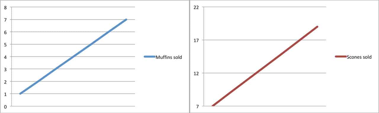
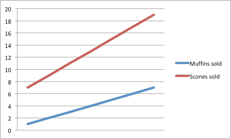
When reading line graphs, pay attention to the starting point and the scale to gain a more accurate understanding of what the data reports — not what the graph creator might want you to think.
How Do You Make a Single Line Graph in Excel?
In the following tutorial, we’ll show you how to create a single line graph in Excel 2011 for Mac. When the steps differ for other versions of Excel, they will be called out after each step.
Creating a single line graph in Excel is a straightforward process. Excel offers a number of different variations of the line graph.
Line: If there is more than one data series, each is plotted individually.
Stacked Line: This option requires more than one data set. Each additional set is added to the first, so the top line is the total of the ones below it. Therefore, the lines will never cross.
100% Stacked Line: This graph is similar to a stacked line graph, but the Y axis depicts percentages rather than an absolute values. The top line will always appear straight across the top of the graph and a period’s total will be 100 percent.
Marked Line Graph: The marked versions of each 2-D graph add indicators at each data point.
3D Line: Similar to the basic line graph, but represented in a 3D format.

Step-by-Step Instructions to Build a Line Graph in Excel
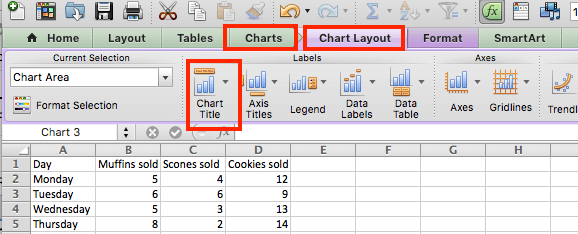
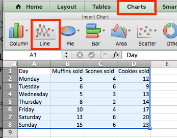
Once you collect the data you want to chart, the first step is to enter it into Excel. The first column will be the time segments (hour, day, month, etc.), and the second will be the data collected (muffins sold, etc.).
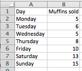
Highlight both columns of data and click Charts > Line > and make your selection. We chose Line for this example, since we are only working with one data set.
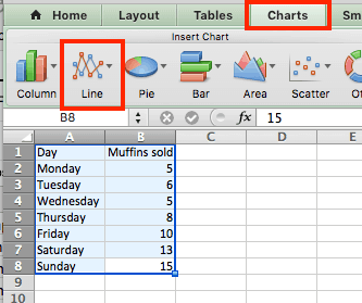

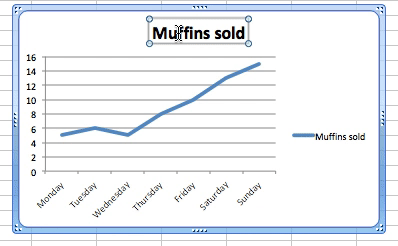
Excel creates the line graph and displays it in your worksheet.
Other Versions of Excel: Click the Insert tab > Line Chart > Line. In 2016 versions, hover your cursor over the options to display a sample image of the graph.
Customizing a Line Graph
To change parts of the graph, right-click on the part and then click Format. The following options are available for most of the graph elements. Changes specific to each element are discussed below:
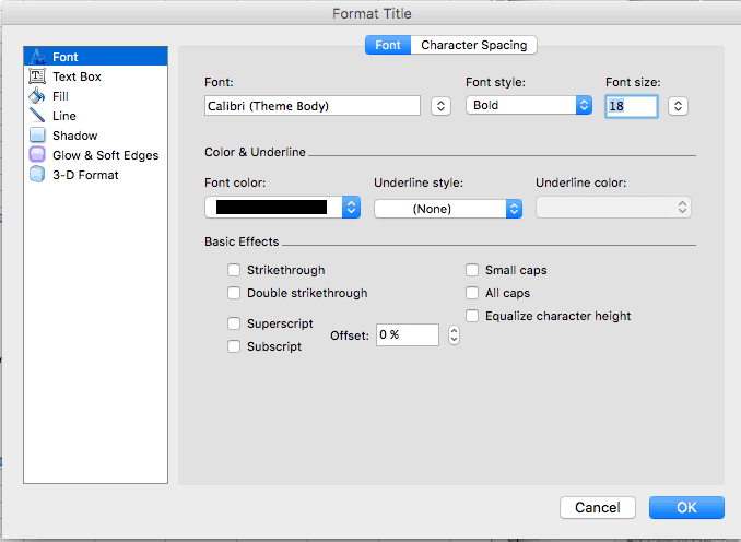
Font: Change the text color, style, and font.
Fill: Add a background color or pattern.
Shadow, Glow & Soft Edges and 3-D Format: Make an object stand out.
Line Graph Titles
If Excel doesn’t automatically create a title, select the graph, then click Chart > Chart Layout > Chart Title.
Other Versions of Excel: Click the Chart Tools tab > Layout > Chart Title, and click your option.
To change the text of title, just click on it and type.
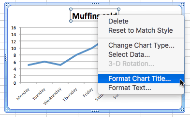
To change the appearance of the title, right-click on it, then click Format Chart Title….
The Line option adds a border around the text. See the beginning of this section for the other options.
Other Versions of Excel: Click the Page Layout tab > Chart Title, and click your option.
Using Legends in Line Graphs
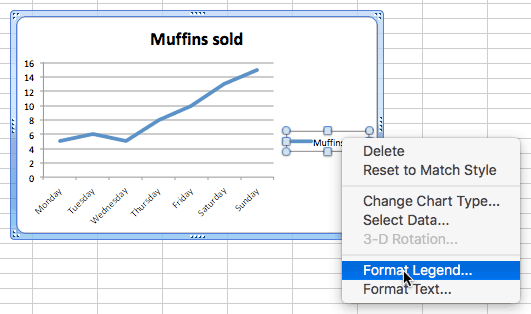
To change the legend, right-click on it and click Format Legend….
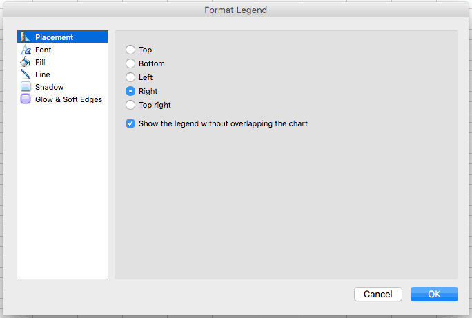
Click the Placement option to move the location in relation to the plot area.
Axes
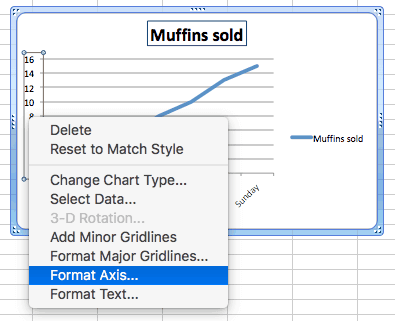
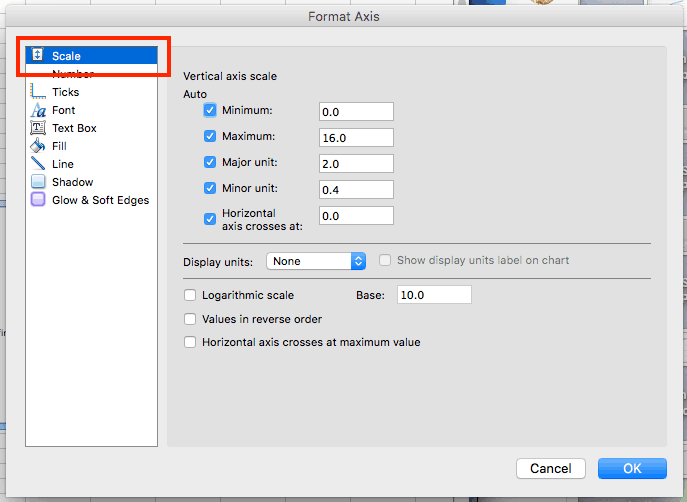
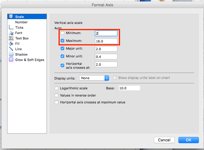
To change the scale of an axis, right-click on one and click Format Axis… > Scale.
Entering values into the Minimum and Maximum boxes will change the top and bottom values of the vertical axis.
You can add more lines to the plot area to show more granularity. Right-click an axis (the new lines will appear perpendicular to the axis selected), and click Add Minor Gridlines or Add Major Gridlines (if available).
Other versions of Excel: Click the Chart Tools tab, click Layout, and choose the option. Depending on your version, you can also click Add Chart Element in ribbon on the Chart Design tab.
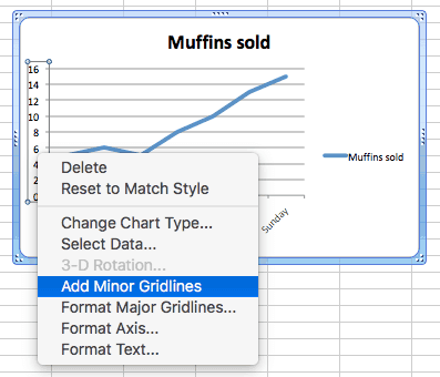
To adjust the spacing between gridlines, right-click and then click Format Major Gridlines or Format Minor Gridlines.
Other Versions of Excel: Click the Insert tab > Line Chart > Line. In 2016 versions, hover your cursor over the options to display a sample of how the graph will appear.
Changing The Line
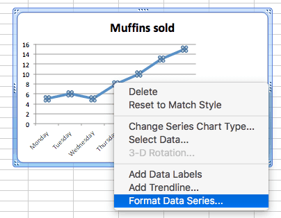
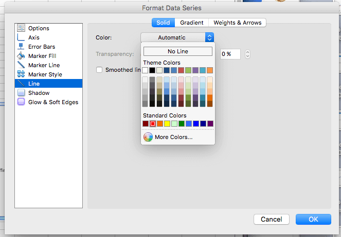
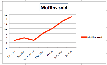
To change the appearance of the graph’s line, right-click on the line, click Format Data Series… > Line. If you want to change the color of the line, select from the Color selection box.
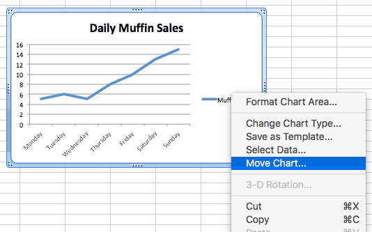
Moving the Line Graph
If you need to relocate the graph to a different place on the same worksheet, click on a blank area in the chart and drag the graph.
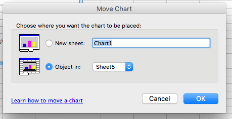
To move the line graph to another worksheet, right-click the graph, click Move…, and then choose an existing worksheet or create a new one.
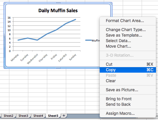
To add the graph to another program such as Microsoft Word or PowerPoint, right-click on the chart and click Cut or Copy, then paste it into the desired program.
How Do You Make a Multiple Line Graph in Excel 2010?
To make a multiple line graph in Excel 2010, follow the same steps to create a single line graph. However, you must enter at least two columns of data into Excel and highlight all the data before creating the graph.
Another Way to Create a Line Graph
Line graphs are often used to introduce the idea of graphing to children because they are easy to create and to understand. The simplest way is to draw one on paper.
First, gather the data. A tally chart is an easy way to track an event over time.

Once you have the data, you’ll need to create a graph, then plot the data on the graph. Plotting is the process of transferring the data to the graph.
Once the data is plotted, draw lines to connect the data points to make a hand-drawn line graph.
The Mathematical Definition of a Line Graph
“Line graph” has a different meaning in the world of mathematics. Here is the formal definition, from the textbook Graph Theory and its Applications by Jonathan L. Gross and Jay Yellen:
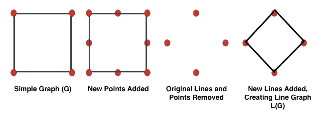
A line graph L(G) (also called an adjoint, conjugate, covering, derivative, derived, edge, edge-to-vertex dual, interchange, representative, or theta-obrazom graph) of a simple graph G is obtained by associating a vertex with each edge of the graph and connecting two vertices with an edge iff the corresponding edges of G have a vertex in common.
A few definitions to clarify what’s in the paragraph above:
A vertex is a point.
An edge is a line.
A graph is a collection of vertices connected by edges.
A simple graph has no loops (i.e. an edge does not originate and end at the same vertex) and a only single edge can connect any pair of vertices.
“Iff” means “if and only if.”
In plain language, if you take a simple graph as defined above, add a point in the middle of every line, remove the original lines and points, and then connect all the new points whose original lines met at a point, you have a line graph.
Make Better Decisions Faster with Charts in Smartsheet
Empower your people to go above and beyond with a flexible platform designed to match the needs of your team — and adapt as those needs change.
The Smartsheet platform makes it easy to plan, capture, manage, and report on work from anywhere, helping your team be more effective and get more done. Report on key metrics and get real-time visibility into work as it happens with roll-up reports, dashboards, and automated workflows built to keep your team connected and informed.
When teams have clarity into the work getting done, there’s no telling how much more they can accomplish in the same amount of time. Try Smartsheet for free, today.