PERT Chart vs. Gantt Chart
PERT and Gantt charts enable project managers to track tasks and project status. PERT charts display tasks in a network diagram, highlighting dependencies; Gantt charts show tasks and timelines in a bar graph. Both have a place in the PMBOK’s work breakdown structure (WBS).
PERT (Program Evaluation and Review Technique) charts are often part of planning, and project managers use them before the start of a project to determine the anticipated length of each task. Here’s how organizations can use a PERT chart for projects:
- The project manager and team define all activities and tasks necessary to complete a project, estimate the time to complete each task, and develop a preliminary time frame.
- In a network diagram, each task is in a separate box that shows its dependencies in relation to other tasks.
- A PERT chart doesn’t have an x- or a y-axis, but each box shows the start and completion times for its task.
Read our guide to PERT charts to learn about their origin, common terms, and ways to use them effectively.
Organizations generally use Gantt charts for tracking the status of tasks and highlighting scheduling constraints. Project managers might also use them before a project to break down tasks into smaller tasks. Here are some characteristics of a Gantt chart:
- Tasks appear in a linear fashion on a bar chart.
- The layout makes it easy to see the expected duration of each task and the entire project.
- Gantt charts are also useful for coordinating resources and scheduling team members.
- When you look at a Gantt chart, the x-axis shows the timeline, and the y-axis displays the tasks.
Read our article on Gantt charts to learn more about their history, benefits, and use cases. You can also learn how to create a Gantt chart or download Gantt chart templates and other WBS-related templates.
Differences Between PERT Charts and Gantt Charts
| Basis of Comparison | Gantt Chart | PERT Chart |
|---|---|---|
| Development | Created by Henry Gantt in the early 1900s so people could see a project’s status at a glance. | Developed by the U.S. Navy in the 1950s to help manage complex projects. |
| Description | A bar chart that shows the status and dependencies of tasks in a project. | A network diagram that illustrates the status and dependencies of tasks in a project. |
| Data Included | Project duration, dependencies, project phases, and responsibility. | Project duration, dependencies, critical path, and responsibility. |
| Usefulness | Used to track the status of each task and break tasks into smaller segments while a project is in progress. | After defining tasks, use the chart to create a timeline for the project. |
| Alterations | The original form of the chart didn’t show dependencies; they have been added in newer versions. | Some versions of the chart are basic and only show the task; others can contain more information about each task, such as the responsible party and completion percentage. |
| Format of Presentation | Bar chart, where each bar represents a task. | Network diagram with boxes that represent tasks. |
| Time Structure | The x-axis is the project timeline. | There is no axis to represent time. |
| Critical & Non-Critical Path | Critical path can’t be easily found when using Gantt charts. | Critical path can be easily found when using PERT charts. |
| Percentage of Task Completed | A filled-in bar represents a task and shows the completion percentage. | There is space to add the completion percentage in the box representing the task. |
| Relationship Between Tasks | In some versions, lines connect dependent tasks. | Arrows connect dependent tasks. |
| Reading the Charts | Generally read left to right to track the status of tasks and sometimes to track the critical path. | Generally read holistically to trace the critical path and, in some cases, to track the status of projects. |
| Prediction of Task Completion | The most common form of the chart fills in the bar to represent the completeness of a task, so it’s easy to visualize. | Many versions of the chart have a field for completion percentage, but it isn’t always easy to read. |
| How the Chart Relates to WBS | Generally used in the execution stages. | Generally used in the planning stages. |
PERT Chart and Gantt Chart Formats
PERT and Gantt charts have some commonalities. You can use them to chart the same activities, but they differ in appearance.
A Gantt chart is a bar chart with the x-axis and y-axis representing tasks in a timeline.

A PERT chart is a flow chart or network diagram that displays project tasks in boxes and links them with arrows that outline dependencies.

Advantages of PERT Charts over Gantt Charts
PERT charts are network diagrams, so they are useful for showing dependencies between tasks. They have three options for activity duration: Most Likely, Optimistic, and Pessimistic. PERT charts are a more flexible planning tool than Gantt charts.
Advantages of Gantt Charts over PERT Charts
A Gantt chart shines at monitoring the status of tasks. It might take some work to create one (though software solutions greatly reduce the load), but they’re well worth the effort for the following reasons:
- Gantt charts generally aren’t as complicated as PERT charts and are usually easier to read.
- Project managers can adjust the tasks in a Gantt chart as the project progresses. This real-time view of progress keeps the team on track for timely delivery, improves efficiency, and optimizes time management.
- Tracking the order of tasks and completed tasks is easier with a Gantt chart.
- Gantt charts are better than PERT charts for monitoring a project status.
When to Use a PERT Chart Over a Gantt Chart (and Vice Versa)
Here are some tips to help you choose between a PERT chart and a Gantt chart, depending on your goals:
- Use a PERT chart when you need to:
- Anticipate the amount of time it takes to complete the project
- Determine the critical path to meet your deadlines
- Plan for large or more complex projects
- Show the interdependence of tasks
- Use a Gantt chart when you need to:
- Anticipate the amount of time to complete each task
- Clearly communicate task responsibilities
- Communicate the project’s progress
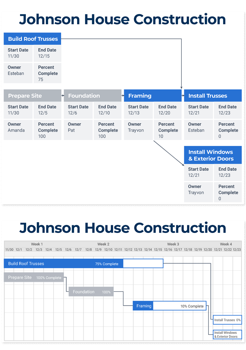
PERT Chart vs. Gantt Chart in Action
PERT and Gantt charts highlight different aspects of tasks in a project. Here are examples of each chart type covering the same tasks in a project. In this case, these sample charts look at the first steps in building a house.
You can see the differences between the two charts below. Compare the information displayed in each and the variations in how the charts present the same information.
How to Make a PERT Chart from a Gantt Chart
You might be able to convert a Gantt chart to a PERT chart in Microsoft Project* by changing the data display. Microsoft Project does most of the work when you switch the view to Network Diagram. If not, try this:
- Open an existing Gantt chart and a blank PERT chart.
- Add a new task to the PERT chart.
- Copy and paste key data, like start date, end date, person responsible, and percent complete from the Gantt chart to the PERT chart. Repeat for each task.
- If you have dependency lines between related tasks, copy them from the Gantt chart to the PERT chart. If you don’t, create them. Repeat for each task.
You’re done. Admire your new PERT chart.
*Microsoft is retiring MS Project Online. Learn more about using Smartsheet as a Microsoft Project Replacement.
PERT Charts, Gantt Charts, and the Critical Path Method
PERT charts and Gantt charts can be used to track the critical path of a project. But since part of the critical path method (CPM) involves estimating the completion time by the best, most likely, and worst-case options, the PERT chart is a better option.
The critical path method (CPM) is a project management technique in which you add all tasks for a project and their dependencies to a chart. Then you calculate the project duration based on estimated durations for each task and the associated dependencies. Once you add all tasks and dependencies to the chart, you can uncover the critical path by tracing the tasks and dependencies. Learn more about how the critical path and gantt charts work together.
The critical path is the longest sequence of tasks in a project plan that, when you finish each on time, enables the project to be completed on schedule. A delay in any task on the critical path pushes back the timeline for the entire project. Most projects have a single critical path, but some projects have multiple critical paths. Read more about the critical path method.
Create Interactive Gantt Charts with Smartsheet
Empower your people to go above and beyond with a flexible platform designed to match the needs of your team — and adapt as those needs change.
The Smartsheet platform makes it easy to plan, capture, manage, and report on work from anywhere, helping your team be more effective and get more done. Report on key metrics and get real-time visibility into work as it happens with roll-up reports, dashboards, and automated workflows built to keep your team connected and informed.
When teams have clarity into the work getting done, there’s no telling how much more they can accomplish in the same amount of time. Try Smartsheet for free, today.