Sales Dashboard Examples and Templates
To get a better idea of the breadth of sales dashboard types, look at the following collection of examples. There are numerous types that can serve differently structured teams and the various roles within them:
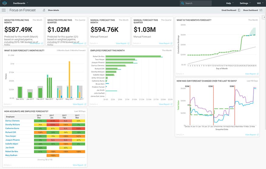
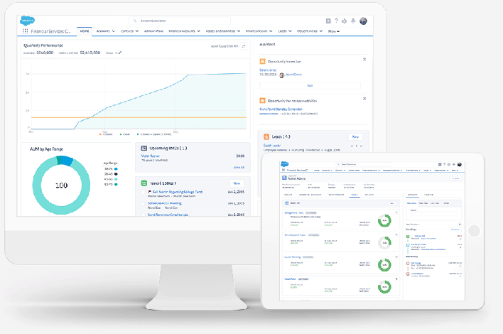
Sales Pipeline and Forecast Dashboard Example
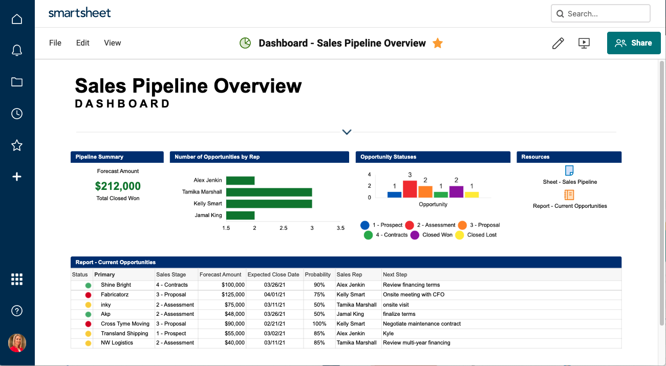
Executives who want to see at-a-glance current and potential sales will appreciate a sales pipeline dashboard. A sales pipeline that also highlights a top-performing salesperson is a good motivator for team members. Additionally, this dashboard does a good job of providing links to critical sales material without cluttering up the layout.
Sales Manager Quarterly KPI Dashboard Example
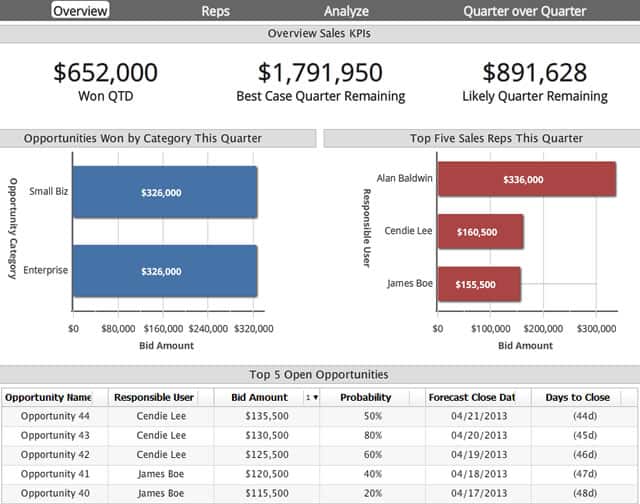
This dashboard is made explicitly for the team manager, showing a few core quarterly data points, like opportunities won vs. the quarterly goal and the top sales reps. Sales managers can use a similar dashboard to determine who needs help, or who can be pushed to even higher levels of performance.
Executive Sales Dashboard Example
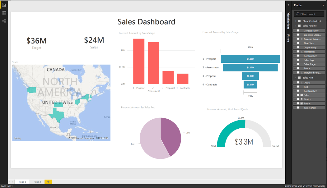
This simple sales dashboard uses a handful of highly-visual KPIs. It shows meters filling up towards team goals, the regions where customers are being won, and general sales performance data.
Sales Management Dashboard Template

Use this sales management dashboard template to track performance by salesperson, product, region, and more. Having this data at your fingertips can provide insight into any issues that may need to be resolved, enhance employee accountability, and drive progress.
Download Sales Management Dashboard Template
Sales Manager Daily Dashboard Template
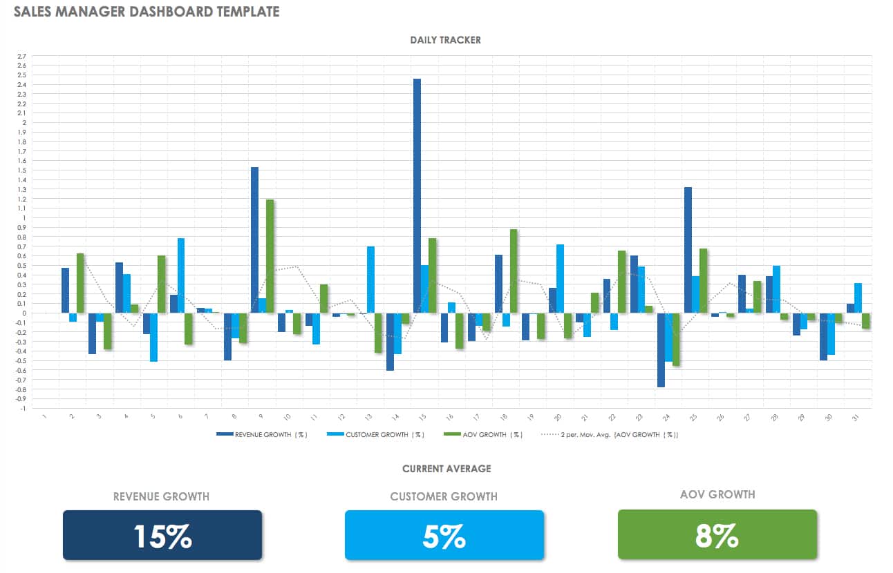
A sales manager works with an existing team to make sure they are performing at optimum levels, and are meeting all their goals. Use this template to instantly see how your team’s overall sales are doing daily, along with information about customer and revenue growth.
Download Sales Manager Dashboard Template
Lead Generation Dashboard Template
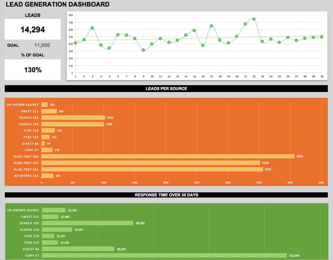
Use this dashboard template to assess your lead generation and conversion performance. Whether you’re working independently or with a sales team, a dashboard can provide a clear picture of your most successful lead sources, conversion rates, and your proximity to reaching your goals.
Download Lead Generation Dashboard Template
Executive Dashboard Template
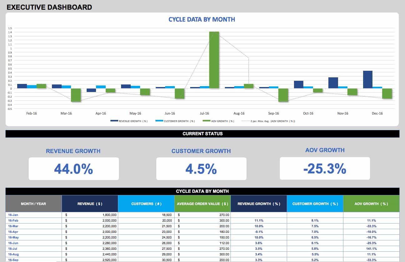
An executive dashboard provides the C-suite with a big-picture view of an organization by consolidating KPIs into a single easy-to-read, graphical report. Choose your KPIs based on organizational growth goals and quantifiable measures of success. This template is just one executive dashboard example - to learn more, read our article on types of executive dashboards and best practices.
The Basics of Sales Dashboards
Let’s start by defining the term: a sales dashboard is an automatically-updated collection of metrics that help its viewers gain insight into their current situation at a given time, and make decisions about what to do in real-time to achieve their organization’s goals.
The timeline is important. Although a dashboard may be updated in real time, they generally only reflect a particular moment, which is important for performing a historical comparison to the dashboard at other times. This information lets you know whether the sales team’s efforts are working towards improving the metrics. We’ll break down the pieces of a basic dashboard here:
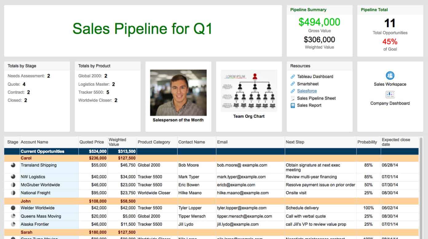
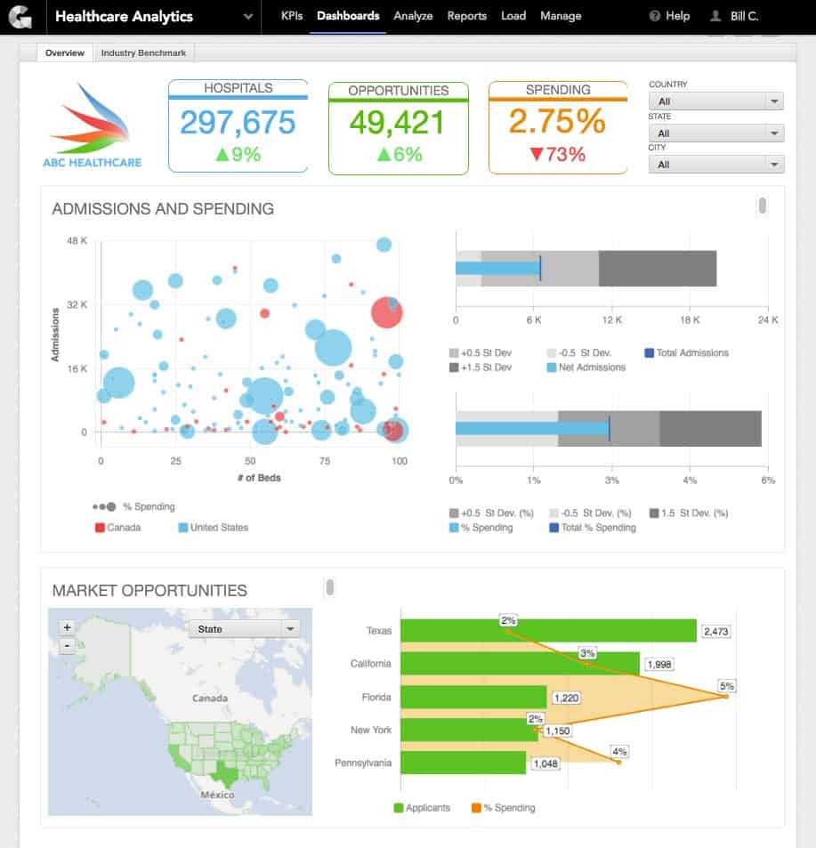
In this Sales Pipeline dashboard, there are a number of elements that can be found on various dashboards, though certainly not all of them.
- Title: Your dashboard should be labeled so that viewers are certain of its purpose. The title needs to be specific and differentiated. This sales pipeline example is only for Q1, which prevents bloating with too much unhelpful data.
- KPI 1: A KPI is a “key performance indicator,” which is a metric whose value lets you know whether you’re on track toward specified goals. Often in dashboards, KPIs have a color code, for example green or black meaning profit, and red meaning loss. In this example, we’re using total value of the sales team’s efforts in dollars, which is pretty standard.
- KPI 2: There often are more than just one KPI per dashboard, which give a more complete picture of the organization’s health at a glance. For example, we know from KPI 1 that there’s nearly $500k in sales made, but how many leads is that spread across? In this case, it’s 11, which is below the goal. This means that although there is more money in the pipeline than planned, it depends upon too few customers, meaning that more effort needs to be placed on adding new customers to the pipeline.
- Tally Metric: A dashboard shouldn’t only be made of KPIs; other supplemental metrics help convey important data. In this metric, we see how the opportunities are spread by stage of the sales pipeline - only two have actually closed, while four are still negotiating price. Maybe the salesperson needs more support from sales managers or senior account managers to help move the client to accepting the quote.
- Tally Metric 2: This is another supplemental metric that tells the team which of their product offerings are making it into the pipeline. The team can use this data to identify opportunities for upsells or focus efforts on more popular and likely-to-close items.
- Competitive: Dashboards don’t have to be all numbers and charts. This visual representation through a salesperson’s headshot helps spur the team to greater competition, often a factor in sales team performance. It also motivates the featured individual to keep pushing to maintain their lead. Such a widget could also contain a chart showing the number of sales per person.
- Information: This type of widget, in this case an org chart, serves to give the sales team members information that could be important. In larger organizations, they may not know who are the managers for other divisions. Maybe they’re cross-selling a product outside of their division, and need help from the product manager to better articulate its benefits to the lead.
- Links: On cloud-based digital dashboards, you can easily insert links to other data as needed. Empower the people who use the dashboard to gather all the information they need from it, so they feel compelled to keep their dashboard handy at all times. If it isn’t used, it isn’t useful.
- Links 2: Again, additional resources for sales team members and analysts that aren’t worth featuring on the main dashboard.
- Data: It isn’t appropriate for every type of dashboard, but you can include a raw or curated subset of the data necessary to manage the dashboard. In this case, all of the actual opportunities within the pipeline have their amount and contact data listed. A dashboard widget like this might be more useful for a sales manager rather than the sales team.
While this is just a short example, it highlights the need for different types and classes of data within a dashboard, and how they’re all logically linked. It provides just enough information for managers and team members to make decisions and locate vital information, without distracting or cluttering elements taking up room.
Planning a Sales Dashboard
As you can see from the dashboard basics, the creation of a single dashboard requires deliberate planning and design. How do you assess what metrics to place where, what are their behaviors, and what do they tell you? Consider these questions as you plan your dashboard.
What’s the Purpose of the Dashboard?
This question is the crux of the entire practice. Does your dashboard describe or prescribe? Does it help a team coordinate efforts, or does it help stoke competition? What do you want someone to walk away from a dashboard knowing?

Business Intelligence Consultant Rohit Keserwani weighs in with this advice:
“The best dashboards are those which tell you what to do, rather than what has happened. All the relevant KPIs should be available on the same screen, in a sequence of causal relationship among them. Under no circumstance should the number of these KPIs exceed seven. Too many KPIs clutter the dashboard beyond the degree of human comprehension.”
Who Needs to See the Report?
Determining the role and seniority of the individuals who will view your dashboard is the next important step. What types of decisions do they need to make? Will it feed into other reports, or will it have other reports feed into it? Consider what Ryan Bottorff, Director of Marketing & Sales Operations at ReviewTrackers has to say:

“It’s important to build dashboards based on team structure. So for our sales development representativess, I have a simple four-stage dashboard that shows: Contacts added → activity → opportunity → revenue.
For me, I build one dashboard each for the sales department rep, our inbound team, account executives, and the C-suite. For the C-suite, I take the information from the other three dashboards and summarize it at the highest level. The CEO and director of sales don’t really care about the daily details of our SDRs, but they are interested in the big picture numbers: how much opportunity was created this month and how much was closed.”
Keserwani adds, “Dashboard categorization is based on the level of decision-making that it is going to support. The strategic dashboard is for top management, tactical is for middle management, and operational dashboards are for lower management and employees.”
How Often Should You View the Dashboard?
Having this time information can help determine the scope of data to include and the type of dashboard to create. If it’s a monthly team dashboard that gives overall status and a time to change “salesperson of the month,” it would include the last month’s sales data split by teams, reps, regions, and more. If it’s a daily dashboard for a salesperson, it might include the best selling items, opportunities in motion, and the list of calls they’re supposed to make that day. Different timelines demand different data.
Over What Time Period(s) Will the Data Be Collected?
Not quite the same concept as how often the dashboard will be viewed, this consideration is for the literal quantity of time the data needs to be displayed. Year-over-year comparisons are good if goals and compensation structures are based on these improvements, but if the product isn’t yet a year old, that won’t work. Take a subscription-based software, for example, weekly user retention might be an important metric to determine if customers need more service or incentives within the software.
How Many Types of Data Will Be Included?
This is a matter of form and function. Not only should the literal quantity of widgets in your dashboard be relatively small so that it isn’t too cluttered, but also they should work together to paint a picture. Metrics like “total sales volume,” “total volume stuck in opportunities in progress,” and “number of leads left in the funnel” all complement each other. This information combined in a single dashboard provides a clear indication of how much money has been made, how much is on the table, and how much possibly could be made with current marketing efforts. Throw in “average sales per rep” and you have a good goal post for reps to reach. But adding a metric like “promotions conducted” might not add anything for the average sales rep who doesn’t deal with marketing, nor would “sales revenue per hour” be beneficial data for a product with a month’s long sales cycle.
What Is the Ideal Way to Visualize the Data?
When it comes to how to represent your various data points, Bottorff suggests, “What’s important to me is the ability to understand the data without clicking on the report. So keep things simple: highlight trends and outcomes. If someone wants the granular data, that’s great, but let them click into the report to find out. Don’t overwhelm them with too much up front.
“Another thing that’s important to me is variety. Remember: You build a dashboard for the members of your team. They’re more likely to read a dashboard and make sense of it if there’s a little variety and fun. That’s why I don’t make everything bar graphs. I’ll include an odometer, and a couple other fun things that aren’t too flashy, but add enough variety to make the dashboard fun.”

David Radin, CEO and Co-creator of Confirmed Instant Scheduler, a scheduling automation solution, explains visualization, “The best visualization is one that is simple, can be understood at a glance, and is actionable. Sometimes that’s a bar chart, pie chart, or other common visual. In many cases, the best visualization is simply color-coding an indicator next to text. For instance, our dashboards list the people with whom you have requested a meeting, with a color-coded icon that indicates whether the meeting has been confirmed (blue), pending (grey), or declined (red). This shows at a glance whether a meeting request needs attention. We further allow our users to filter, to show only pending meeting requests (those with the grey icon). This makes the visual even more actionable by showing only the meeting requests that need attention and removing the distractions that don’t need attention.”
How to Create a Sales Dashboard
Planning was most of the battle - now you need to create the dashboard. Follow these seven steps:
- Determine the KPIs and Sales Metrics You Need to Monitor
Based on which people need to see the data, how often, and the dashboard’s purpose, choose your KPIs. There are examples later in this article to help you begin choosing. - Locate Where That Data Currently Lives
You already have systems in place to collect the data. There are spreadsheet applications like Excel and Google Sheets, and database applications like MySQL and Access, which may have custom automations that collect and analyze the data. These may contain data from many different departments, but also don’t have standard formatting that’s always reliable. There are also customer relationship management (CRM) systems which sales teams are likely to already use to collect and store data, like leads, opportunities, deal status, and revenue. Uncover the location(s) where your required data lives and work with devs and the systems to import it into one centralized dashboard. - Determine How Your Dashboard Will Be Viewed
Location is everything. Is this a dashboard for a team’s general status? Maybe displaying it on a big TV central to the sales department is in order. Is this for field reps to organize their efforts? A mobile-optimized dashboard with limited metrics would be better. An inside-sales team? Create something just right for their company laptop. - Use Your Requirements to Evaluate a Dashboard Software Vendor.
You can cobble together a dashboard in Excel with PivotTables, but it will have limited real-time capabilities and will require reformatting data often. Many existing CRMs have more advanced dashboarding capabilities, but they only use data that can be imported to them, and often they are focused on proprietary software ecosystems which lock down data. In that case, you’ll need to find a dashboard solution that can sync data from all relevant data sources - often these apps allow developers to use APIs to import data from a CRM or other tools, and tend to have better, more informative UIs that you can optimize for any screen. Information on dashboard vendor options appears later and at the end of this article. - Import Data from Your Data Solutions
Now that you have your dashboard platform and your data sources selected, tie them all together through built-in automations or custom developed solutions. - Design and Implement Graphical Visualizations
Based on the plans you made at the beginning of this process, build your dashboard with just the right amount of data to inform decision-making and actions, make it aesthetically pleasing (but not too cluttered), and tell an honest story about current sales status. - Share the Dashboard with Your Team
With a proper, real-time sales dashboard ready to go, share it with all relevant team members and begin the process using the information it provides to perform better and increase sales.
Common Mistakes in Sales Dashboard Design
Just because you’ve built a dashboard that has everything you need doesn’t mean it’s perfect. There are tons of pitfalls and kinks to avoid. Address these issues quickly to ensure your dashboards are as useful as possible. The following are common mistakes you should avoid:
Building a One-Size-Fits-All Dashboard
Since dashboards are built for varying purposes, don’t try to make one that suits the needs of all. Including too much information will either destroy the simplicity required to make quick assessments and decisions, or could be simply inappropriate. All sales reps probably shouldn’t see a widget that shows who has the lowest sales - that would hurt morale and is more suited to a sales manager who wants to figure out whom to help or who would benefit from corrective action.
Not Adding Comparison Values
While often compared to a car’s dashboard, a sales dashboard is quite different and it shouldn’t just show status at this one particular time. Comparison values adds context that viewers can draw meaningful conclusions from. Are sales up month-over-month, or down? Was the same quarter last year more or less productive?
Poor Layout Choices
Layouts can be done in many ways, but some take away from the dashboards value of providing quick understanding. Bottorff advises, “I think of dashboards like storyboards. It may sound cheesy, but I want to tell a story left to right, as much as possible. I want leads to flow into opportunity which flows into accounts.”
A dashboard should follow the natural direction of the human eye, and some metrics (those with greater importance) should be larger, rather than just having a collection of squares of equal size.
Using the Wrong Chart Types
This advice goes back to your basic math classes - a pie chart is only good for ratios, a bar graph is good for quantifying, and a line graph is best for timelines. Don’t get too creative. Use the best visualization for the job at hand.
Misusing Color
Another important visual signifier for sales dashboards is color. As mentioned earlier, a number could be shown in green for positive revenue or red for negative, or yellow for at-risk. Adding color in this manner provides a quick understanding of good/bad that can be investigated further by the viewer. Colors also help differentiate widgets from each other, and the data within them. If you are including a regional map widget in your dashboard, each region should have its own color, and then the pie chart that gives a ratio of sales volume for each region should have the corresponding color on it.
Making People Do Mental Math
A dashboard isn’t a place for analysis - a dashboard is the report from the analysts. It’s like feeling pain - the pain is just a signal that tells you to pay attention to the flaring area, and do something about it. It’s the work of a specialist to identify the cause, that’s not your concern. Dashboards should have no math, just results.
Mismatching Its Usage Frequency
Is a dashboard report going to be seen every day? If so, then only show the results pertinent to today. A daily report doesn’t need the entire month’s worth of potential problems, just the ones that must be managed now.
How Much Data Is Too Much?
Bottorff advises, “Keep it simple. That’s the biggest thing. The point of the dashboard is to communicate. So you don’t want to overload with too much information. As a rule of thumb, I won’t add more than nine components to a dashboard. Each component (chart, graph, etc.) should only tell one thing. As a sales and marketing leader, you love digging into the data, but that doesn’t mean you should be broadcasting the minutia to your office everyday.”
Important Sales Metrics to Track
There are a wide variety of metrics you can include on dashboards, based on their purpose. In general, you should be drawing at least a few from the list below, so familiarize yourself with them:
- Closed Opportunities: How many deals have generated revenue, and how much revenue total?
- Leads by Source: Figure out which channels are resulting in leads. Are you generating them from Facebook ads, brand ambassador street teams, or someplace else entirely? Know where to focus efforts to fill the sales pipeline.
- New Business Versus Upselling: It’s important to know your retention rate, and have a healthy ratio of new business coming. Remember the 80/20 rule: 20 percent of your customers will churn yearly.
- Open Activities: These are the “to-do” list for most salespeople, and feature calls to make, emails to send, and meetings to schedule.
- Open Cases: These are customer service situations for existing customers, created when they reach out first. You need to address these customers quickly, and it’s typically account managers who make contact.
- Open Opportunities: This is your lead-tracking metric, letting you know who to call on and work with to close deals.
- Opportunities Past Due: This metric helps illustrate to management how far behind the team is as a whole, and if there are team members overburdened who need to have opportunities moved to others with lighter schedules.
- Pipeline: This common CRM metric shows the current stage of each opportunity, so you know how to talk to each lead as you help them through the sales funnel.
- Product Gaps: This is the gulf between expected sales of a product and the actual sales. Gaps need to be closed, and represent opportunities as a sales rep to find out how to sell it better.
- Sales By Closed Date: This information helps salespeople track what they need to close by certain days, because they have quotas and commission goals to meet.
- Sales Cycle: The average duration (in days, usually) for the team to close a sale. This lets team members know how to plan revenue, commission payments, and their own pipelines.
- Win-Loss Rate: How many opportunities are closed and won vs. closed and lost? This is an important metric to improve, but also serves to let team members know how they’re doing compared to the average.
Popular Software Options for Sales Dashboards
Dashboarding and data visualization software often come as standalone platforms that import data from many sources. These programs can also sometimes be integrated with CRM systems or generalized work management platforms. Here are a few of the most popular options on the market:
Self-described as “live TV dashboard software for business,” Geckoboard focuses on large, colorful widgets. These dashboards are all meant to be viewed by everyone at once on big displays, and integrates with tons of spreadsheet and data platforms so it can be an all-in-one solution. It also has a mobile integration that lets team members take metrics with them on the go, still updating in real-time.
GoodData helps businesses gather insights from large quantities of data while also assisting them to find ways to monetize it, usually through on-demand access for customers and clients. The data this software handles is often more complex and complete than direct sales data.
InsightSquared is a business intelligence tool that helps sales teams gather data in dozens of pre-made reports. It’s also ReviewTrackers’ Bottorff’s personal favorite. “InsightSquared integrates with Salesforce, and makes it easier to track performance over time. InsightSquared has a library of 80 some odd sales reports, so it’s a really helpful add-on for any sales ops team,”he explains.
Klipfolio allows some robust widget editing and customization, taking in specific pieces of data from hundreds of sources and displaying it as a spreadsheet in the editor for last minute adjustments. Even new complex formulas can be manipulated in the editor to model projections to compare against data.
Qlik is a powerful visualization platform that enables automated associative indexing, drawing different data sources together and maintaining the data that is most fitting.
Salesforce is a massive CRM platform with a long history that goes far beyond just dashboard abilities. As the CRM of choice for many sales organizations, it is worthwhile to explore its native analytics abilities, as they are tied more closely to your data and don’t require importing or exporting.
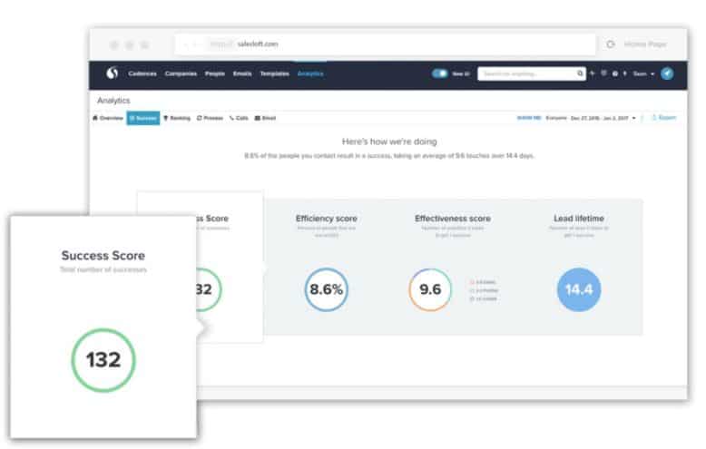
SalesLoft is also a CRM of sorts, with call and email tracking functions tied into an automation platform that outputs smart dashboard widgets so users can understand effectiveness.
Make Better Decisions, Faster with Sales Dashboards in Smartsheet
Empower your people to go above and beyond with a flexible platform designed to match the needs of your team — and adapt as those needs change.
The Smartsheet platform makes it easy to plan, capture, manage, and report on work from anywhere, helping your team be more effective and get more done. Report on key metrics and get real-time visibility into work as it happens with roll-up reports, dashboards, and automated workflows built to keep your team connected and informed.
When teams have clarity into the work getting done, there’s no telling how much more they can accomplish in the same amount of time. Try Smartsheet for free, today.
