What Is a Project Management Chart?
A project management chart helps project managers visualize and share data with teams and stakeholders. They can share basic, comparative details with simple bar and pie charts. More complicated charts such as network and activity diagrams outline complex informational relationships.
Types of Project Management Charts
Project management charts can take many different forms, from graphs and matrices to calendars and diagrams. Charts are specialized to best display a certain kind of data. Some charts require more context to understand than others.
Remember that no single chart shows the whole story, so in most cases it is best to use different charts for different needs. We’ll outline each chart’s best use cases, provide examples, and detail the pros and cons of each type in the sections below.
Gantt Charts

Gantt charts are useful for tracking schedules, tasks, and dependencies over time for projects and teams of all sizes. They clearly display essential information in a layout that is easy to understand at a glance.
Each bar in a Gantt chart represents a project task or assignment, and its length corresponds to its start and end dates. Arrows connect vertical tasks that are dependent on one another, and the bars are often color-coded to denote phases, employee assignments, or whatever organizational scheme the project manager chooses. Some programs can also display the percent completion of each task or highlight tasks that are in danger of exceeding their deadline. These charts are easiest to create with software using premade, customizable Gantt chart templates.

“Gantt charts are useful to track the progress of a project and for early identification of any potential delays or issues that need to be addressed,” explains Ben Walker, the CEO of Ditto Transcripts.
Gantt Chart Pros:
- Straightforward to read and understand
- Offers a comprehensive project schedule overview
- Can use software to easily create, update, and share
- Provides visibility into team assignments
- Visualizes dependencies and helps anticipates risks
Gantt Chart Cons:
- Difficult to create and update without software
- Not ideal for charting complex projects because it can be hard to read
- Can be time-consuming to create for multifaceted projects
To learn more, visit our in-depth guide to the pros and cons of Gantt charts.
Kanban Boards

Kanban boards are a visual task board to show the status of each project activity. They break up work into progress phases, most often named To Do, In Progress, and Completed. Kanban boards began as pen-and-paper tools, but many software solutions now offer Kanban functionality.
Kanban boards and Kanban cards are ideal for smaller projects and teams to manage a backlog of tasks that do not necessarily require specialized tools or expertise. Rather than assigning tasks to an individual, team members choose their next task based on what is available in the To Do pile to move the project forward.
Project managers often create physical Kanban boards with sticky notes and a whiteboard, but many Kanban templates are available for those looking to create them digitally.
Kanban Board Pros:
- Easy to set up and use without software
- Clear to read and understand
- Quickly add and remove items on a board
- Great solution for sprints or short projects
Kanban Board Cons:
- No visual timelines means they are less comprehensive than other chart types
- Difficult to scale; larger projects are harder to visualize
- Cannot see dependencies
- Teams need a new board for each project phase
Work Breakdown Structure

A work breakdown structure (WBS) organizes each project step into the individual tasks and deliverables needed to complete it. A WBS chart is useful for project strategy, including identifying bottlenecks, determining possible task assignments, and creating estimates for project schedules.
Breaking project work down into pieces is one of the most critical parts of project planning. You can’t finish a project until you know the tasks needed to complete it, and a work breakdown structure chart helps you visualize and organize your thoughts while strategizing. Work breakdown structures are not usually shared with stakeholders, who usually want more information than the chart can provide. You can create a WBS chart with pen and paper or use a free work breakdown structure template to make one digitally.
WBS Chart Pros:
- Works with most project management methodologies and frameworks
- Use as a first step in overall project planning strategy and visualization
- Powerful organizational tool for visualizing all project tasks
- Easy to create the chart with or without software tools
WBS Chart Cons:
- Does not order tasks sequentially
- Does not factor in time or resource needs or constraints
- Not suitable for sharing detailed project information with stakeholders
- Can’t display detailed task relationships
Network Diagrams

A network diagram is a sequential visualization of all required project tasks linked by dependencies. Project managers use them to organize and visualize project tasks and dependencies. They are the first step in creating a PERT chart and identifying the critical path.
Network diagrams are a work breakdown structure organized by the order of needed tasks. They are useful as a step in project planning and strategy, but do not provide much-needed context to stakeholders. These diagrams are not generally shared.
Network Diagram Pros:
- First step to creating a PERT chart or finding the critical path
- Useful for visualizing the tasks required to complete a project
- Further breaks down work into manageable workflows and provides an order to complete tasks
Network Diagram Cons:
- Does not track or estimate time for tasks or project completion
- More of a planning tool than a way for stakeholders to visualize the project
Program Evaluation and Review Technique (PERT) Charts

PERT charts are most useful for scheduling project tasks and estimating overall project timelines and deadlines. A PERT chart arranges all project tasks and the estimated time needed to complete them from start to finish and links them to their dependencies.
A PERT chart is a type of network diagram that includes the time needed to complete each diagrammed task. On its own, a PERT chart does not provide project details, but project managers typically use them to find the critical path, build project schedules, and create other more shareable data visualizations.
PERT Chart Pros:
- Can be used to find the critical path
- Helps to estimate the time needed to complete project tasks and phases
- Identifies and visualizes task dependencies
- Useful for identifying dependencies between teams and departments
PERT Chart Cons:
- Harder to read for complex projects
- Requires accurate time estimates
- Errors and inaccuracies can easily cascade down the line, causing larger errors later
- Does not factor in resource needs or constraints
Critical Path Method (CPM) Charts

Use a critical path method (CPM) chart to identify the minimum time required to complete a project. They are useful for estimating timelines, performing risk assessments, and identifying project dependencies. Almost all projects can benefit from determining the critical path.
A CPM chart uses the time estimations made in a PERT chart to calculate the longest span of time required to see the project through to its end, or, the critical path. In this way, project managers can more accurately calculate project schedules and fit projects into a larger requirements calendar. A CPM chart is sometimes shared with stakeholders during the planning phase as part of project strategy, but it is not often included as an ongoing tracking metric. CPM charts can be made with pen and paper for smaller projects or with a critical path template for more complicated ones.
CPM Chart Pros:
- Creates more accurate project schedule projections
- Visualizes progress for a project
- Easy to read with little context
- Possible to create without software
CPM Chart Cons:
- Does not factor in external timelines or deadlines
- Does not include resource information
- Cannot anticipate external delays
- Becomes much more complicated and harder to read on larger projects
Flowcharts

Flowcharts are used in project management to create workflow diagrams or model decision trees or user journeys. They are useful for visualizing the possibilities related to decisions made and their potential journey and outcomes.
Flowcharts are easy to read and understand, and they can be easily created with pen and paper or pre-made flowchart mapping templates. Their graphic nature makes them ideal for describing thought processes or model workflows and more complicated processes to stakeholders in presentations. A workflow diagram is a flowchart that specifically visualizes the process order of a particular task.
Flowchart Pros:
- Numerous use cases, from workflow diagrams to decision trees to user journeys
- Intuitive; easy to read and understand
- Simple to create with or without software
- Highly visual format is ideal for presentations and sharing
Flowchart Cons:
- Hard to edit and change; one change often necessitates additional adjustments down the flowchart
- Complex flowcharts are more difficult to read
- Challenging to maintain neatness as flowcharts get larger
- Can be time-consuming to create
Activity Diagrams

Activity diagrams are complex flowcharts with specific, universal notations for choices, parallel actions, and requirements. They are often used in business process modeling and can also model more complicated workflows and processes.
Activity diagrams are often used to model the user journey through an app or website or to model complex business and systems processes. They are generally more complex than a regular flowchart, and they’re easier to create and edit with software. Activity diagrams can be shared with stakeholders, but they are more often used for visualizing activities for planning and internal research purposes.
Activity Diagram Pros:
- More specialized than a basic flowchart
- Useful for visualizing more complex processes
- Features additional standardized notation to indicate parallel processes and requirements
- Helps to visualize the logic behind UI/UX decisions
Activity Diagram Cons:
- The layperson might find it challenging to interpret at a glance
- Complex processes can be difficult to organize and read
- Difficult to edit; changes to one item often require changes to subsequent ones
- Does not provide context for resources or time
Cause-and-Effect Charts

A cause-and-effect chart enables you to visualize the results of direct inputs on corresponding outputs. These charts are a straightforward method for modeling the outcome (real or assumed) of choices made during or when planning a project.
Cause-and-effect charts are useful for presentations and sharing with stakeholders. They can help highlight the effects of decisions made during a project in a business post-mortem or lessons learned meeting. These simple charts are easy to make with graphics using software or simply by writing side by side in columns on paper.
Cause-and-Effect Chart Pros:
- Easily visualize the outcome or potential outcome of decisions made
- Ideal for strategic planning in post-mortem and lessons learned meetings
- Might be useful for compiling data over the long term
- Great for training and resource planning
Cause-and-Effect Chart Cons:
- Limited in scope; effects are often related to more than one cause
- Does not separate cause and effects by weight; displays all items as the same impact visually
- Requires accurate data and reflection, so the creator must be impartial
Fishbone Diagrams

Fishbone diagrams are used to visualize the potential causes of a given effect or outcome. The diagram orients the effect at the fish’s “head” and the potential causes cascade behind as the “bones.”
Fishbone diagrams are useful for brainstorming and strategic planning. They are often filled in as a group activity in meetings or to perform a root cause analysis. They are easy to create with pen and paper or from customizable fishbone templates. While they can be shared with stakeholders, a better option might be to provide a simpler cause-and-effect chart.
Fishbone Diagram Pros:
- Good tool for group brainstorming sessions
- Identifies numerous potential causes for an effect
- Useful tool for organizing thoughts before taking other actions
Fishbone Diagram Cons:
- Cannot measure weight or severity of any cause over any other
- Can create irrelevant lists of information, and checking them wastes time
- Not suitable for more complex issues with more complex causes
- Must be paired with a strategic response to make improvements
Line Charts

A line chart is one of the clearest ways to model numerical data based on two variables. Those variables are often a quantity of an item on the y-axis in relation to “time” on the x-axis. Line charts are simple, universal, and easy to read.
Line charts can describe all kinds of data. You can easily see trends as a line that rises to the right, indicating the growth of your variables, while a line that descends portrays a reduction. You can “zoom in” on a chart to show small changes or “zoom out” to show larger ones. A line chart’s simplicity makes it easy to create without software. If you don’t want to make a hand drawing, you can learn how to make line charts in Microsoft Excel.
Most people are taught to read line charts when they’re young, so the charts are widely understood. For this reason, they are great for sharing trends or progress information with stakeholders and are often included in project status updates or dashboards.
Line Chart Pros:
- Often familiar to viewers
- Easy to understand
- Outlines trends at a glance
- Can represent large or small ranges of data equally well
- Easy to create with or without software
Line Chart Cons:
- Must be careful with chosen ranges to tell your data story — data from a shorter period might show larger variance than the same data from a longer time
- Can track only two variables at a time
- Does not include context to its data
- Best when paired with other data or an explanation
Burn-Up and Burn-Down Charts

Burn-up and burn-down charts are line charts that model the work completed and remaining over a period of time. They are commonly used to track the progress of Agile sprints and provide an overview of how a team spent its time.
“A burn-down chart illustrates the progress of a project sprint over time,” explains Walker from Ditto Transcripts. “Project managers use them to assess how quickly a project is progressing and whether or not it will be completed on time.”
The y-axis measures the number of tasks or projects, and the x-axis measures the chosen timeframe. Burn-up and burn-down charts are easy and intuitive to read and create. They are often included on project status updates or dashboards because team members and other stakeholders can quickly see how a project is progressing and the amount of work remaining.
Burn-Up and Burn-Down Chart Pros:
- Great for tracking progress of project sprints and ticket-based teams
- Provides a model of productivity and efficiency for stakeholders
- Extremely easy to read
Burn-Up and Burn-Down Chart Cons:
- Provides no context to the type or impact of tasks completed or remaining
Cumulative Flow Diagrams

A cumulative flow diagram is a specialized burn-up chart that visualizes the amount of work by stage of progress. They provide more details about the state of a team’s backlog by highlighting tasks to do, in progress, and completed.
Cumulative flow diagrams are often used to monitor the stability of workflow over time. They are a great tool to share with stakeholders because they are an easy-to-read, graphic representation of the work a team is doing. They are relatively complex to design, so they are best created and updated with software and shared digitally.
Cumulative Flow Diagram Pros:
- Highly visual and easy to read
- Provides a view of a backlog and the phases of each task
- Can help identify potential bottlenecks if the “flow” of any measured state becomes too uneven
Cumulative Flow Diagram Cons:
- Difficult to create without software
- Cannot be used to predict the future state of tasks
- Doesn’t represent the size or impact of individual tasks
Control Charts
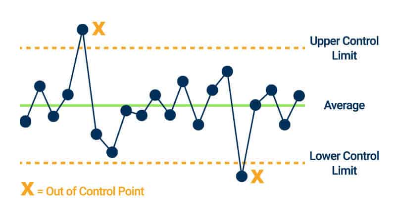
A control chart is a line graph bounded by an upper and lower control limit. They are generally used to track the outputs of a particular process and ensure that operations are within an acceptable range.
Control charts provide more context than a simple line chart because they indicate how close each data point came to reaching the upper and lower control limits. They also include a center line that shows the average value of the charted y-axis, allowing viewers to see trends over time.
“A control chart demonstrates the performance of a process over time,” explains Walker. “They allow managers and stakeholders to monitor the quality and consistency of various processes and help identify potential issues that need to be addressed.”
Control charts are easier to make with software or by using a control chart template. They are useful for auditing and diagnostics, but may contain too much specialized information for the casual stakeholder. A control chart does not provide context as to why a data point might be outside of the control limits, so they are most useful when the user has access to more detailed project data to diagnose these anomalies.
Control Chart Pros:
- Useful for quality and performance management
- Easy visualization of outliers and when they occurred
- Great for tracking performance changes when introducing new processes or procedures
- Can help diagnose issues by tracking down when outliers occurred
Control Chart Cons:
- No context into how or why outliers occurred
- Less intuitive for the layman to read
- Requires context
- Limits must be chosen carefully for the chart to be useful
- Difficult to create without software
Bar Charts

Bar charts, like line and pie charts, are a straightforward way to display basic data to stakeholders. Like line charts, bar charts also graph two variables, but they are better for comparing quantity instead of time.
Bar charts can take two forms, traditional or stacked, to show off the data whichever way you prefer. They can also be modeled with vertical or horizontal bars based on design needs and how the creator wants to display their data. Bar charts are visually appealing, making them ideal for sharing data with stakeholders in project reports or dashboards. You can create bar charts with software or on paper or a whiteboard.
Traditional bar charts often display numerical quantities of a variable or to show variance in the number of responses over time or from a group, such as sales of the same item at different store locations. A stacked bar chart acts similarly to a pie chart and visually displays the percentage or ratio of each variable within the total of the bar, which makes it easier to show the range of responses or its demographics. Bar charts can consist of single bars or groups of bars, but a single bar chart might often be better displayed as a line chart.
Bar Chart Pros:
- Intuitive design and easy to understand for the layman
- Can be used to model all kinds of relational data individually or by group
- Highly graphic; works well for a presentation or dashboard
Bar Chart Cons:
- The creator must understand the data being presented when selecting the range, or data can be skewed
- More complex data is more difficult to chart and to read
- Cannot provide additional context outside of variables
- Most useful when paired with discussion or context within a presentation
Pareto Charts

A Pareto chart is a combination bar and line chart that displays a quantitative variable in bars and the cumulative total of that variable over time with a line. They are used to measure the relative impact of a variable on an outcome.
Each bar in a Pareto chart represents a ratio of the total. For example, it can display the number of units of the same item sold by store location in bars and the number of units sold overall as a line chart. They are also used to identify the most common cause of an effect — for example, the most reported causes of the same kind of incident. The bars are always aligned with the highest quantity on the left and descending to the right. They are often used as a diagnostic or prioritization tool when tracking the cause of something, but can also be a helpful display for stakeholders when showing data such as sales by location.
“A Pareto chart shows the relative importance or impact of a variable,” explains Walker. “We use them to prioritize our manager’s efforts and focus on the things that will have the biggest impact on the success of a project.”
Pareto charts can be hard to create without software because of their relative complexity and the need for precise math to align the bars and the line chart. If you don’t want to use specialized software, you can also download a Pareto chart template .
Pareto Chart Pros:
- Visual prioritization of the most important variables; easy to see what is most impactful and how it compares to other variables
- Can chart many kinds of data, from store sales by month or location to the number of each type of reported cause of an incident.
- Easy to read and understand
- Graphic; great for sharing in presentations or dashboards
Pareto Chart Cons:
- Does not provide context beyond quantity for each bar, so it can be challenging to determine cause and effect with a Pareto chart alone
- Does not necessarily represent the severity of variables, only the quantity
- Hard to create and update without software
Pie Charts

A pie chart is a simple data visualization tool used to represent the percentage ratios of a single variable with a limited number of options. They are easy to read and useful for stakeholders who don’t require a lot of context.
You can create pie charts with software or by hand. They are good for providing information to stakeholders in presentations or on dashboards. They can represent all kinds of data, but are best used to compare the comparative quantities of multiple variables when grouped as a whole.
Pie Chart Pros:
- Great for visualizing a small number of variables in relation to one another as part of a whole
- Graphic and easy to read, making them good for dashboards and presentations
- Easy to create with or without software
Pie Chart Cons:
- Too many variables makes them harder to read
- Requires a key to identify variables
- Provides no additional context
- Limited in scope; you might need multiple pie charts to represent the same information found in a stacked bar chart, for example
Matrix Diagrams

Matrices are used to compare complex data sets with numerous variables, helping viewers visualize many-to-many relationships rather than one-to-one. They can display more data at once, making them well-suited for prioritization and for visualizing a holistic overview of a situation.
Matrices can be used to help prioritize tasks or projects, as scoring models, or to find simple relationships between variables. They are easy to create with or without software tools and are an integral part of project planning and prioritization for many organizations. While they are sometimes shared with stakeholders to explain decision-making choices, there are often better charts for that purpose that do not include information they may find irrelevant.
Matrix Diagram Pros:
- Used to visualize many-to-many relationships that might not otherwise be obvious
- Ideal for project and task prioritization
- Easy to create and understand
- Useful for decision making and strategic planning
Matrix Diagram Cons:
- Can get overly complex and lead to decision paralysis
- Not a great visualization tool for stakeholders because of complexity and irrelevant information
- Can be difficult to know how variables are related without context
- Harder to read the larger they get
Responsible, Accountable, Consulted, and Informed (RACI) Charts
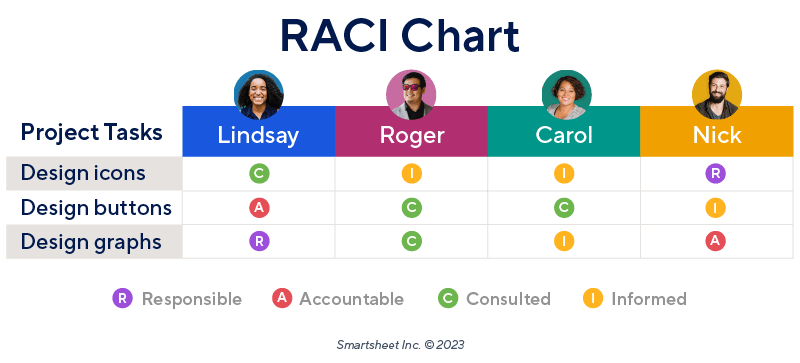
A RACI chart is a visualization of who on a team is responsible, accountable, consulted, or informed for various project tasks and phases. They help provide visibility and encourage accountability across teams and departments.
Often, even if someone is not directly doing the work, they are still involved in a consultant or managerial fashion that may not be obvious when tracked on more traditional task assignment displays. RACI charts provide a more detailed picture of who should be paying attention to which project tasks at any given time.
You can make RACI charts without software, but they are often shared digitally and made available to everyone at all times. For this reason, using a RACI chart template or project management software is best for creating them because they can be shared with the team.
RACI Chart Pros:
- Provides visibility and encourages accountability for tasks
- Useful reference for cross-functional teams
- Can be made simply with spreadsheets or use graphics for sharing in presentations or on dashboards
RACI Chart Cons:
- Might add complexity where it is not needed or when responsibilities are clear and well established
- Can be time-consuming to create
Strengths, Weaknesses, Opportunities, and Threats (SWOT) Matrix

A SWOT matrix helps the user outline the strengths, weaknesses, opportunities, and risks present in a potential project or business. It is a strategic planning tool that is useful for project prioritization and for business and personal growth.
SWOT matrices are used for planning the strategies for business and growth opportunities, to shore up weaknesses, identify threats, and capitalize on strengths. It’s easy to perform a SWOT analysis with a pen and paper, but can benefit from using customizable SWOT templates. For more template ideas, see our collections of SWOT templates for Microsoft Word, PowerPoint, Google Docs, and Google Slides.
SWOT Matrix Pros:
- Good for strategic planning and identifying growth opportunities
- Useful for risk identification and mitigation
- Simple to create and share
- Easy to read and understand
SWOT Matrix Cons:
- Requires the creator to be completely impartial
- Needs further action to act upon
Stakeholder Analysis Matrix

A stakeholder analysis matrix can help determine the level of involvement, as well as the regularity and type of communication, needed with different stakeholders. Depending on their interest and influence, stakeholders might need varying communication types and frequency about updates.
A stakeholder analysis matrix is easy to create with a pen and paper or from a stakeholder analysis template. They are a critical part of stakeholder management and are usually included in a project communication plan. They are useful tools for managing stakeholder expectations about types and frequencies of contact, and can help reduce the number of calls and emails required to keep clients in the loop.
Stakeholder Analysis Matrix Pros:
- Sets expectations of types and frequencies of contact
- Helps manage client expectations
- Provides a reference for team members to field questions and reports
Stakeholder Analysis Matrix Cons:
- Can be time-consuming to create if there are a lot of stakeholders
- Stakeholders’ needs vary by projects making profiles hard to templatize
- Stakeholders might not always agree about their assigned level of contact
Project Management Charts at a Glance
Project management uses dozens of types of charts. We’ve created this chart to help you see what each kind is used for, what to consider when using it, and which project management methodologies it integrates with best.
| Type of Chart | Used For | Considerations | Used in These PM Methodologies |
|---|---|---|---|
| Bar, Line, Pie, and Pareto Charts | Basic data visualization for sharing with stakeholders | Limited in scope; do not provide context to the data involved | Can be used in conjunction with all PM methodologies |
| Matrix Diagram, SWOT Matrix, Stakeholder Analysis Matrix, RACI Charts | Visualizing many-to-many relationships; strategic planning | Can get overly complex and difficult to read; not always a good choice for sharing with stakeholders | Can be used in conjunction with all PM methodologies |
| Fishbone and Cause-and-Effect Charts | Visualizing the root cause of effects and outcomes | Can be difficult to model complex outcomes with more than one cause or effect | Can be used in conjunction with all PM methodologies |
| Burn-Up/Burn-Down and Cumulative Flow Charts | Visualizes the status of the backlog for an Agile or ticket-based team | Cannot distinguish size or impact of tasks in the list | Used in Agile methodologies such as Scrum and Scrumban |
| Flowcharts and Activity Diagrams | Models the path through a specific workflow process or user journey | Can be hard to read with more complex workflows; difficult to edit once created | Can be used in conjunction with all PM methodologies, but especially useful when workflows are digital |
| Work Breakdown Structure, Network Diagrams, PERT Charts, and Critical Path Charts | Visualizes a breakdown in work processes required to achieve project completion | Can be difficult to estimate task schedules; becomes much more complex for larger projects | Can be used in conjunction with all PM methodologies, but especially for traditional approaches such as Waterfall |
| Control Charts | Quality control and visualizing outliers in processes | Requires expert level knowledge of processes; must be set up correctly to be useful | Can be used in conjunction with all PM methodologies |
Why Charts Are Crucial for Project Management
Charts help you visualize data to aid in sharing or decision-making. Project management is a complicated business: Using charts to get complex ideas out of your head and onto the page helps keep you organized.
“The biggest advantage of visualizing project data with charts is that it allows you to quickly and easily recognize trends and patterns in your data,” says Walker. “This can help you identify areas in need of improvement or potential issues in your work processes, so you can make more informed decisions about how to manage your projects.”
In addition to tracking numerical data, charts are also useful for planning and organizing your thoughts.

“The biggest advantage of using charts is the ability to visualize complete content in one image,” explains Randall Englund, the Project Management Instructor at Northeastern University College of Professional Studies. “It can really help you see the big picture, and each topic can be expanded to see additional details, such as relationships to other topics. They’re also useful for brainstorming project tasks, categorizing them, and then exporting the most important things into your project plan and your software.”
Charts are an important diagnostic and tracking tool that can show your progress, or lack thereof, over time.

Alaa Negeda, Chief Technology Officer at ALXTEL, adds, “Charts are visually appealing and make data easy to understand. They make it easy to compare data across different periods or projects, and can help you make better decisions by providing data-driven insights. Depending on the chart, they can improve your communication with your team, or with stakeholders and clients. Charts make it easier to identify and solve problems, which makes it easier to manage projects.”
What to Consider When Choosing a Chart for Data Visualization
Different charts are best for visualizing various kinds of data. Some charts are better for decision making, and others are better for sharing with stakeholders. Here are some considerations when choosing a chart:
- Consider Your Audience: Are you making a chart to share data with stakeholders, or is it for your own decision-making purposes? Charts that are shared with stakeholders should be more graphic and simple to read. “Consider the specific goals and objectives of your project and its audience, as well as the type and amount of data available. Every project is different, and the best way to determine what works best for your stakeholders is through trial and error,” advises Walker.
- Consider the Type of Data:

Many project management charts are specialized for a single purpose. Use the kind of chart that best fits the data you are visualizing instead of trying to force your data into an inefficient chart. “Choosing the chart type depends on what data you want to represent. Think of tools and their uses — you wouldn’t use a hammer to take out a screw,” says Dr. Stefan Oborski, the Director of Project Management at Red River.- Consider Your Goals: What is your goal when charting? Are you sharing information, pitching a new process, or using it to help make a decision? For decision-making, often it is suitable to put pencil to paper and get to brainstorming knowing that it will not be shared with others.
- Consider Its Future: Will your charts be used to compare to past or future projects? It might be worth making digital charts if you know you will want to reference or update them in the future.
Easily Create and Share Charts for Your Projects in Smartsheet
Empower your people to go above and beyond with a flexible platform designed to match the needs of your team — and adapt as those needs change.
The Smartsheet platform makes it easy to plan, capture, manage, and report on work from anywhere, helping your team be more effective and get more done. Report on key metrics and get real-time visibility into work as it happens with roll-up reports, dashboards, and automated workflows built to keep your team connected and informed.
When teams have clarity into the work getting done, there’s no telling how much more they can accomplish in the same amount of time. Try Smartsheet for free, today.